Embracing Pinks And Florals: My Plans For A Hallway Update In My Home
So it might seem like it’s all talk and no action round these parts - my last post was on a home office and en-suite makeover yet to be revealed - but sometimes projects and opportunities just overlap! Today, I want to talk about my plans for a makeover to my hallway, which has never had much attention and has therefore never really worked. As I have decorated around the house, the hallway has become more of an issue as this is the space that flows between each of these new rooms. Each room feels unrelated and disconnected from the hall, when really it should be an introduction to each separate space.
When we moved in the hallway was painted magnolia and the woodwork ivory. To try and give the hall a bit of depth I painted it this greeny-grey colour and left the ivory trim as it was. The neutral carpet was innoffensive and in great condition so it stayed. The problem that I have with this space is that the light bursts in and up the hall and I don’t think at the top the colour looks very complimentary in the light. It becomes almost a lime green in places. I also think a big mistake that I made was to leave all the doors and woodwork in ivory - it makes the features very plain, nothing special, and the whole hall has no ‘oomph’ to it. When I walk in my front door the space does not give me joy, it does not reflect my love of colour and pattern and it certainly does not feel modern.
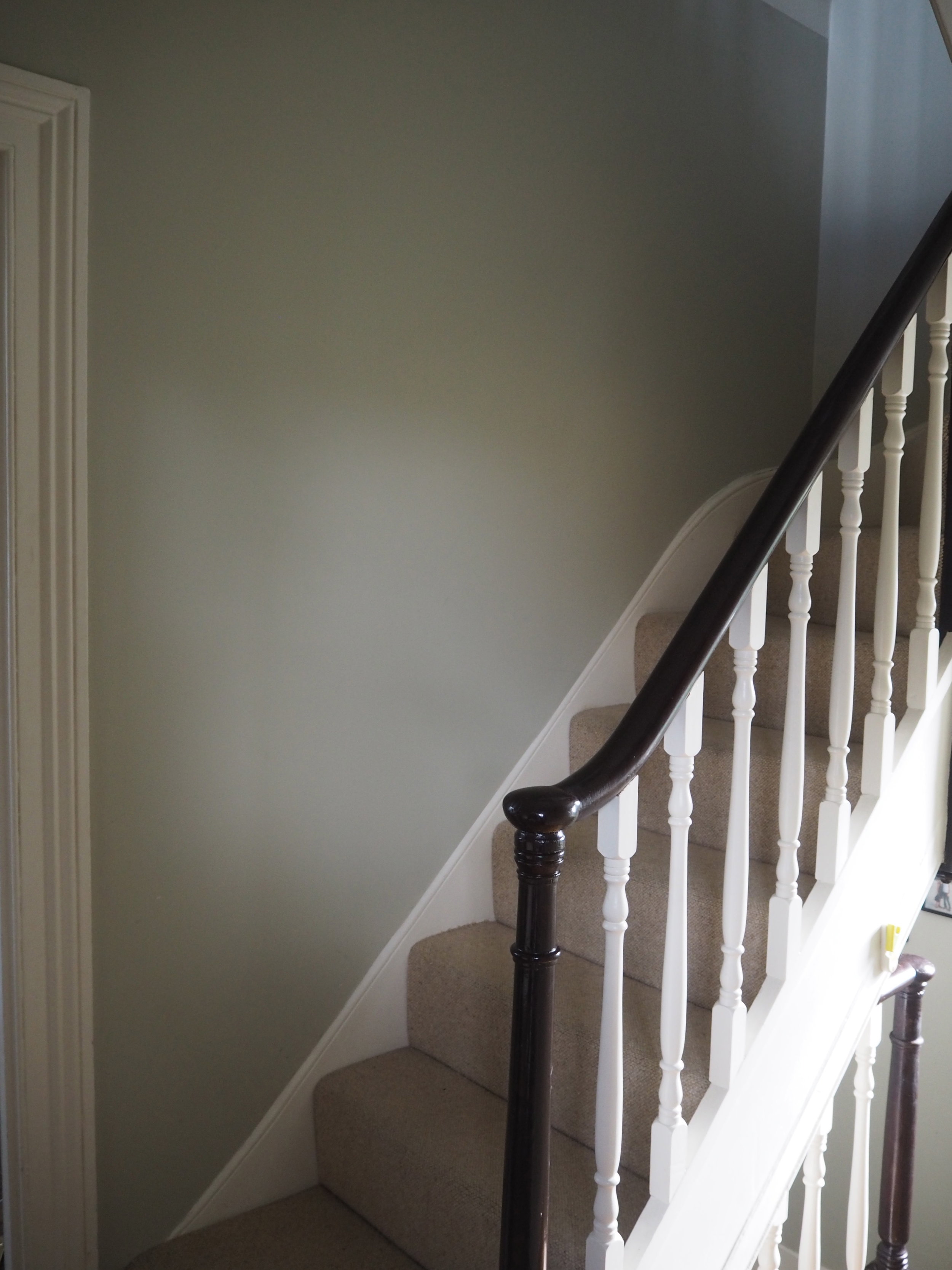
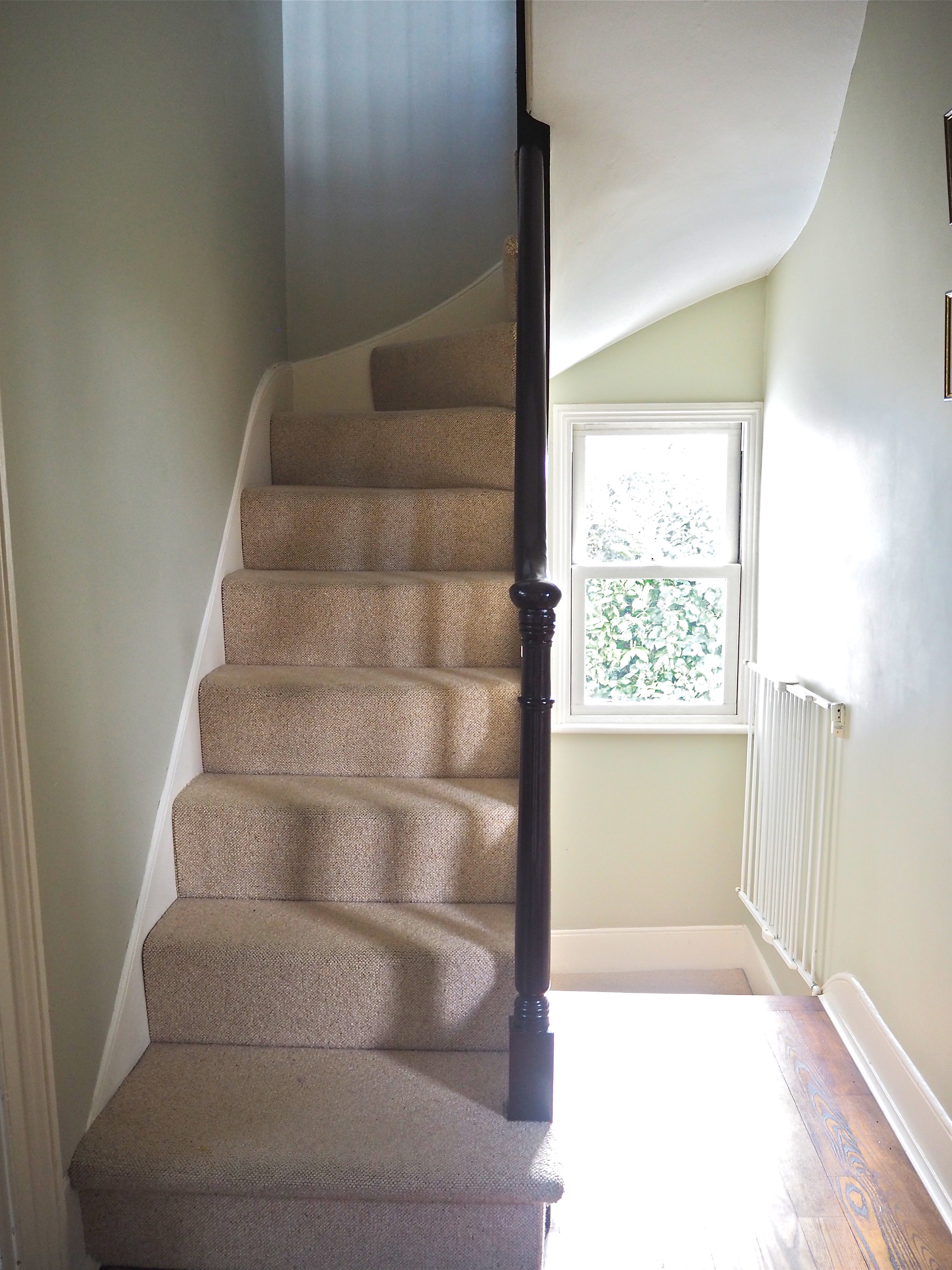
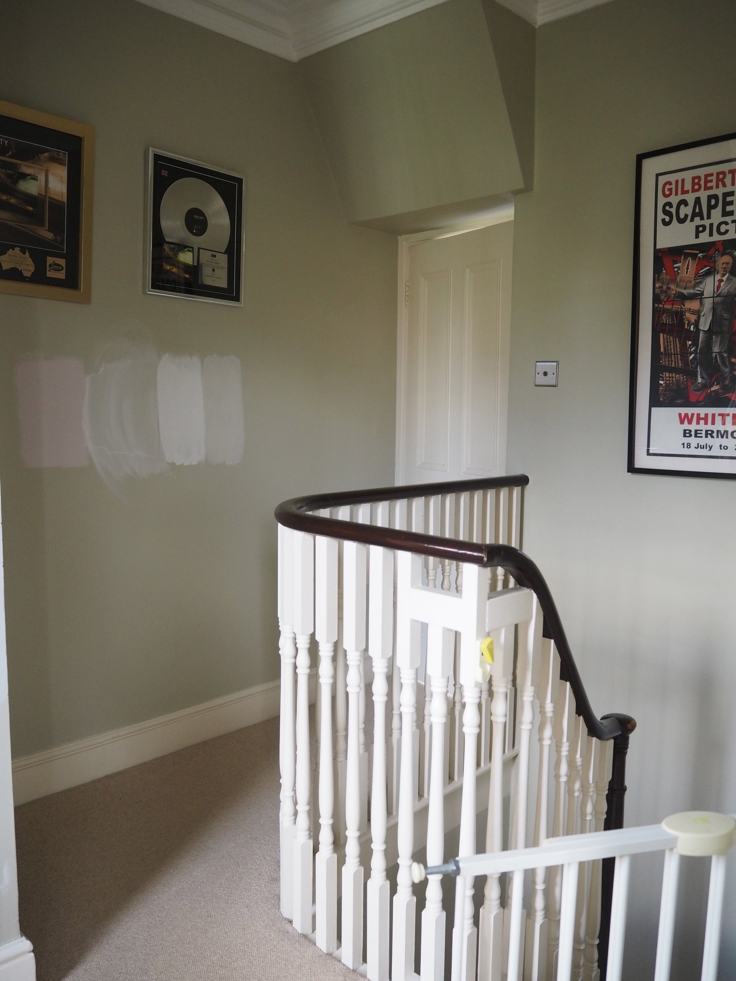
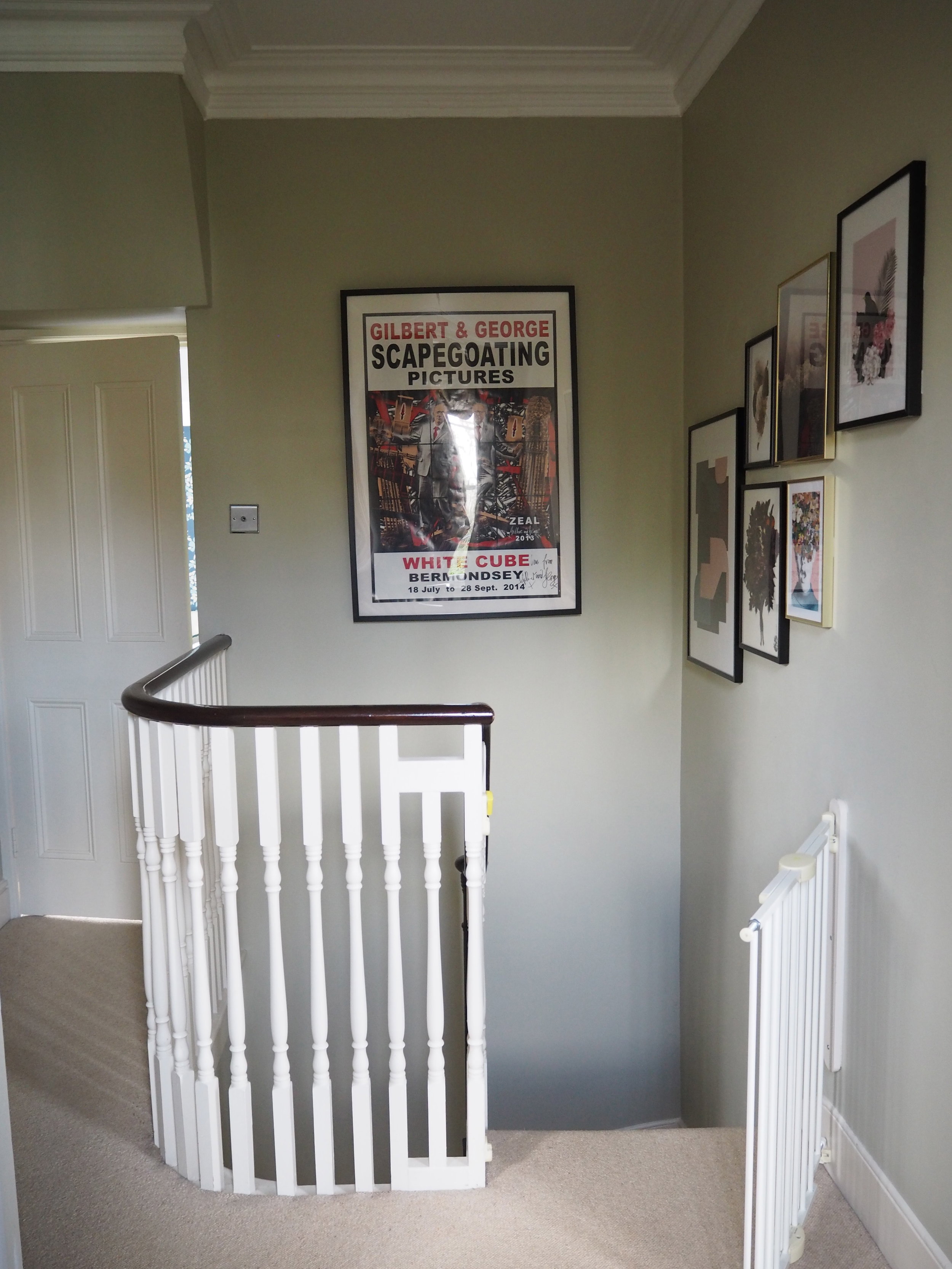
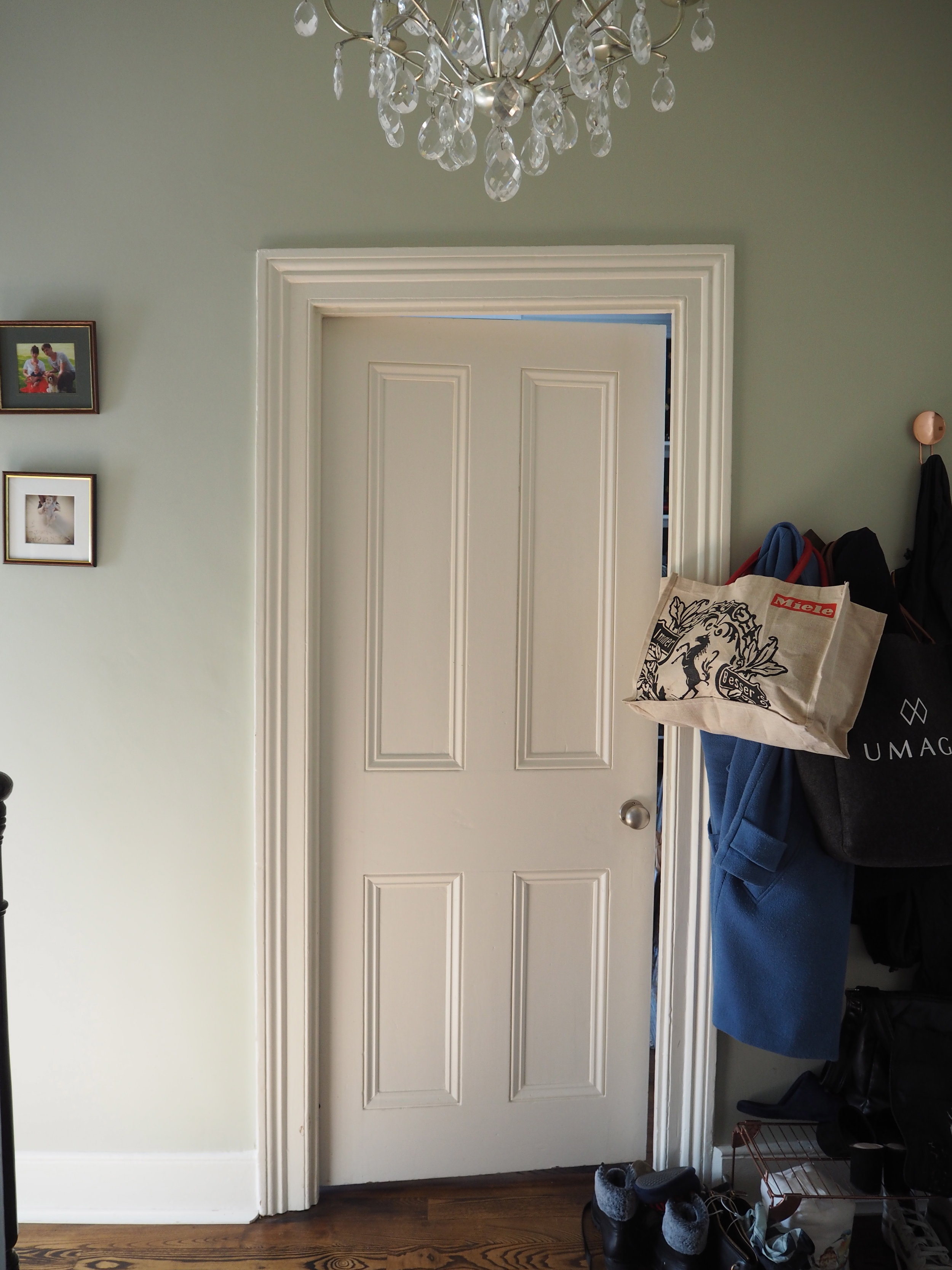
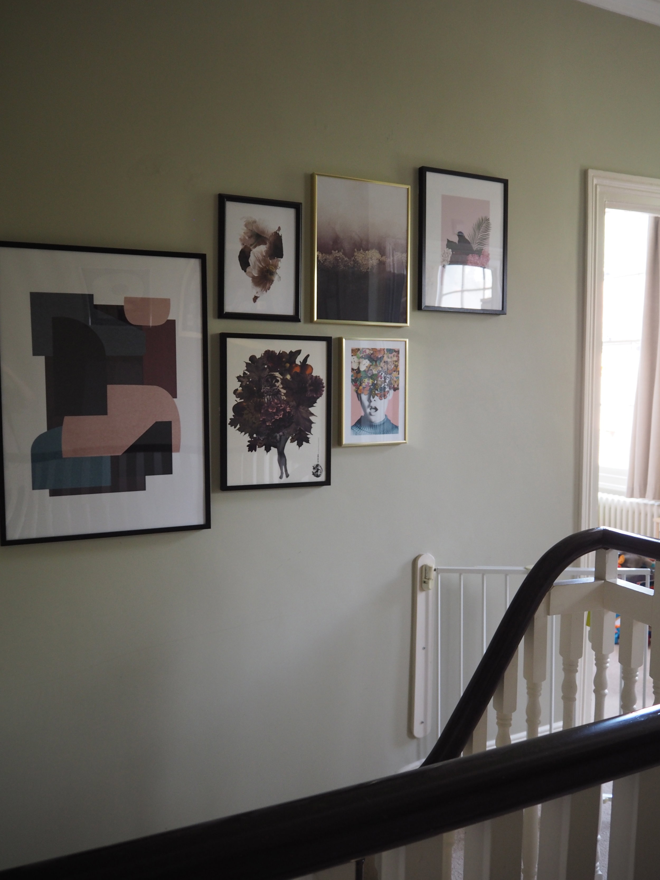
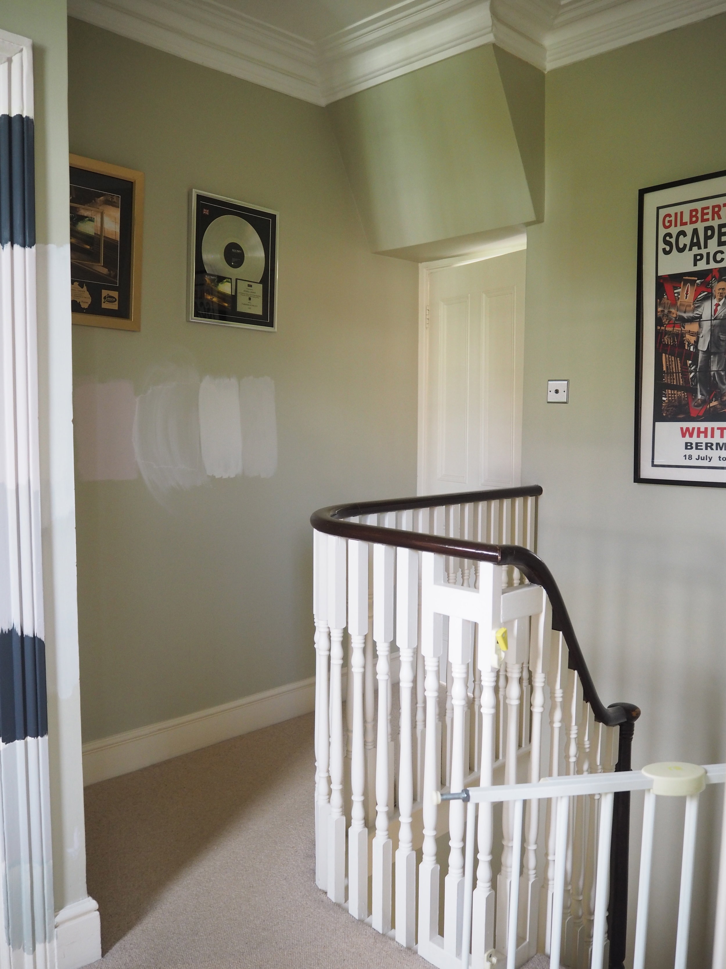
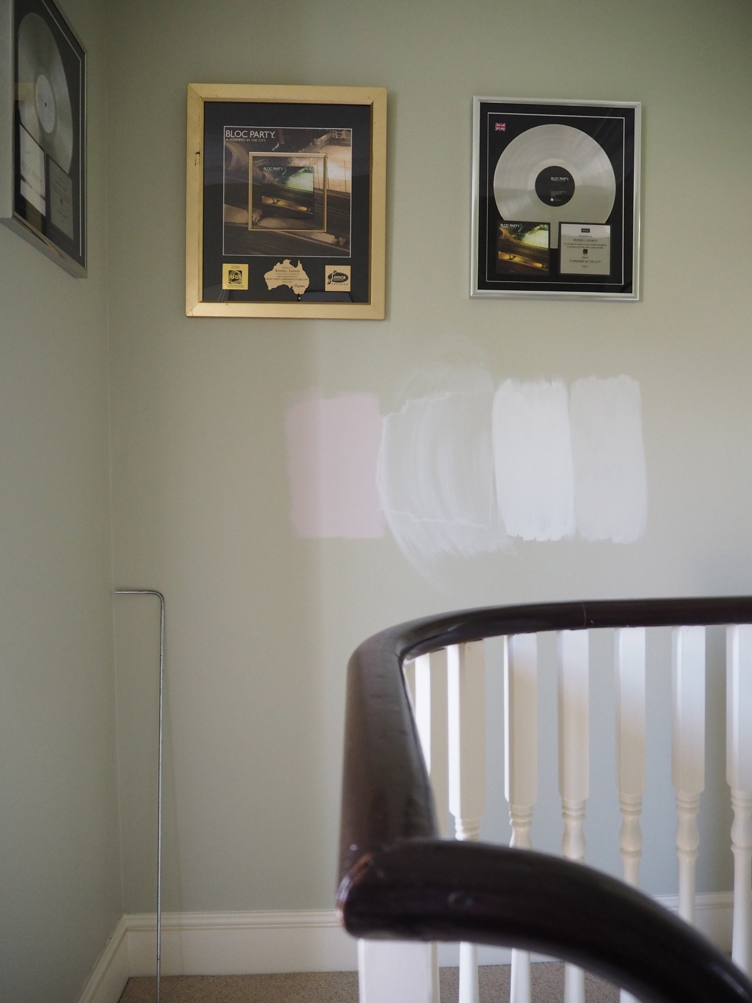
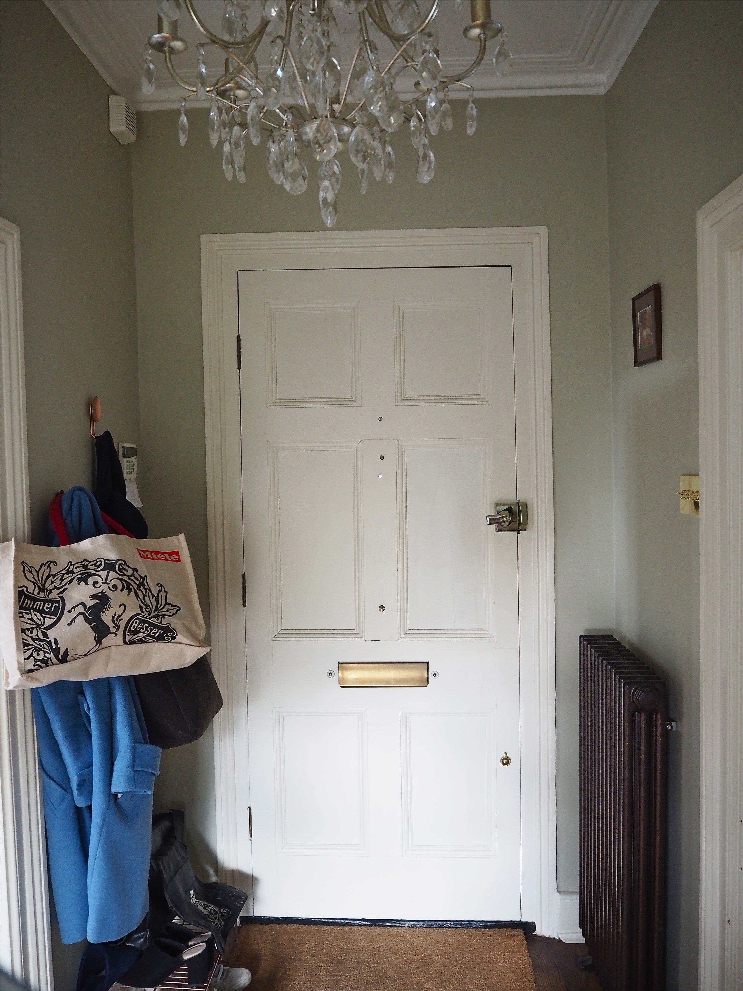
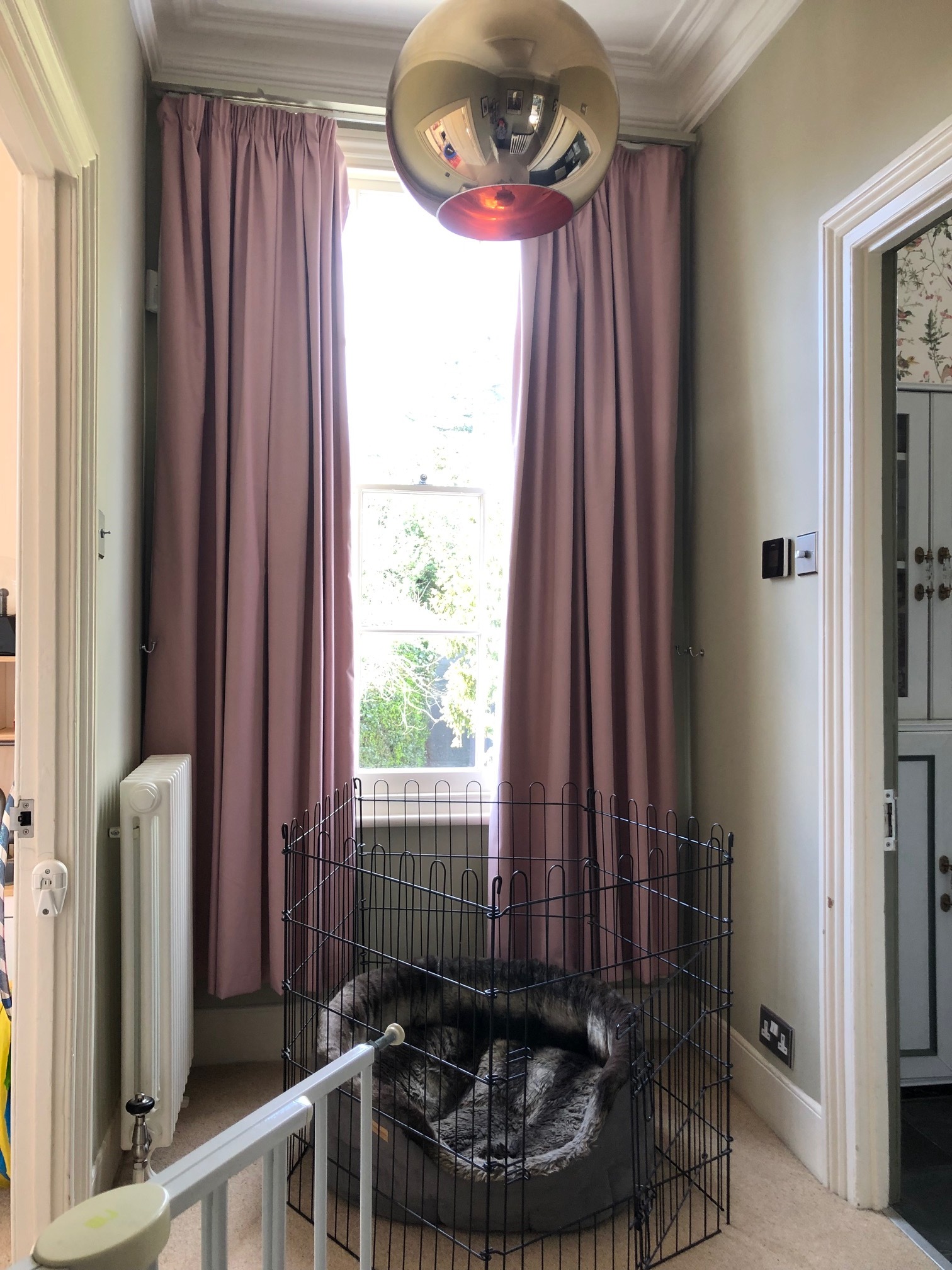
In all honesty, I didn’t have any clear, initial idea of what would work in this space or make it look better. Hallways can be so hard to design, especially if they span more than one floor. The light can be different on each level and often furniture is not going to be a feature, so the walls need to do the talking. Ideally, I would love to panel the space, but there are so many dips and grooves and curves I wouldn’t be able to achieve any level of symmetry. Instead, I had one key piece of art and some fabric that I wanted to create curtains with, so those became my starting point for the whole scheme.
M&L Paints, clockwise from top left: White Lilac, Plaster Pink, Old Rose, Steel, Shell and Hilltop.
M&L sent me samples of all their key pink colours and I was instantly drawn to Plaster Pink and Old Rose. Old Rose has a very dusky, vintage feel to it, but I felt that it may be too strong to use in such a large area of my home. Instead, Plaster Pink was the perfect shade: grown up, delicate, but not too candy-coated.
M&L Warm Neutrals, L-R: White Pepper, Paperlining, English Plaster.
I’ve decided to team it up with English Plaster, a warm, grey-tinged neutral. I also fell in love with White Pepper, which is more of a shadowy white, but I felt it did not give as much contrast to the pink as English Plaster does.
So, this as the vision board for the area. Lots of pinks, lots of florals, very delicate:
What do you think? I’m really excited to get going and hopefully I’ll be back in a few weeks with the full reveal!
