Using Treron, One Of The New 9 Farrow & Ball Colours, In My Home.
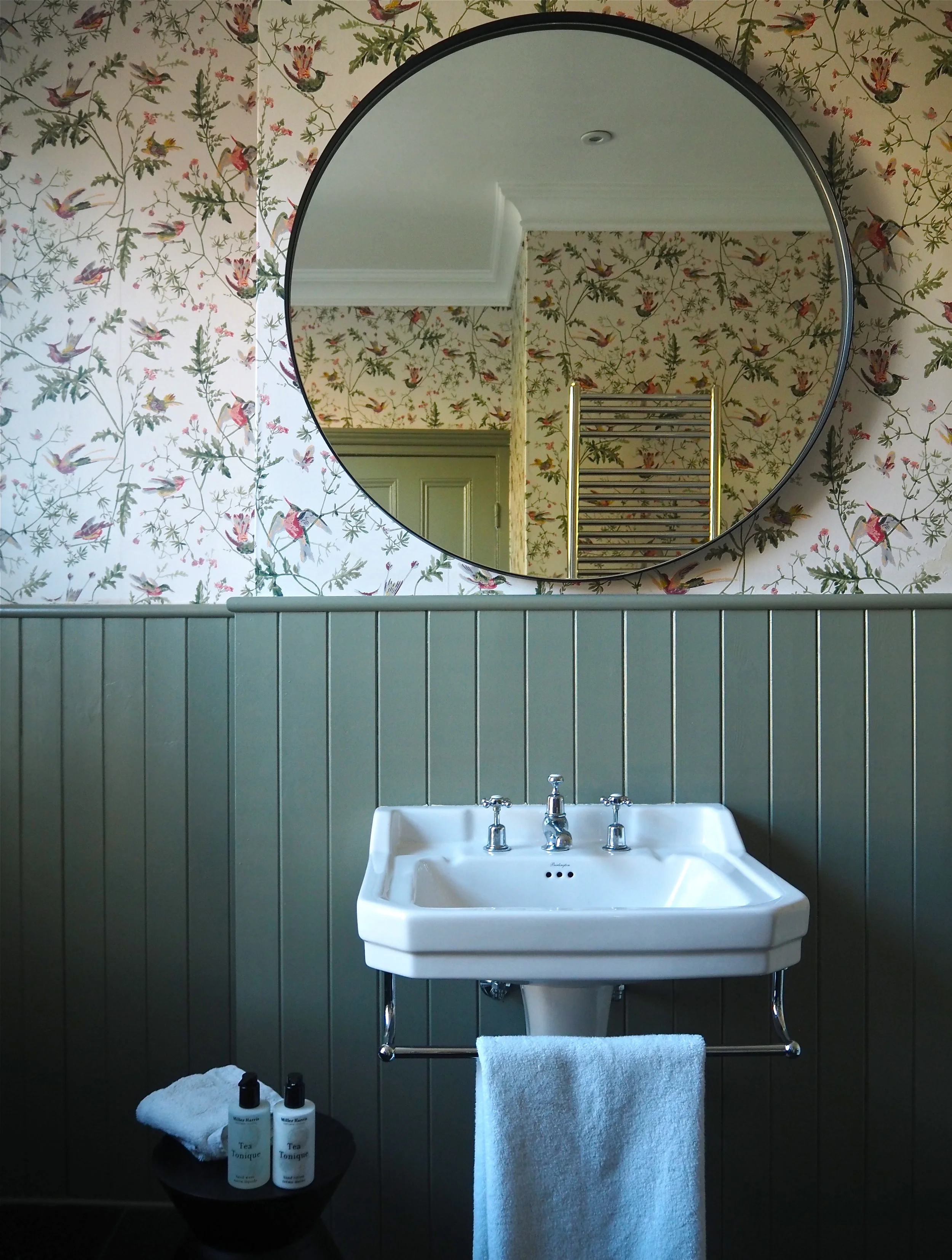
In September this year the esteemed paint manufacturer Farrow & Ball released 9 brand new colours to take their palette up to 132 hues. Without looking like I am very late to the party, I held off writing about the colours until they had been used in abundance in ‘real homes’. The thing is with Farrow & Ball press images is they are just so good. They hire the best stylists and produce the most amazing pictures, they could probably rub a dog turd on the wall and it would look like a desirable colour to paint your guest bedroom in. What I really wanted to see was how the colours would look in different types of homes and in different settings. Plus, when I received the press pack (which included sample tins of the 9 new shades) there was one colour in particular, Treron, which I flagged for use on the tongue and groove in my bathroom.
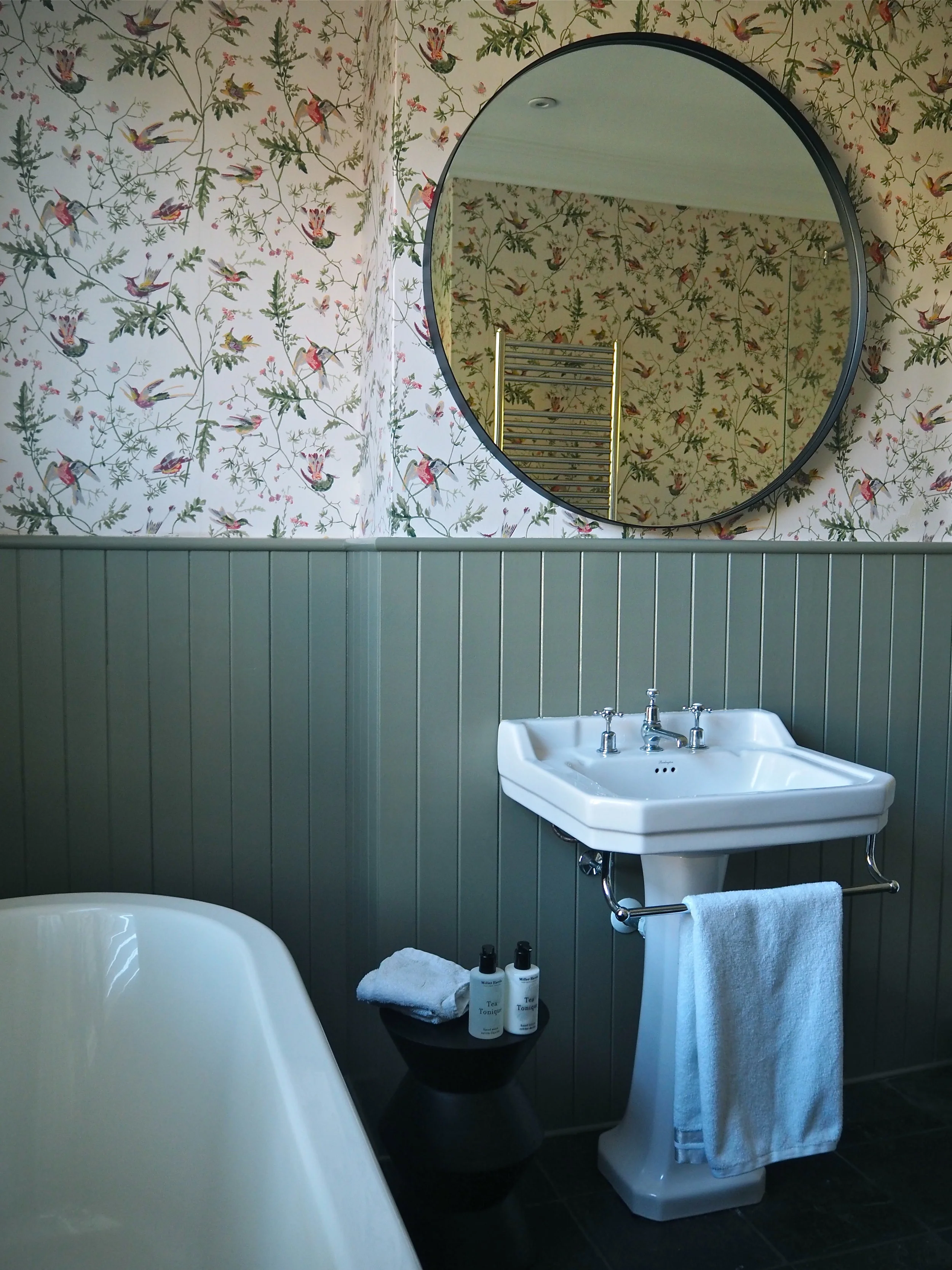
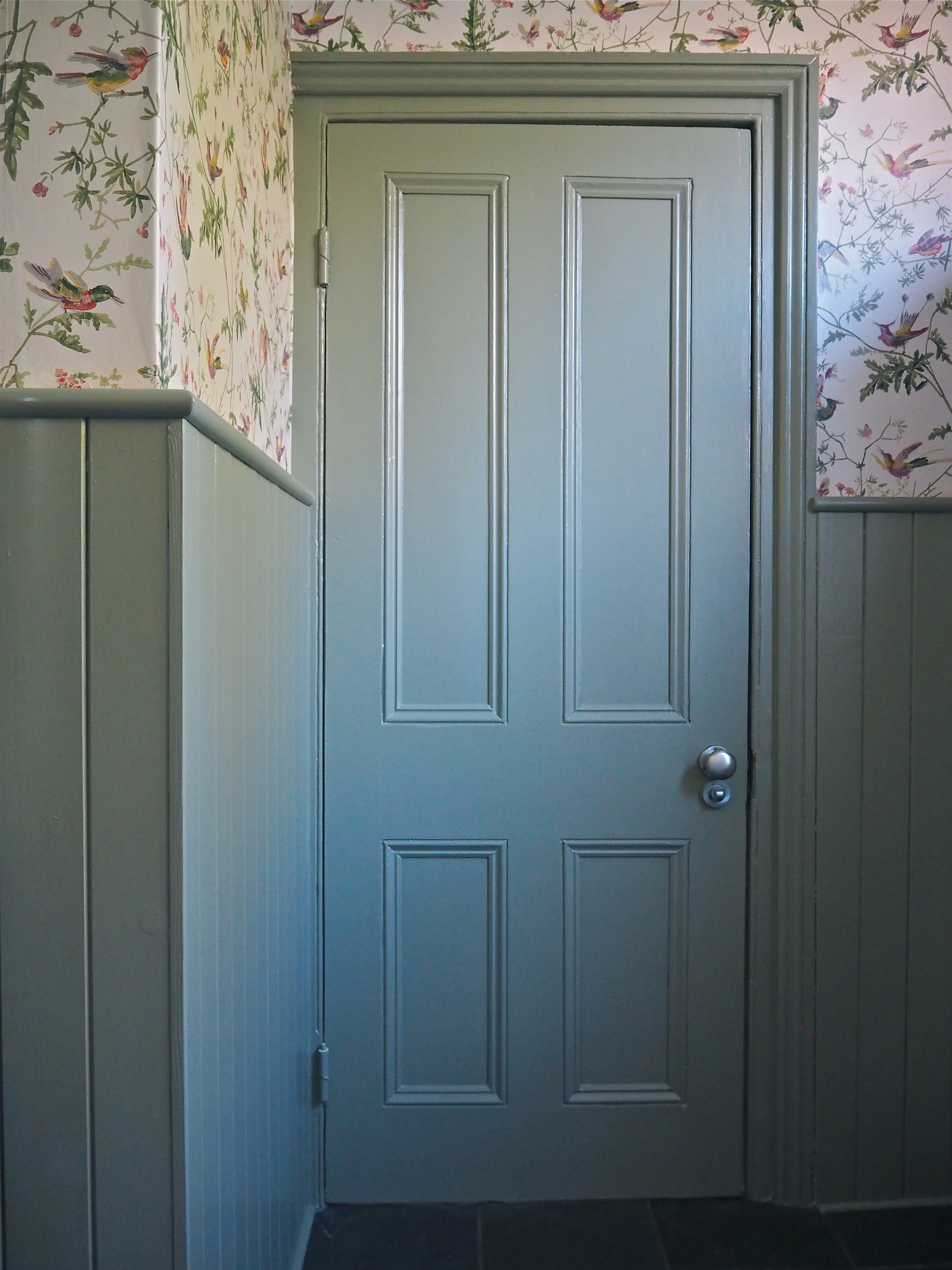
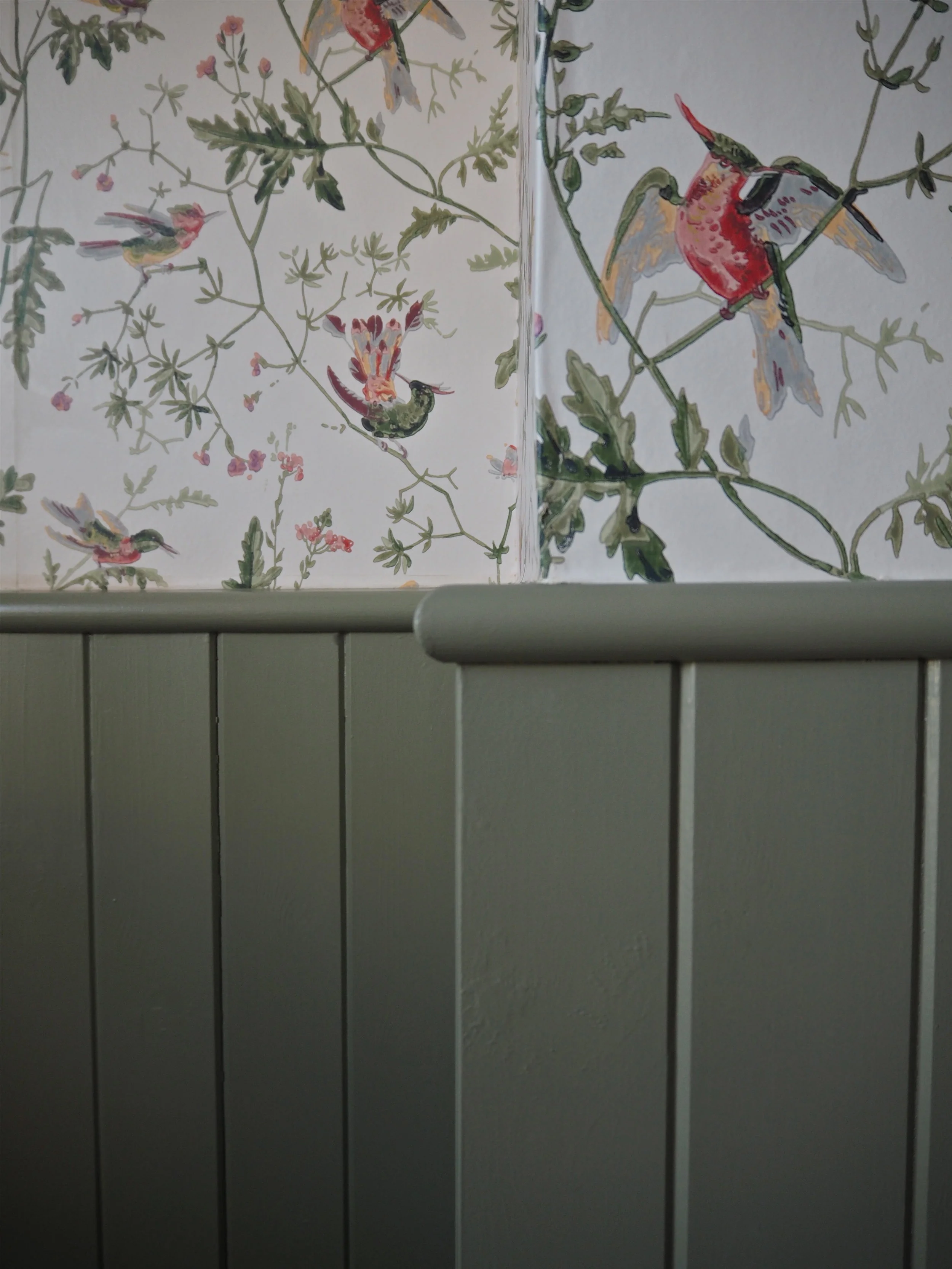
I had wanted to paint the ivory tongue & groove in the family bathroom to match the Cole & Son wallpaper for a few months now. Feeling that the ivory was just too plain for my liking and wanting the bathroom to have a bit more ‘oommphh’, I knew that a green to highlight the green branches featured in the Hummingbirds wallpaper was the way to go. However, I also knew that the green couldn’t be too green as I thought it would clash with the blue bath. Instead, I wanted a very grey-green, something muted that was not a rich emerald or forest green.

Treron is a greener version of Pigeon, one of my favourite Farrow & Ball shades. It feels a traditional colour while at the same time modern, which is perfect for my conventional bathroom that I wanted to make a bit more contemporary in style.
To update the tongue and groove I gave it a thorough washing down in sugar soap, blocked out the wood knots with a shellac primer, then painted it in three coats of Treron Modern Emulsion (an extra durable eggshell suitable for bathroom and kitchen cabinets). I had already updated the mirror to a more modern circular mirror with a black rim (to tie in with the slate floor). I then swapped out the vintage tables for a more modern stool/side table from La Redoute.

I’m really happy with the result and I love the colour! After the initial first application I was concerned that the shade was a bit too ‘murky,’ but with each coat the colour really built up and came through.
So that’s Treron, what about the other 8 new shades? Well, as per my last blog post for 2019 trends, I think that we will be seeing a lot more Sulking Room Pink:
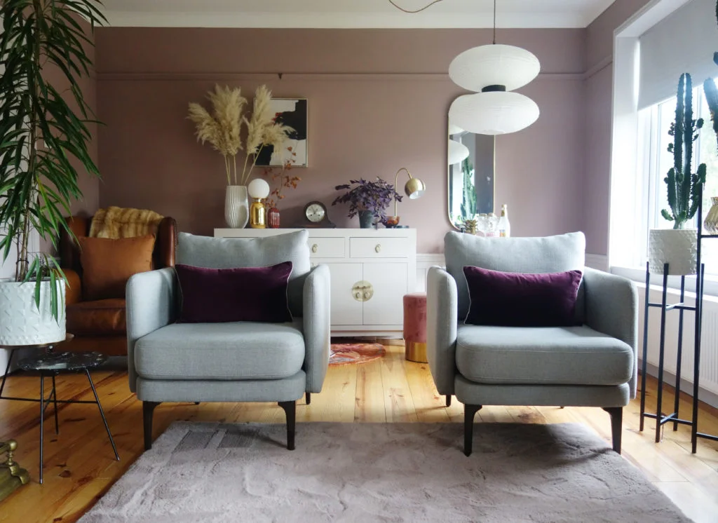
Sulking Room Pink used in a lounge makeover by Green & Mustard
In the living / dining spaces above and below, you can really get a feel for the warm, retro feel that Sulking Room Pink evokes.
This warm pink works well with black accents. Photo Credit: Frederik Boukari
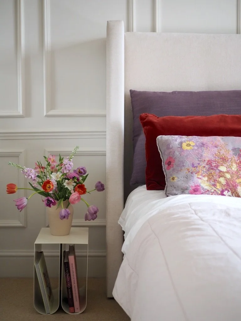
Ruth Matthews from her wonderful blog Design Soda decorated her young sons room in Sulking Room Pink, which I love as it shows that it is not a cold pink so therefore works well in a bedroom:
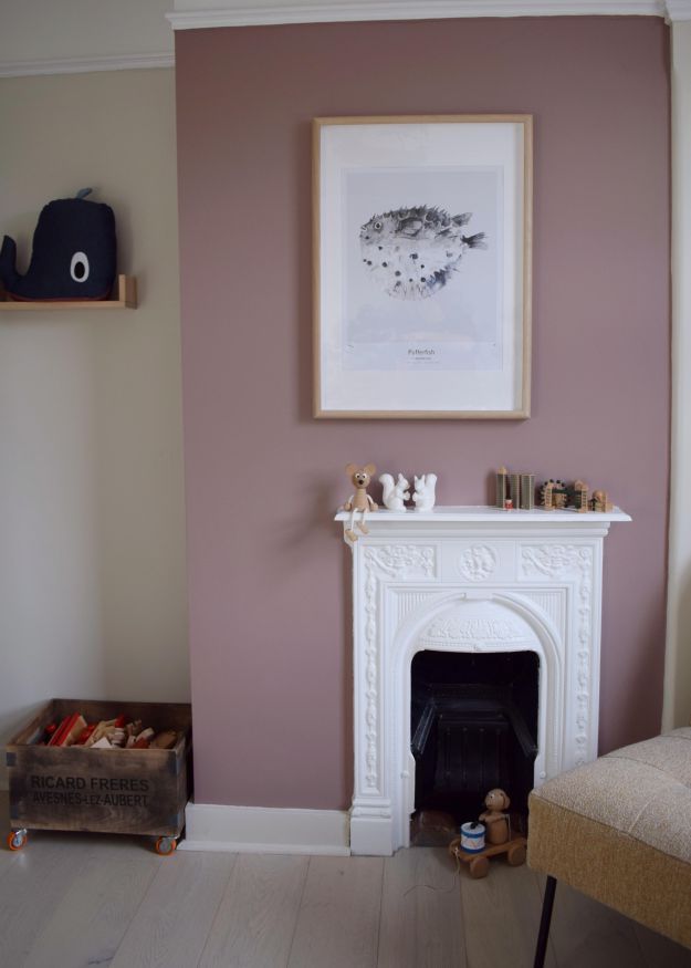
Photo Credit: Design Soda
The ‘white’ in the 9 new colours is a shaded white, so part of the group that contains Shadow White, Shaded White and Drop Cloth. It is used here in the bedroom of Laura, author of The Indigo House blog. I think it is a perfect accompaniment to the grey bed, soft furnishings and the natural styling elements that she has in this space. It can be considered a warm white with a slight vintage edge:
‘School House White’ used in the master bedroom by The Indigo House
The back of this front door is painted in Paean Black by Little House On The Corner. Paean Black has a purple undertone and my friend Ruth Matthews described this colour perfectly when she painted her sons window frame in the shade. She told me the black was the exact black you’d get from the juice of a squashed blackberry and she was totally right.
Photo Credits: Little House On The Corner
Jitney I think is the shade that everyone loved from the press images, but is too scared to use in their own home. If you take the plunge like Clémence did in her home, then I cannot imagine you would be disappointed:

Jitney used in the living room of turbulencesdeco on Instagram.
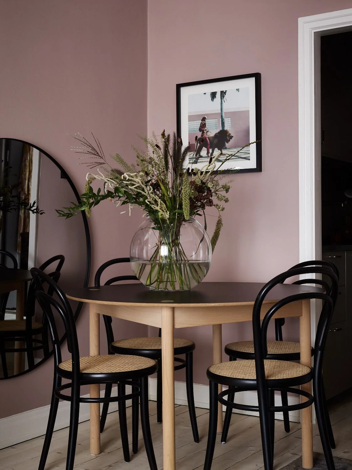
Farrow & Ball blues…..my love affair with them will never die. In my own home I have Dix Blue in the living room, Railings in the office, Oval Room Blue in the bedroom and Hague Blue in the kitchen. Must be time to fit new shade Di Nimes in somewhere, right??
The Pool hallway in Di Nimes No 299.
So the remaining 3 colours I cannot find any internet evidence of….yet. So here are the 3 associating press images for your reference. Preference Red is a red that I think would only really work in more grand homes, so I am excited to see how people pull it off on a smaller scale. Rangwali is a pink but a much more exotic, hot pink than Sulking Room Pink, so I expect it to be used more next summer as people lean towards more vibrant shades. Bancha is exactly the sort of green that I did not want to use in my bathroom! Yet, I think its trendy olive tones will become quite popular, especially on feature/signature walls.


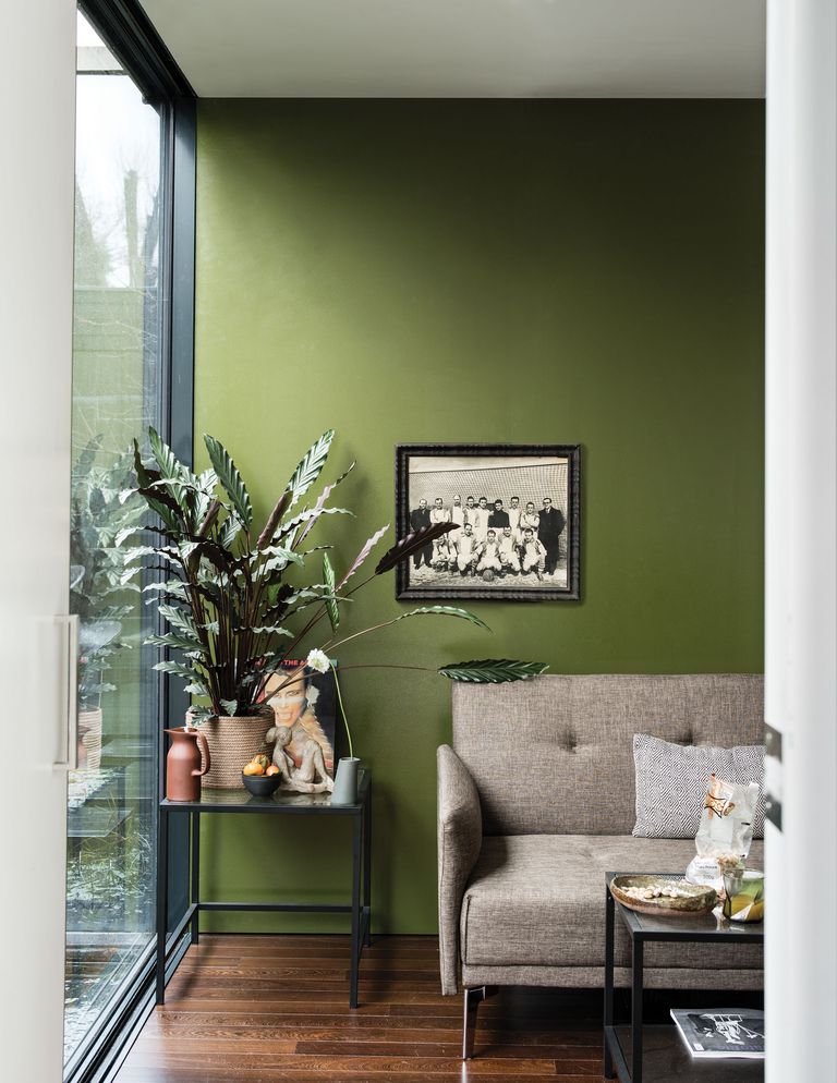
Top to bottom, Reference Red, Rangwali, Bancha. Photo Credits: Farrow & Ball.
What do you make to the colours in ‘real homes’? What are your favourites? Do you like my bathroom update? Let me know in the comments section below….
* Please note that this post was in no way sponsored. I purchased the paint used in my bathroom with my own money.