How To Use Blue At Home: The Best Blue Interior Decor Ideas

Popular American paint brand Benjamin Moore released its Colour Of The Year for 2021 last week to a very enthusiastic response (it’s fair to say opinion favoured it far more than ‘Brave Ground’ by Dulux). The greeny-blue shade, ‘Aegean Teal’, is a warm, welcoming hue that was picked for its earthy, enriching quality.

Colour Of The Year 2021 Aegean Teal 2136 40 From £24 0.94L, Benjamin Moore
I was happily surprised when the COTY was proving to be desirable, as when I suggest to clients that they should paint a room blue the first thing they say is “won’t blue be a bit cold?” In response, I always ask them when they open their curtains to clear blue sky in the morning - does that make them feel cold? Blue is actually a fantastic colour to use all around the home, you just need to use the right shade of blue (pick green-based blues that feel warm over grey-based) and know how to incorporate the colour into a design scheme. With that in mind, today on the blog I’ve picked out my favourite inspirational blue interiors to demonstrate the ‘brilliance of blue’.

Image Credit: @rikkesroom
First up is one of my favourite homes, @rikkesroom on Instagram, who has teamed blue wallpaper and luxury blue curtains with pink in her bedroom. While ‘blue & pink’ has connotations tied to babies and gender, the colours themselves really complement each other. I prefer lighter shades of each colour when combined in interiors, such as in this child’s bedroom, below, by interior designer Em Gurner:
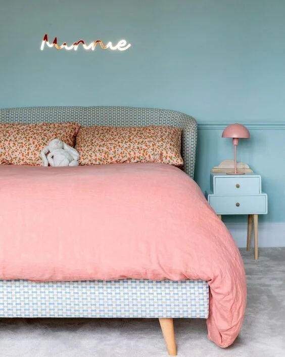
Designer: Em Gurner; photographer: Anna Yanovski

Image credit: Cathrine de Lichtenberg
Pink and blue can also be seen here in the home of Cathrine de Lichtenberg, who has teamed soft pink walls with a punchy blue table. If you feel that you cannot commit to blue walls, then bringing in a statement piece of blue furniture works really well.
Photographer: Lol Johnson ; Design ‘and then they went wild’
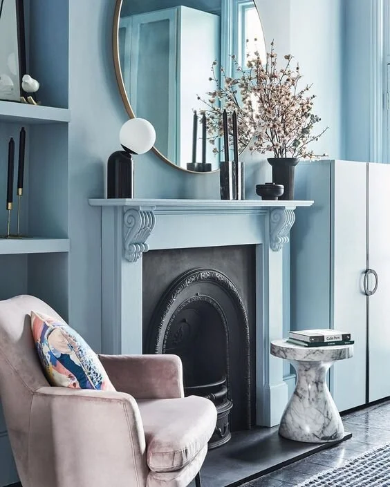
In contrast to just a pop of blue, Nicki Bamford-Bowes of interior design studio ‘and then they went wild’ colour washed her entire sitting room in ‘Lagoon’ by Valspar Paint. The walls, fireplace surround and cupboards are all painted in the same pale blue, which she teamed with black and pink furniture and accessories.

The home of Sofie de Kruijff with her beautiful blue internal doors.
Blue doesn’t just have to be on the walls or as a statement piece of furniture - think outside the box and paint doors, trim, or even your ceiling in a striking shade of blue:

Photo: LivingEtc
While deep navy kitchen units have been unequivocally popular for the past five years, lighter blue tones on kitchen cabinets are equally as inviting and homely. Try to keep the colour to the bottom units only and keep top units (if you have them) neutral so that the blue does not dominate.

Image credit: Husk

The most stunning green-blue kitchen units in the home of designer Laura Butler-Madden
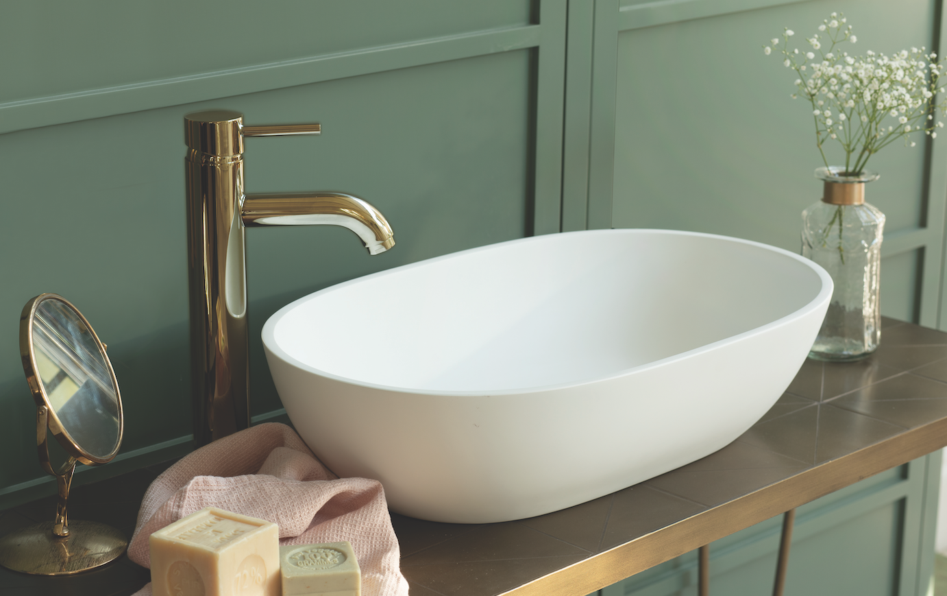
In the bathroom, bring blue in via the fittings and the tiles. Blue and brass are a killer combination, as seen below in this dreamy scalloped bathroom by designer Emily Henderson :

Image credit: Emily Henderson
This baby-blue sink designed by Gesa Hansen for Villeroy & Boch has always been on my ‘wish-list’. Seen here in Gesa’s bathroom at her home in France, I love how she combines it with pale blue walls and herringbone white tiles:

Image Credit: Gesa Hansen for Villeroy & Boch
This insanely clever ombré effect stairs belong to @ormistonhousedesign. Each step up is slightly a lighter shade from the last, so you go from dark to light as you climb. These stairs go up to a skylight at the top of the house - evoking the impression of ‘reaching the light’ as you move to the top:

Image credit: @ormistonhousedesign
Last week I featured a conservatory which had been completely spray-painted from white to black. This week, this conservatory belonging to stylist genius Marianne Cotterill is painted in Farrow & Ball’s Dix Blue, which adds a ton of style and character to the space.

Photographer: Roger Bool; design Marianne Cotterill
Finally, I couldn’t finish this post without including my own ‘blue room’ - my favourite room in my house! Like Marianne’s conservatory, this is also painted in Dix Blue. I did write a really old post on painting it blue from magnolia if you fancy a peek at the ‘before!’