
Farrow & Ball Release 11 New Paint Colours For 2022

Selvedge - a lighter version of De Nimes - is new from Farrow & Ball. Image credit: Farrow & Ball.
While there has been a huge surge in new paint brands hitting the market in the past 5 years, Dorset-based paint and wallpaper company Farrow & Ball still hold onto their crown as one of the most popular and desirable paint manufacturers, thanks to the distinguishable colours and rich pigmentations you find within their tins. Today they release 11 new shades, which is quite exciting as although they reissued some archived colours in collaboration with Liberty last year (and launched a collaboration with designer Kelly Wearstler on a collection aimed at the American market), there has not been a shake-up of the signature colour palette since 2018.


Clockwise from the top: The warm neutral Stirabout; the green-grey of Eddy; the new cult dark colour Hopper Head; a delicate pink: Tailor Tack. All images belong to Farrow & Ball.
With cult colours in their catalogue such as School House White and Sulking Room Pink, there will be a real focus on what will be the new ‘it’ shades from the 11 new releases, developed by the incredibly talented due Joa Studholme, Colour Curator for Farrow & Ball, alongside Charlotte Cosby, Head of Creative.
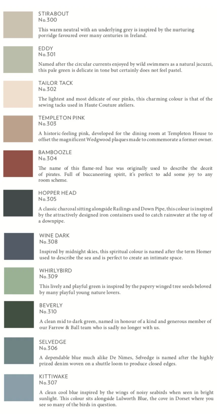
The new colours and a short description of each from Farrow & Ball.
While greens continue to be a popular choice for the home, Beverly - a clean mid to dark green - will no doubt soon be found all over Instagram. “I’ve developed a soft spot for many of the new colours especially Beverly which, just like its namesake, is reassuring, uncomplicated and full of depth,” says Charlotte Cosby. “We used it in a kitchen with Selvedge and I wanted to move in immediately.”

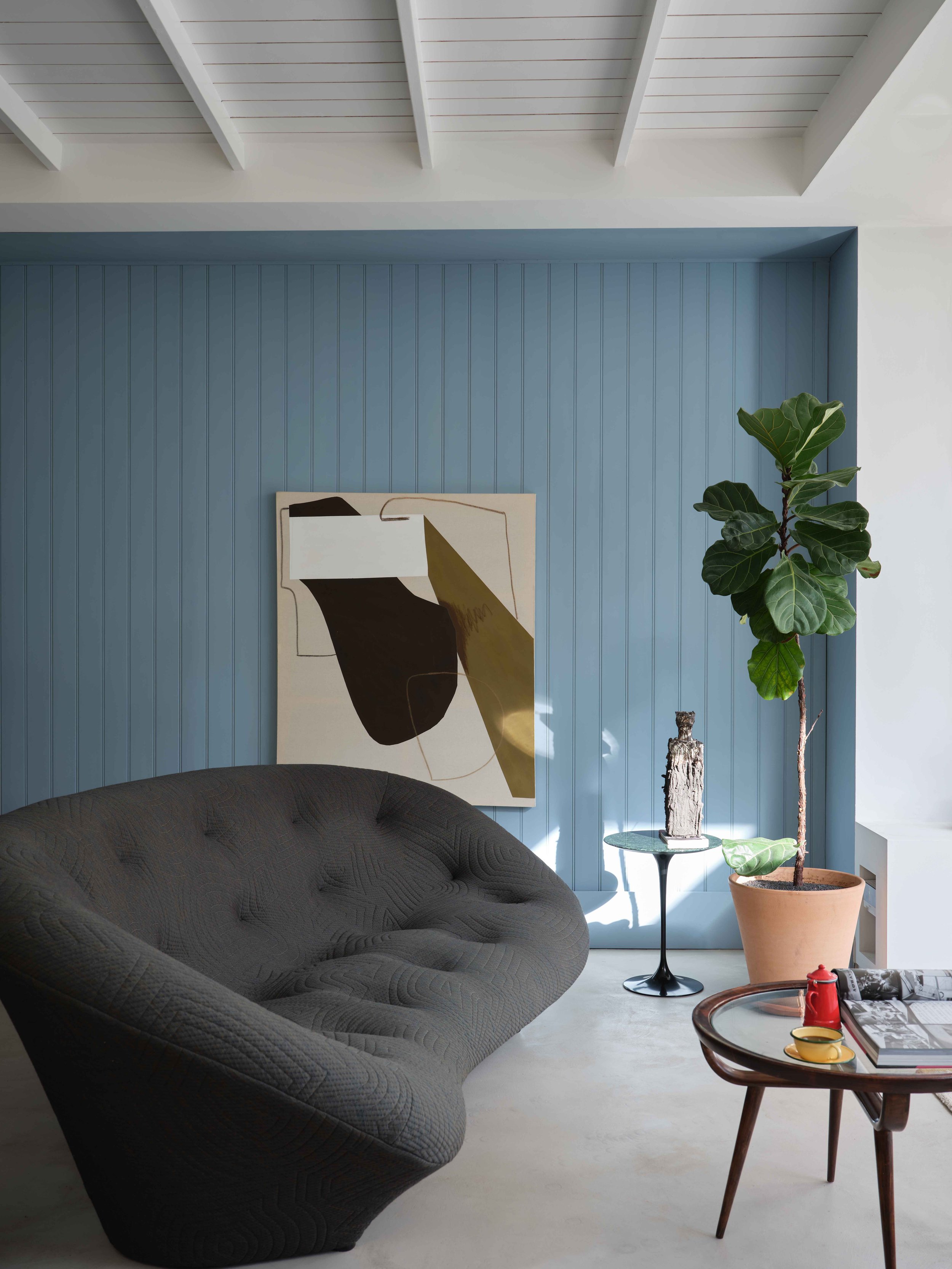

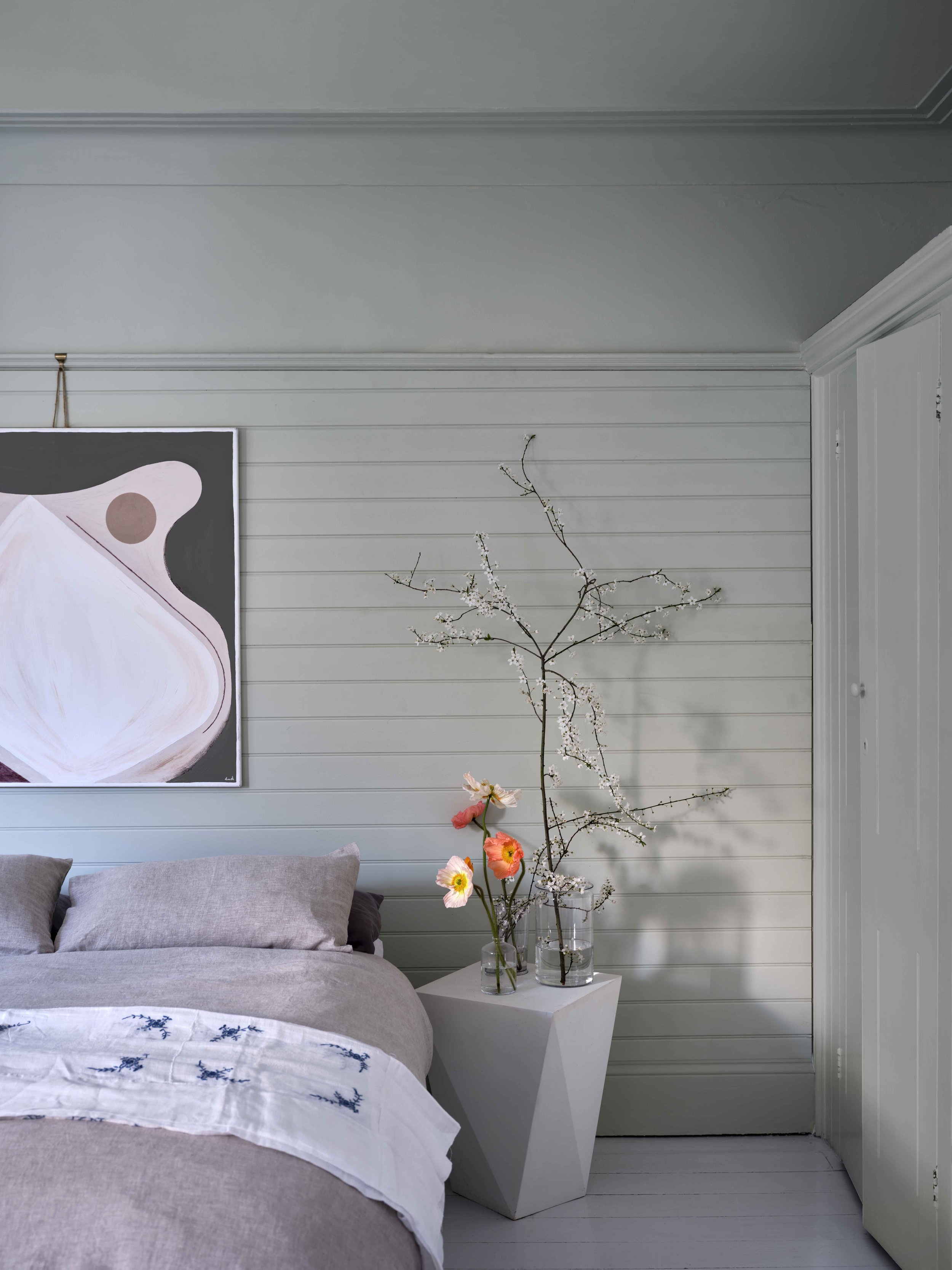
Clockwise from the top: Selvedge on the top wall; the clean cool blue of Kittiwake; The nature-toned green of Whirlybird (on the walls); the deep blue of Wine Dark. All images belong to Farrow & Ball.
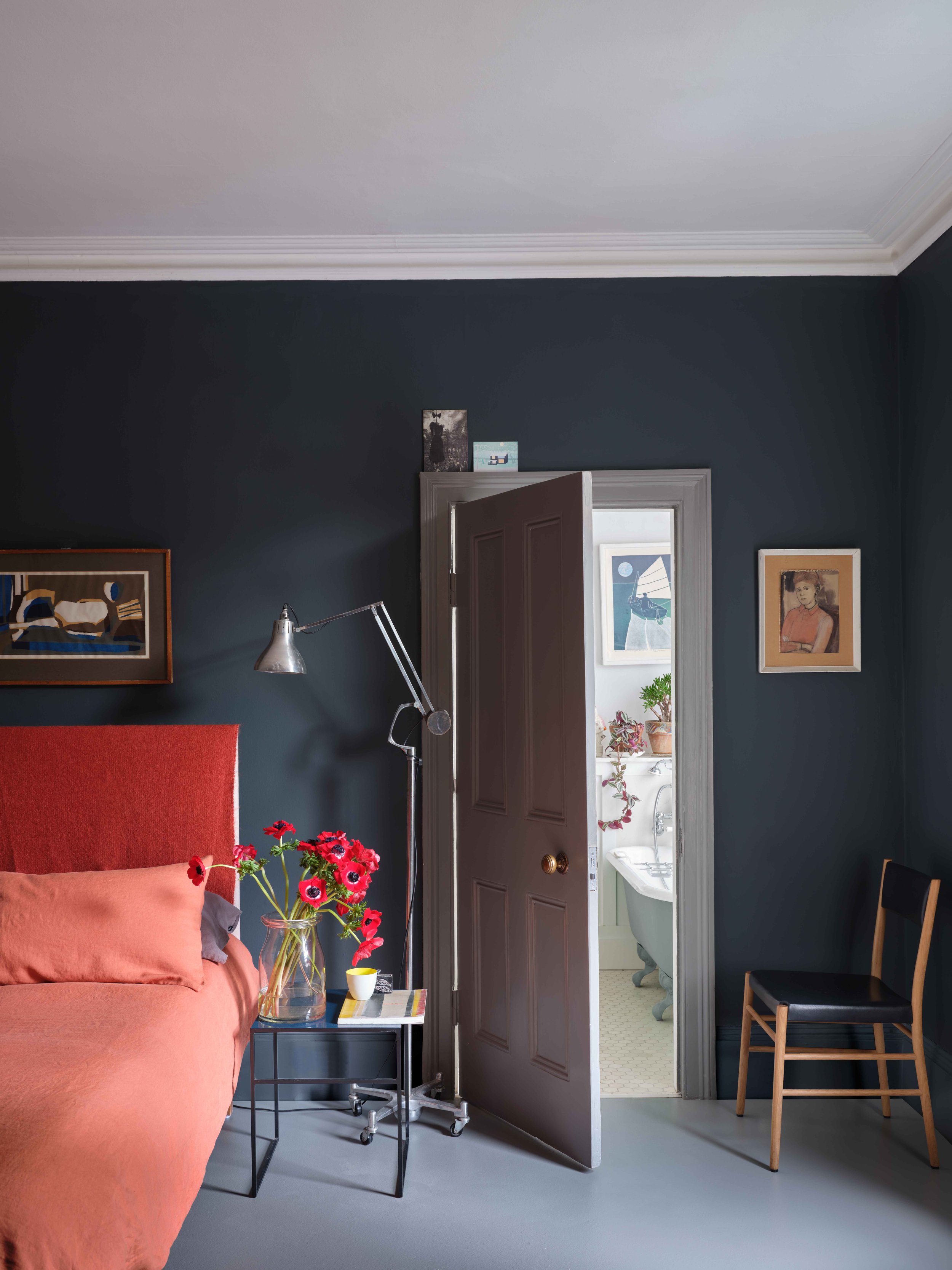
With warmer, dark red tones surging in popularity and really being embraced as we move into autumn and winter, the flame red hue of Bamboozle was designed by Charlotte and Joa to add some joy to the home; I think it will look great used on kitchen islands and on cabinets and cupboards to create eye-catching, standout joinery.
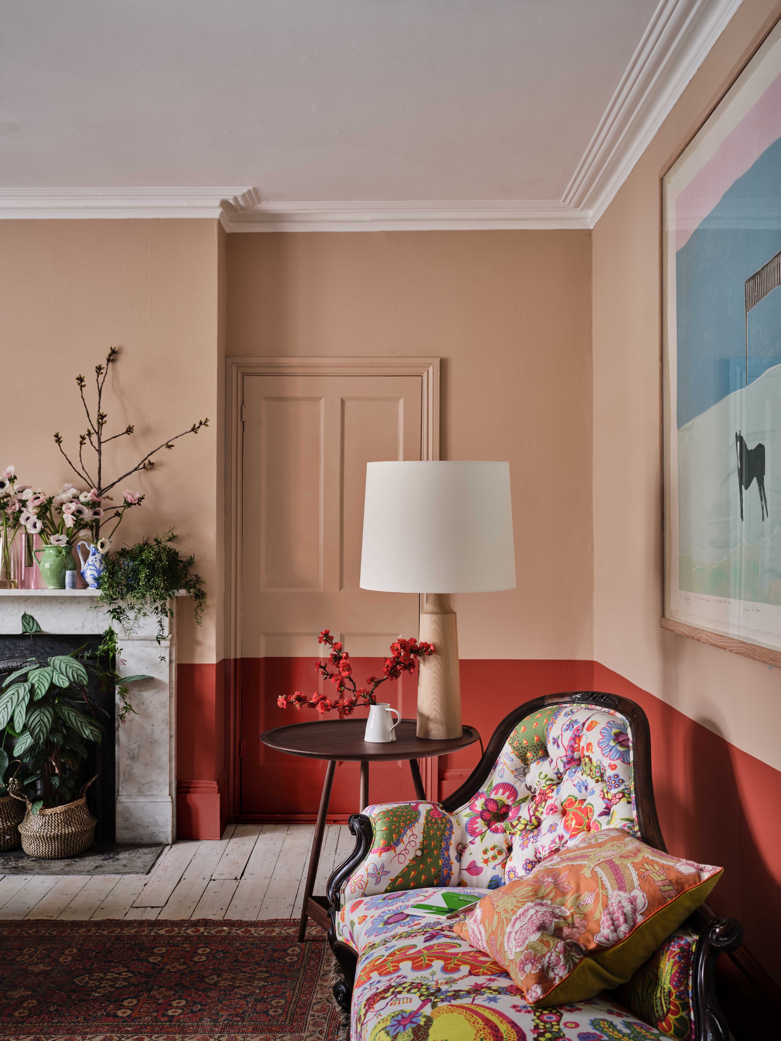
The historic-feeling ‘Templeton Pink’. Image Credit: Farrow & Ball
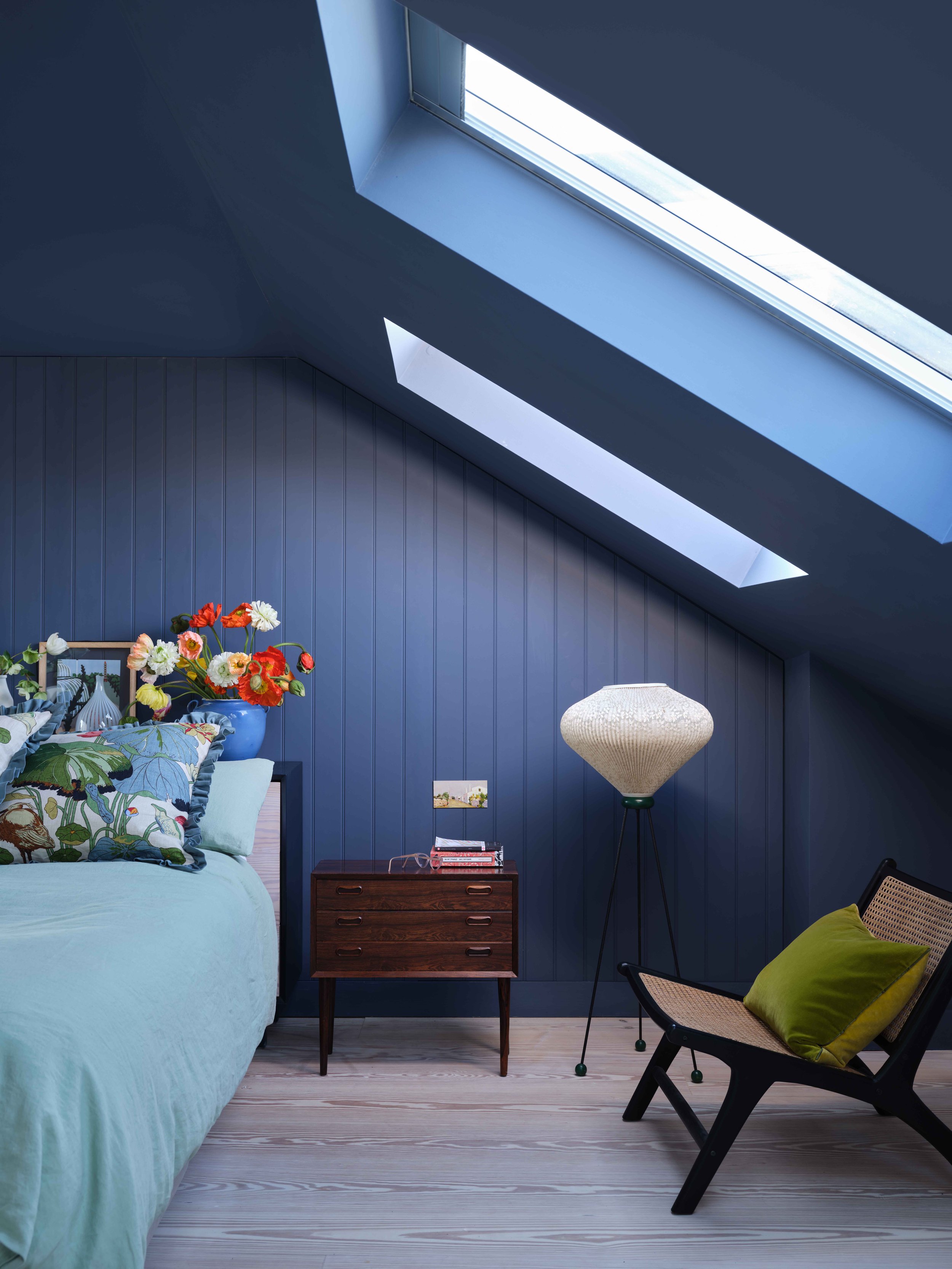
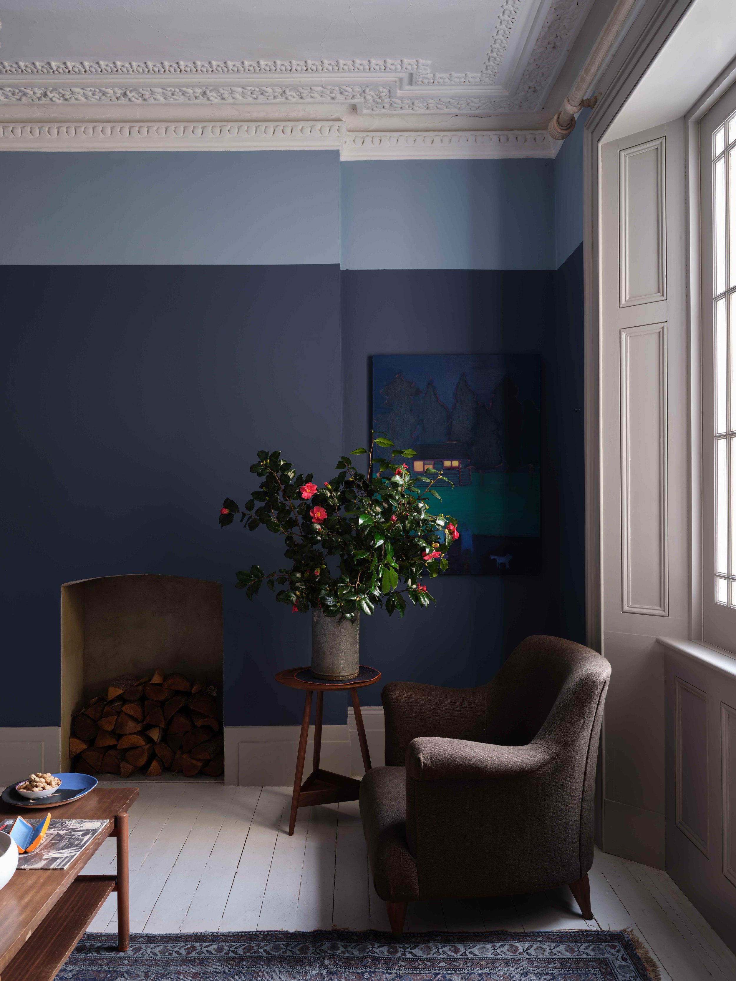
For me, Farrow & Ball have always been about the blues, so I particularly cannot wait to get my hands on a tester pot of Selvedge - a sophisticated blue that packs a punch rather than fades into the background.
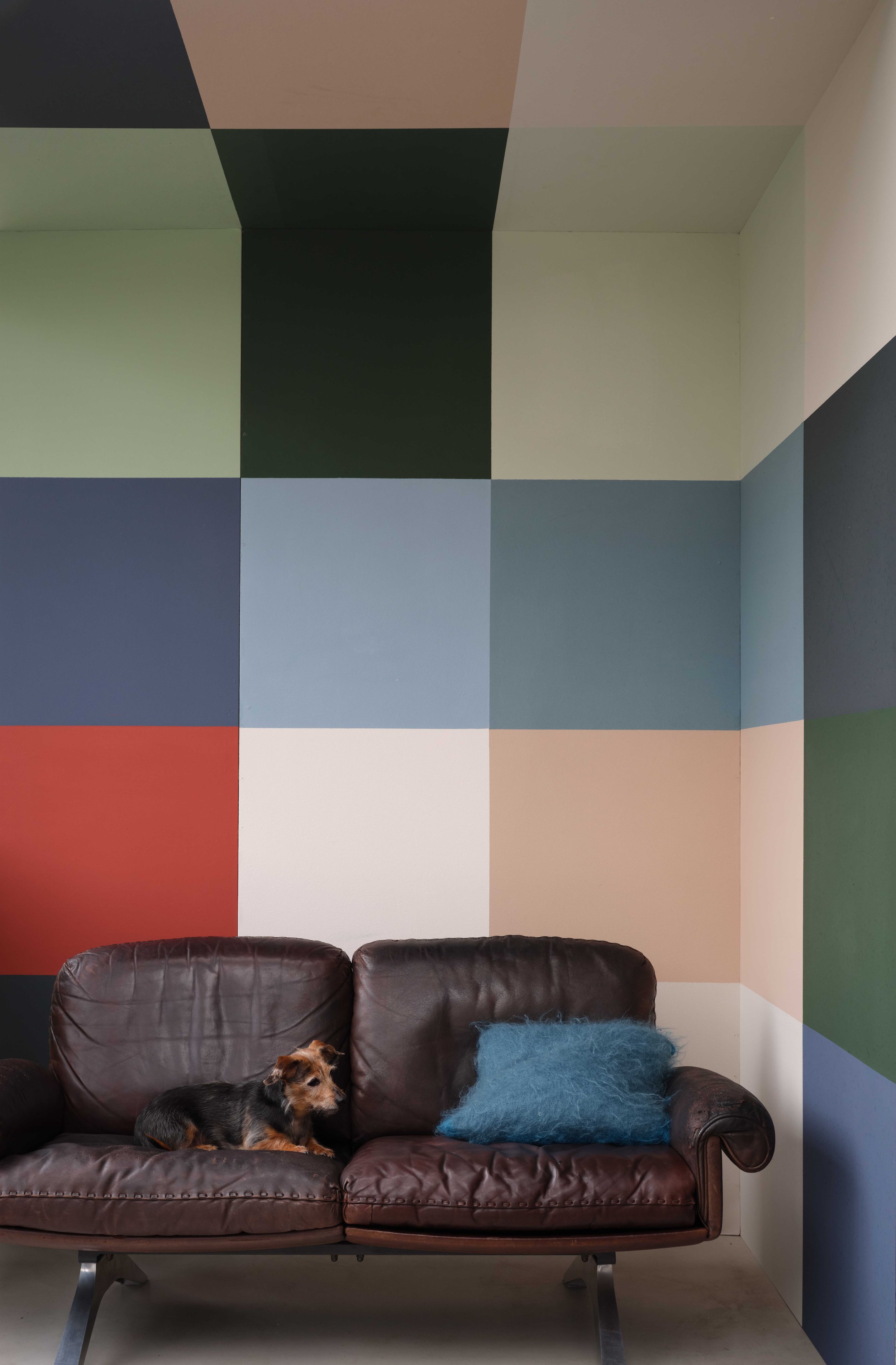
Clockwise from the top: The mid-green Beverly; Wine Dark - inspired by the midnight skies; The flame-red tone of Bamboozle (bottom wall)’; all the new shades combined. All images belong to Farrow & Ball.
The 11 new colours are available from today from Farrow & Ball stores, stocklists and Farrow & Ball online.


