
5 Inspirational Interior Design Ideas I Saw At WOW!house 2025

This week, I headed down to Chelsea Design Harbour for WOW!house, the annual luxury interior showcase where multiple designers create and curate a showroom in collaboration with leading interior design brands and suppliers.

I must admit that I had never been to WOW!house before, so I was unsure what to expect, but I have to say I was blown away by the spaces and had a thoroughly good time exploring the 22 showrooms.

Of course, with the showcasing designers being leaders in their field and the Design Centre itself leaning towards high-end interiors, I did wonder if WOW!house might be one of those events where it’s ‘nice to look at’, but you’ll never find anything that you can transfer over into an ‘average home’. While the vast majority of the rooms featured furnishings, furniture and wall coverings that I’d never be able to afford in my lifetime, I also found myself really inspired by several clever decorating ideas and styling tricks that would be easy to DIY and recreate for a lower budget.

More is More Shelf Decor
The Entrance Hall, designed by Victoria Davar of Maison Artefact and sponsored by Cox London, was a grand, dramatic affair, with tall ceilings and a floating staircase. It was a feast for the eyes, featuring a wonderful array of ceramics (this room introduced me to the potter Charlotte Mcleish and artwork by Dominique Fuglistaller), but what really drew me in was an alcove layered with sculpture, trinkets, small framed artworks and lighting.
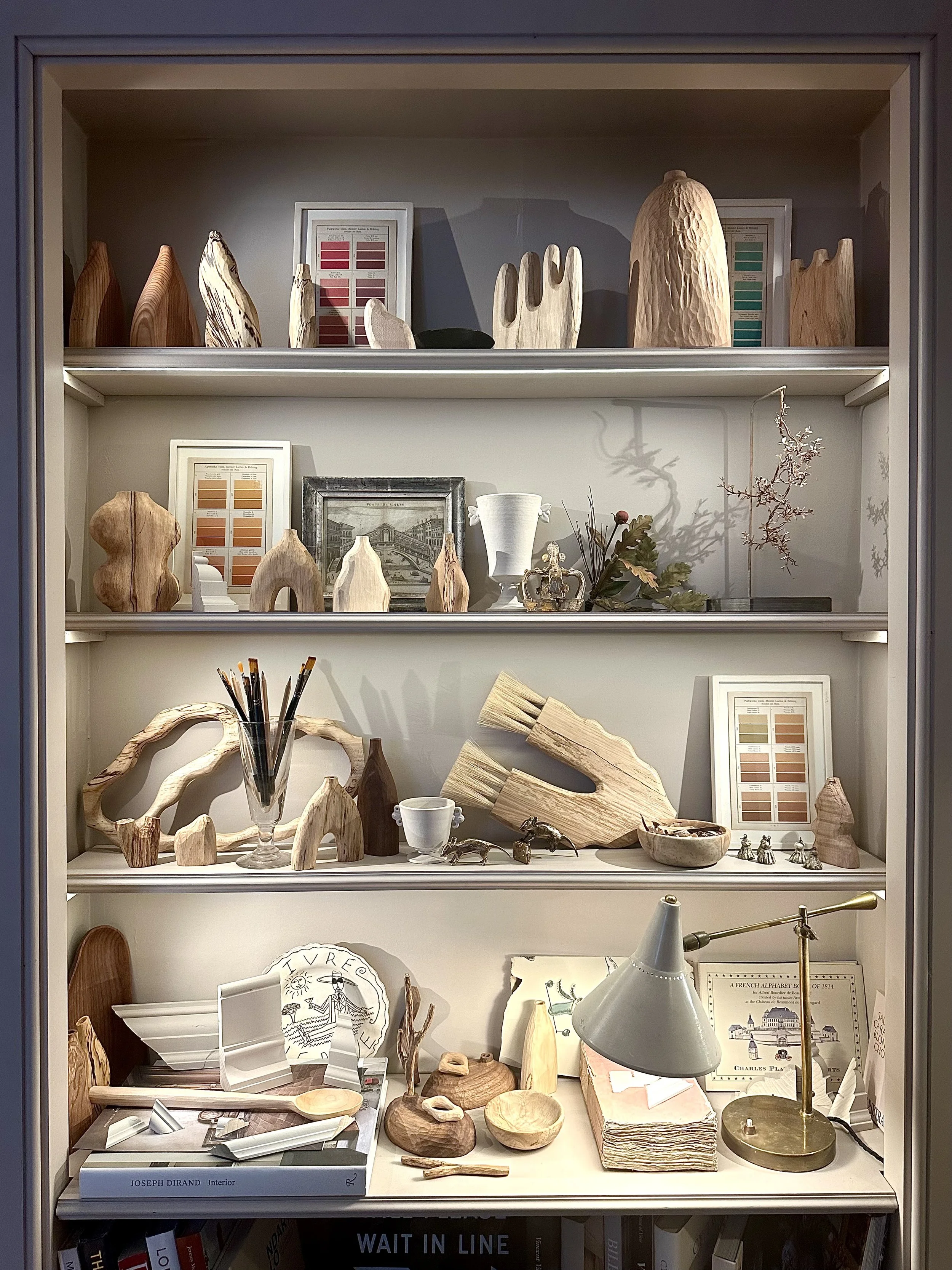
When I style shelves, I usually do two or three groupings (depending on the width of the shelf) of three items. I leave space and try not to ‘overload’, but after seeing this alcove, I am going to change this formula. I just loved all the multiple items on the shelves; I think it works because even though there is a lot on each individual shelf, the colours of the items are all similar and muted. Natural, light wood, milky white ceramics and monochrome plates all complement each other, making it perfectly executed rather than cluttered.

Ceiling Details
What stood out to me in a lot of these luxury showrooms was that every surface area had been cleverly considered, especially the ceilings. In the Drummonds Powder Room, designed by Nicola Harding, there was some great woven panelling on the ceiling of the little loo. The ceiling could have been left plain and just painted in, but this 3D interest just took the room to another level. It totally made me reconsider leaving the little loo ceiling in my own home, blank! This same look could be DIYed easily with some strip moulding from Wickes, a handsaw and some glue.

The Fromental Dining Room by Chad Dorsey featured beautiful Fromental butterflies on the ceiling, further convincing me that a wallpapered ceiling is always a good idea if you can handle the neck pain and have a lot of patience for a DIY application. However, it was my favourite room in the show - the Courtyard Room by Emma Sims-Hilditch - where the ceiling really stood out to me. Rather than add coving and paint the ceiling an aesthetically pleasing colour, Emma Sims-Hilditch created a distinct divide between where the wall ended and the ceiling began by running decorative strip moulding and wallpaper trim side-by-side, adding timber beams and painting it all in a distinct shade. I thought this was so clever; it defined the ceiling space, and it’s something that could be done in any plain box room to add interest and detail. I think when we have very small, bland rooms, the go-to is to colour-drench it to make it feel cohesive, but this Courtyard showroom has inspired me to think deeper about how to define a ceiling and add visual interest, without using traditional coving or painting everything in one colour.


Pairing green, yellow and blue
Continuing my love for Emma Sims-Hilditch’s Courtyard Room, I was obsessed with the room's colour palette of yellow, green and blue. Yellow and green shiplap, doors, windows and woodwork sat side-by-side alongside a vintage blue antique dresser, blue delft tiles and a large soft blue lantern (sourced via Charles Edwards). I have to say these are not three colours that I would think to combine together myself, but the palette worked so well. It is definitely a combination that I will be incorporating into my own home in the future.

Proving the ‘unexpected red’ theory, correct
You couldn’t escape the viral ‘unexpected red’ theory from interior conversations last year. The claim that by “adding anything that’s red, big or small, to a room where it doesn’t match at all and it automatically looks better” was a convincing argument to me as a fan of using red in my home, but I had never seen a better example of it than in the Treasure House Fair Morning Room, designed by Daniel Slowick. This very traditional room full of antiques (Daniel is an antique dealer as well as an interior decorator) was full of trellis print, a 17th-century bookcase and gilt tables, but it was the vibrant red coffee table, placed centrally in the room, that lifted the entire scheme. To source something similar, try Modern Furniture by Two Seventy Nine.

A focus on texture
Something that I really need to do more of is include texture within my room schemes, and there was loads of textural inspo at WOW!House. From the customised, previously plain Soho Home lampshade in the Cox London entrance hall (which had been hand-stitched to add detail), to wicker planters full of foxgloves in the Entrance Courtyard, (designed by Alexander Hoyle). There was just something about adding more tactility to items which otherwise could have flat surface areas.


WOW!house runs until Thursday, 3rd July 2025 at London’s Chelsea Design Centre.
5 brilliant interior ideas I took away from WOW!house 2026…