
Red & Pink Home Office Makeover: How To Choose Warm Paint Colours
The multi-use room at lower ground level in our home needed a bit of a refresh. Used as my home office 90% of the time (and a guest room on occasion), the previously white space was looking a little dirty and had paint chips all over the place. Last month, I decided to give it a lick of paint to smarten it up a bit, but I also wanted to bring warmth to this dark room that features little natural light.
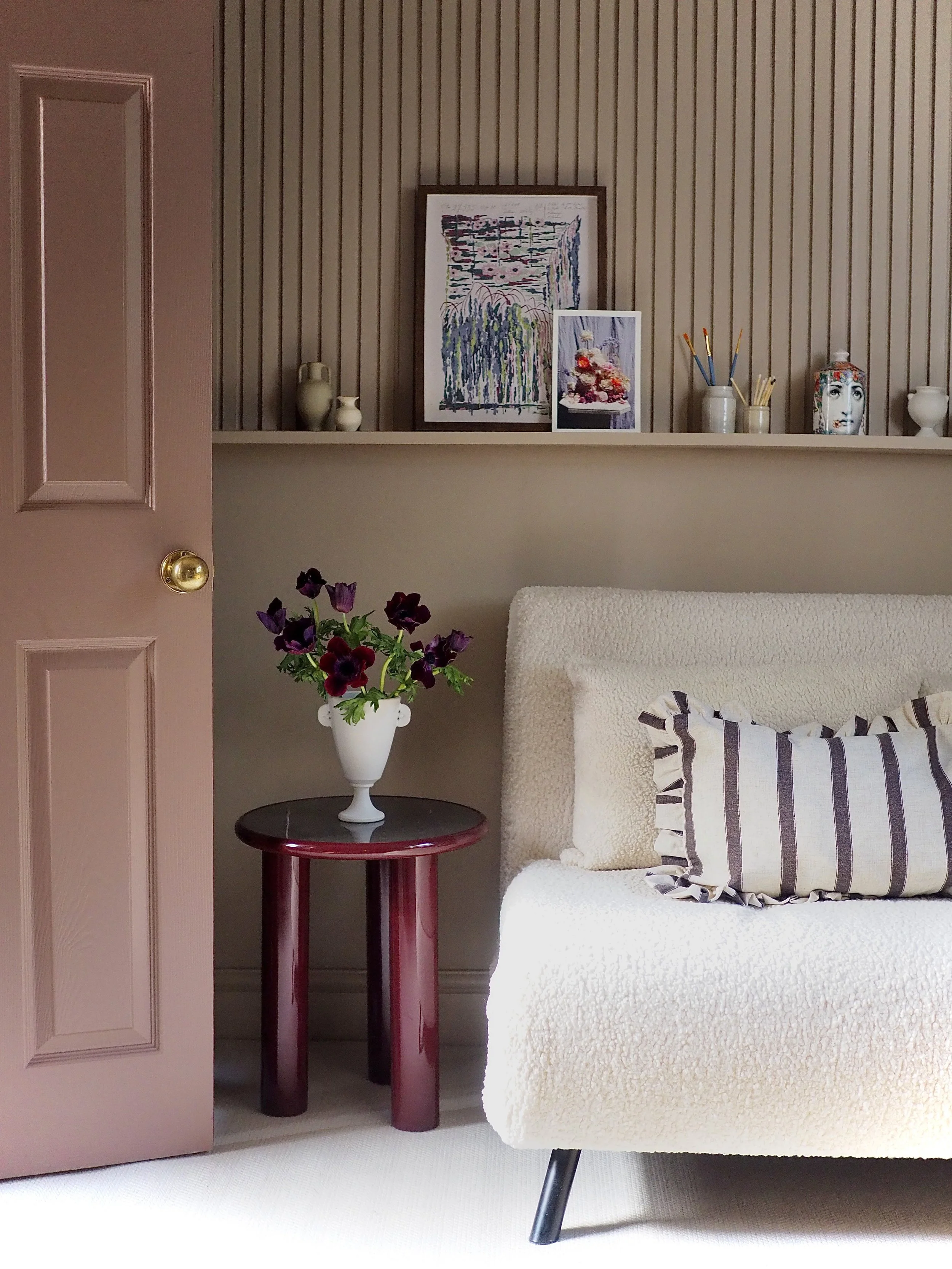
Walls painted in Roman Plaster by Little Greene.
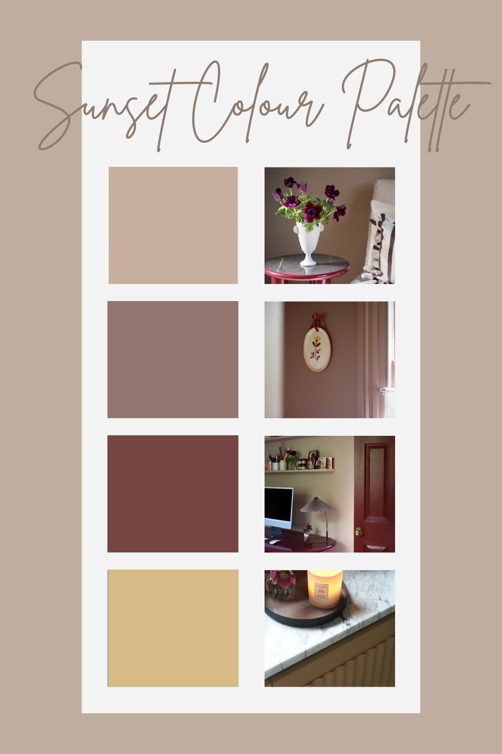
Previously painted an off white shade to keep this task room from feeling too enclosed, it actually felt a bit too cold with ground directly at window level. Also, when the sun was bright, the room had an unattractive green tinge to it as the light bounced off the greenery. It definitely needed some warmer tones in here in order to feel more cosy and inviting, so I picked out a sunset-inspired paint colour palette of four shades to decorate with.
Warmer paint colours are shades that contain organic, earthy pigments as their undertone. Paints that are mixed with a heavy dose of red, brown or yellow will produce a wide spectrum of soft pinks, caramels, tobacco hues, biscuit shades, deep oranges, tans, burgundy and plums. Whether you want a warm neutral shade or a more saturated colour, making sure that the undertone of the paint has a natural richness means that it will combat cooler directions of light on colder, greyer days.
To warm up this room, I used four sunset-toned paint colours by Little Greene:
Roman Plaster on the walls, ceiling, window and skirting
Arras on the doors
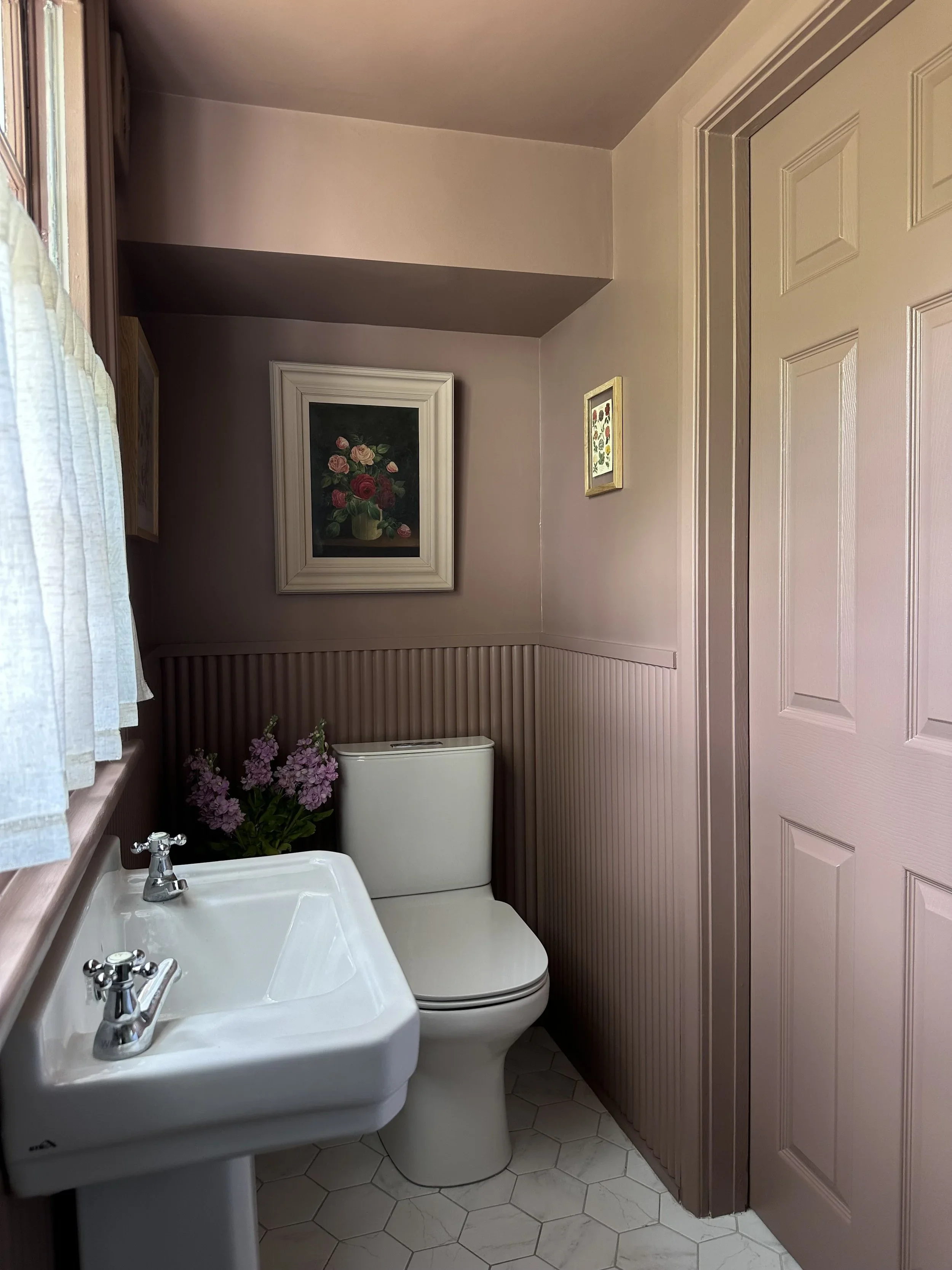
Nether Red in the adjoining en suite where the door opened up into the room
Madeleine on the upcycled IKEA cabinet
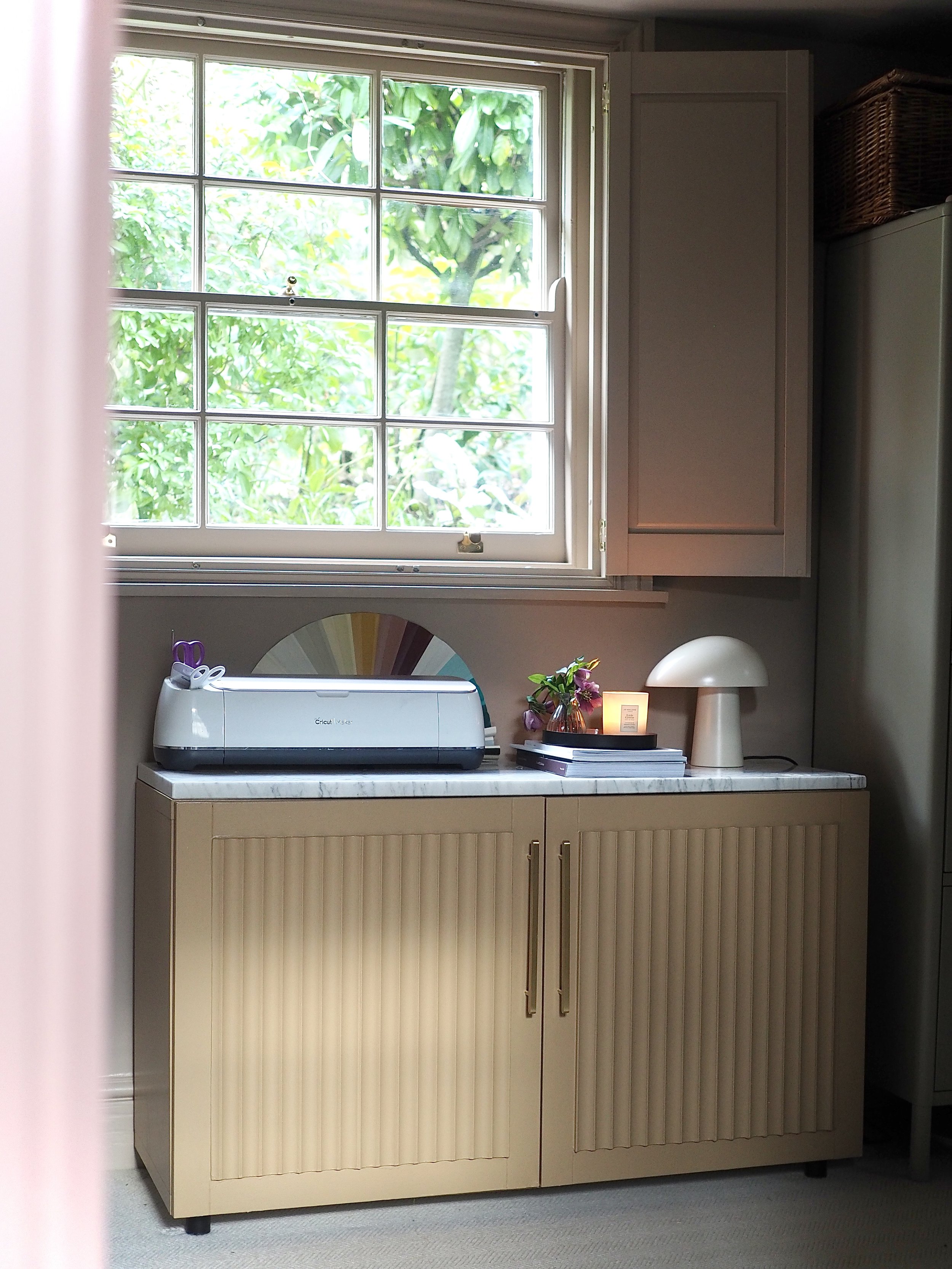
Ikea unit painted in Madeleine by Little Greene.
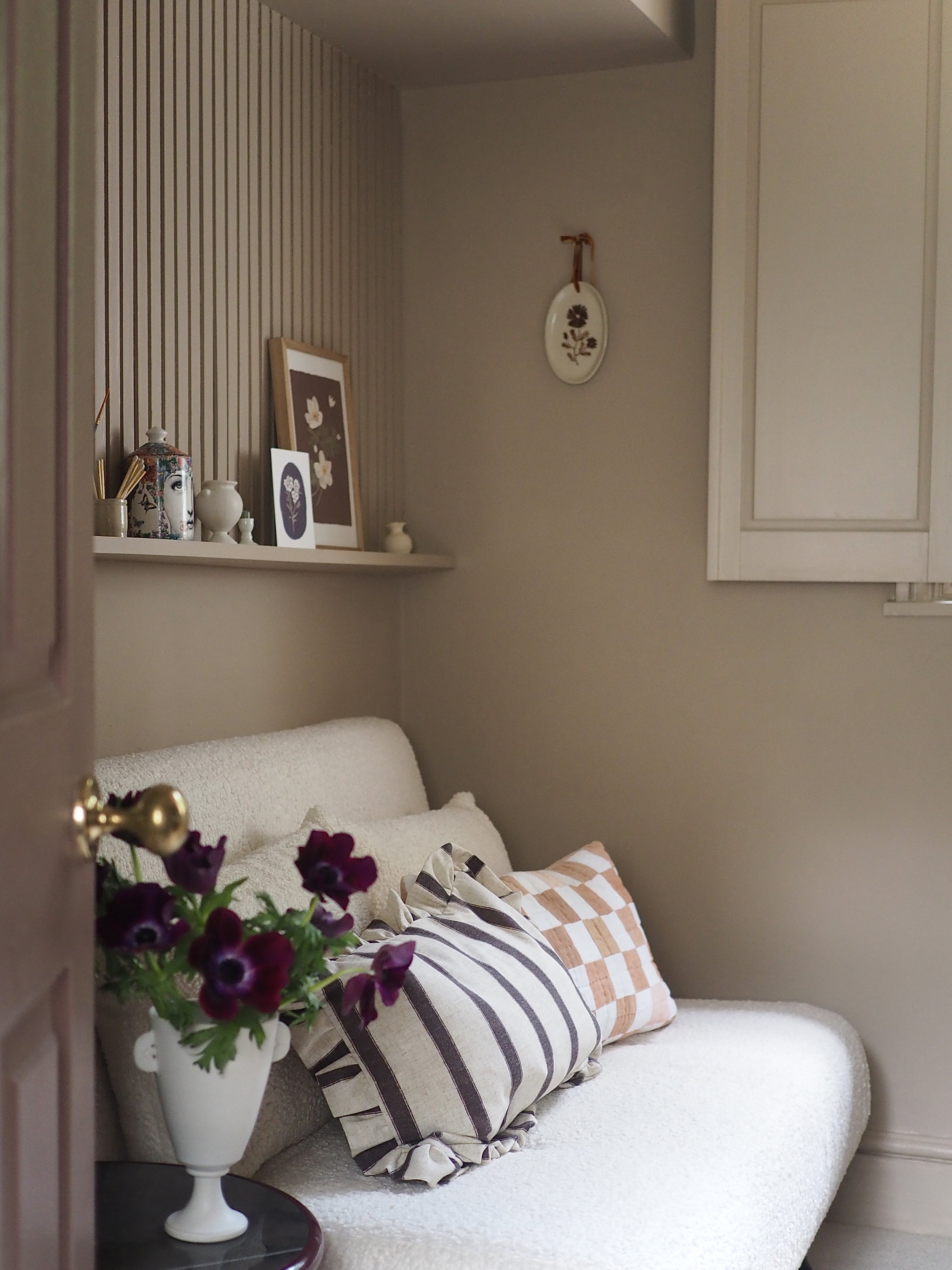
While I wanted to warm up this space, I also wanted to keep it light as I work in here everyday. I felt that the pinky-beige tones of Roman Plaster had enough pink pigmentation to add real depth of colour, while still being a neutral hue.
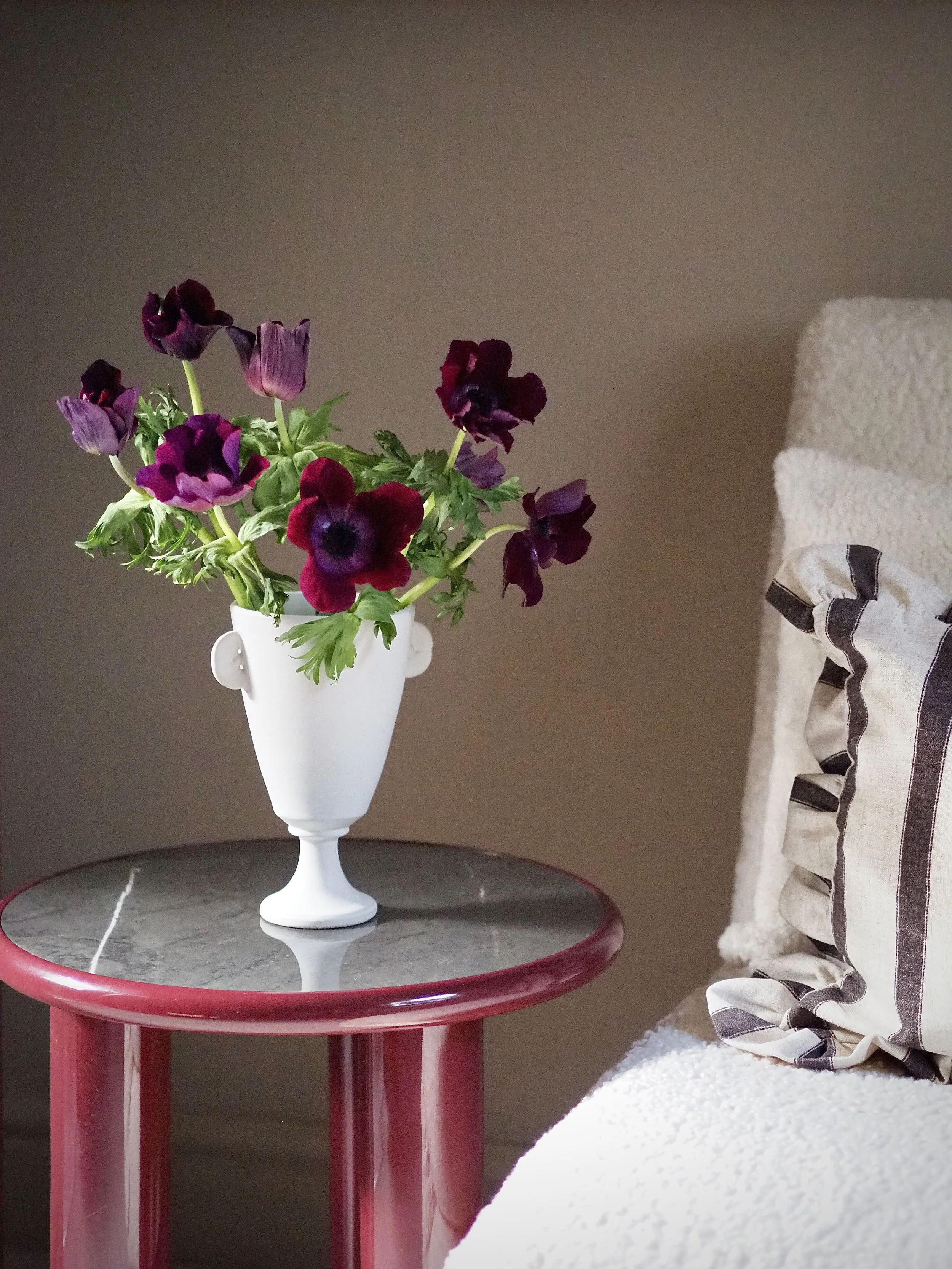
Roman Plaster on the walls and woodwork.
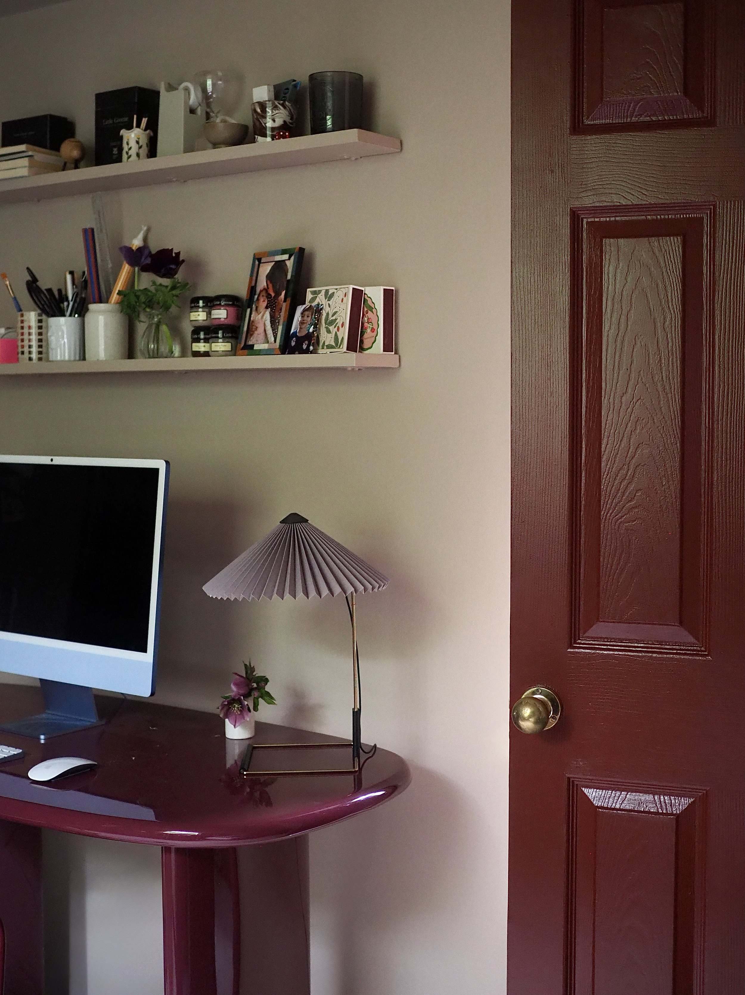
To add a bit of drama and interest and to break up the pink, I painted the two doors in the room in Arras, a brown-based red that I’ve used in other areas of my home. It’s a really rich red that feels more grounded than a burgundy or oxblood red due to the heavy brown undertone.
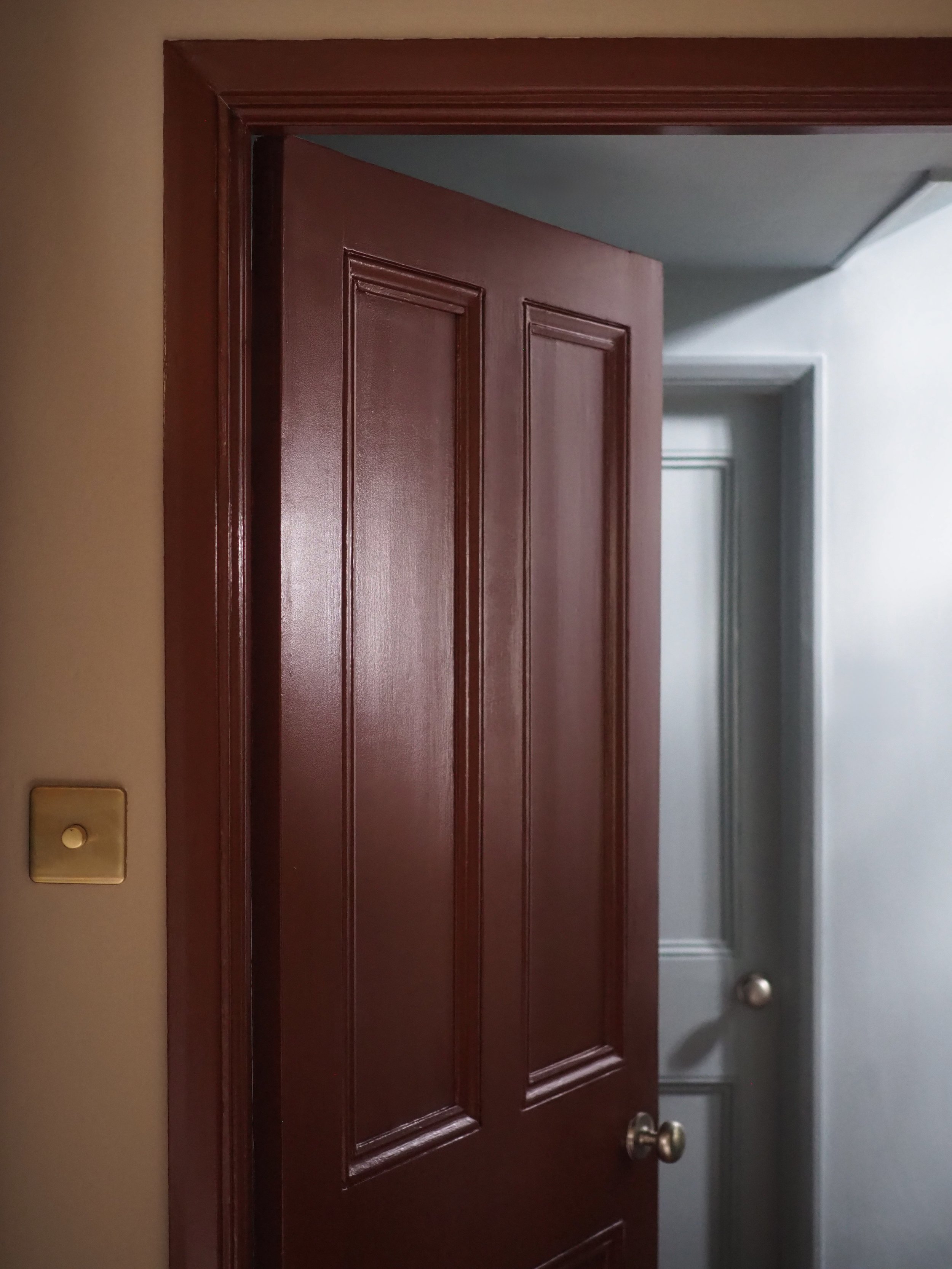
Arras on the doors in a Satin finish.
I had an old IKEA hacked cabinet in the room; to blend it into the sunset palette, I painted in it Madeleine - one of my favourite yellow hues that is more muted than vibrant (without being creamy or magnolia in tone).
Finally, the adjoining en suite is painted in Nether Red, a really interesting shade that is not quite pink, nor purple, and changes in the light. It’s a rich shade that is really easy to live with as it doesn't feel overbearing.
By pairing these sunset shades together the room now feels warm and full of interest without being too vivid, dark, or ‘in your face.’
I’m really happy with the outcome!
Nether Red by Little Greene.


Room makeover reveal and tips on choosing warm paint colours for your home…