
8 Of The Best Green Paint Colours For Colourful Home Lovers
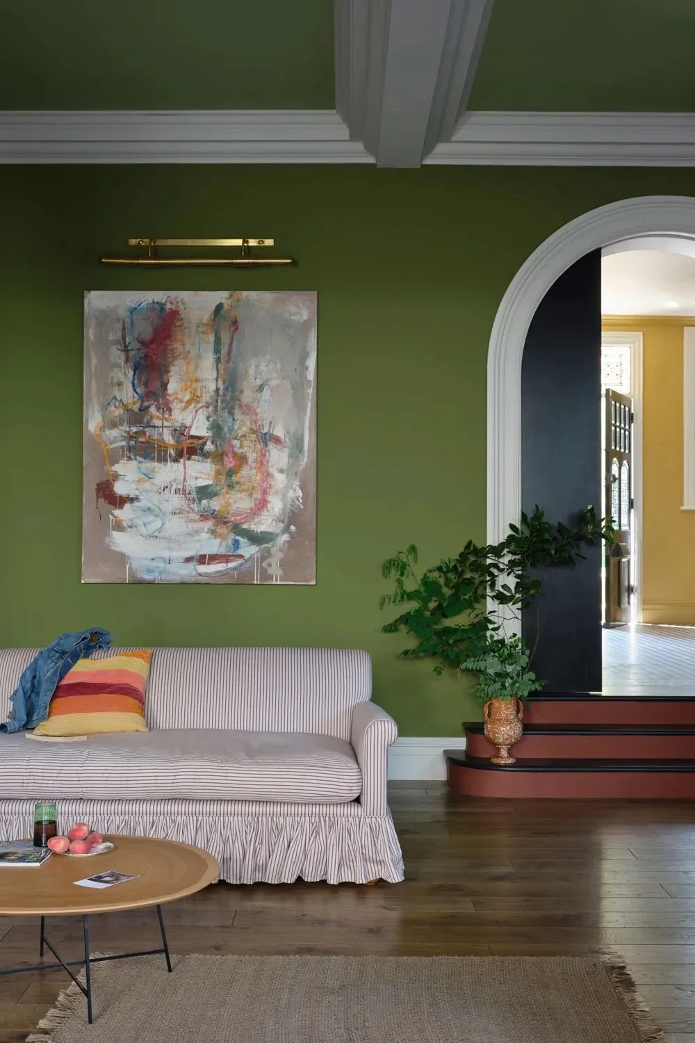
Image credot: Farrow & Ball. Colour: Sap Green.
While there were whispers that green within interior design was becoming ‘the new grey’ (due to certain shades becoming a mainstream choice among general homeowners), the reality is that green is going nowhere. There are countless variations of green and, when used well, the colour can bring so much to a space. A vibrant green can create visual interest while maintaining a timeless appeal. More muted olive tones can add colour and sophistication, while mint greens can brighten smaller spaces.
I’ve been a little obsessed with green paint colours of late as I am currently choosing two different green shades for two very different projects in my home. The first is a green for the inside of my outbuilding - a summer project that is keeping me busy. Inside, I want a green that feels a little vintage but fun - something that provides a good backdrop to terracotta pots filled with red germaniums and wicker baskets filled with garden tools. The second green is going to be the colour of my steel windows and doors for my kitchen extension. This green needs to compliment a kitchen not yet installed and one I have to get right (pick the wrong one and it will be an expensive mistake!)
If you yourself are looking for that perfect green shade, here are seven of my favourites:
Nettle by Neptune
The latest shade to join the palette of 48 shades by kitchen and homeware supplier Neptune, this green is seasonal and rich and stole my heart when I tested a pot of it recently for our new utility room. A green that feels modern and traditional at the same time, it’s a great choice for cabinetry, or when used throughout a smaller space.
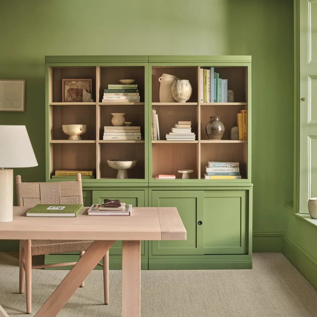
Nettle by Neptune
Whirlybird by Farrow & Ball
I love this minty green from Farrow & Ball. Whirlybird feels light and fresh and it has best been used my one of my favourite interior designers, Laura Stephens, in a hallway.
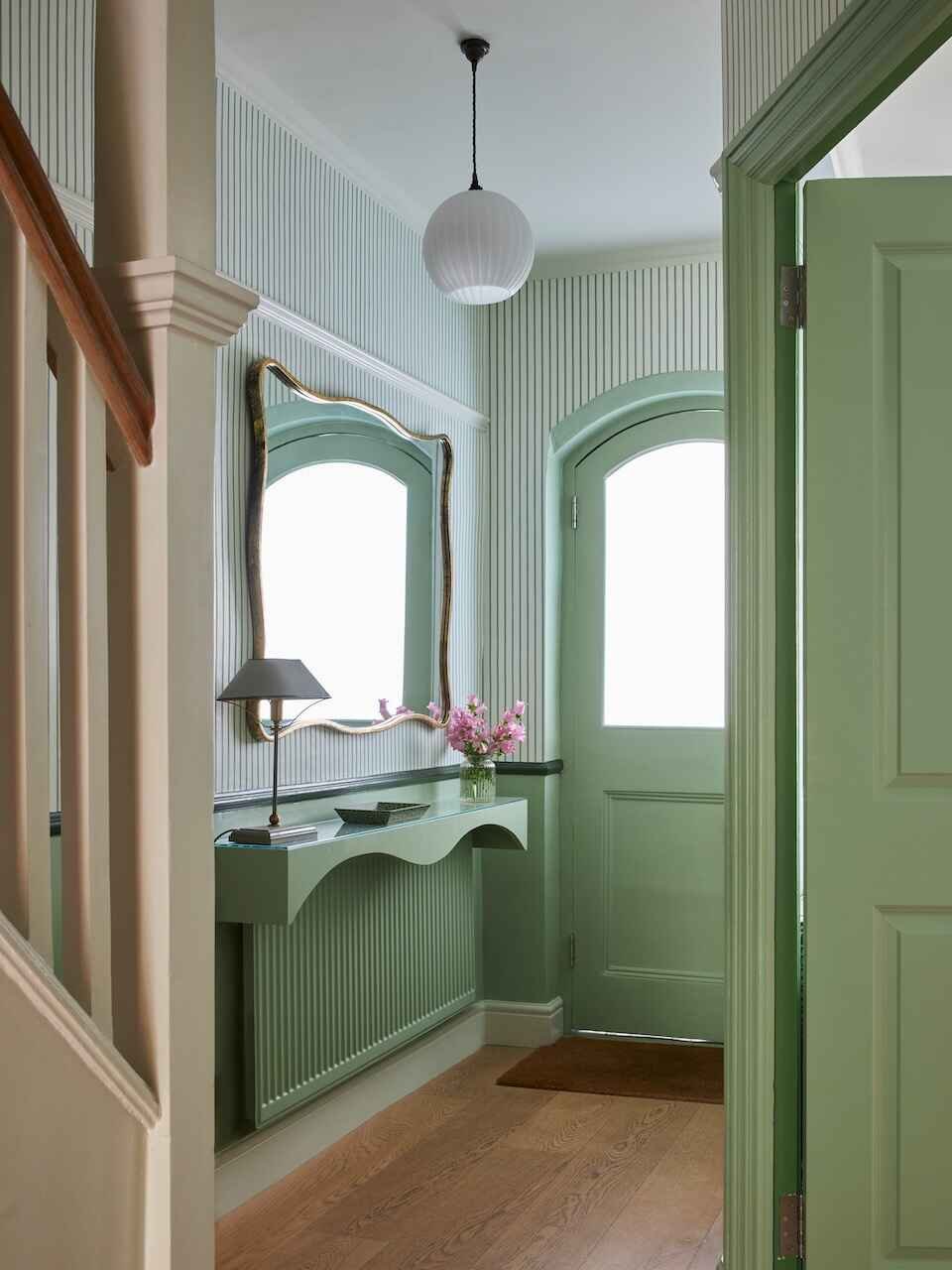
Image credit: Bob Gagovski. Design: Laura Stephens.
Green Smoke by Farrow & Ball
This deep green has been on my ‘to use’ list for so long. It feels rich but muted at the same time, working especially well with mustard yellows and pinks.
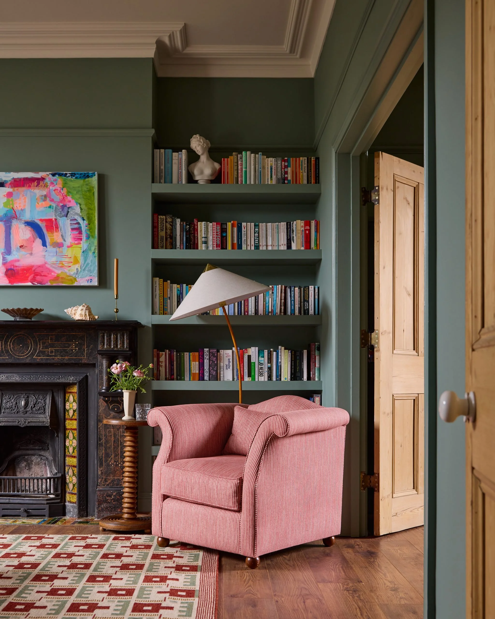
Green Smoke in a room designed by Laura Stephens. Image credit: Bob Gagovski.
Light Bronze Greene by Little Greene
For a green with a bronze base, Light Bronze Green by Little Greene has such a heritage feel and works well with wood furniture and accents.
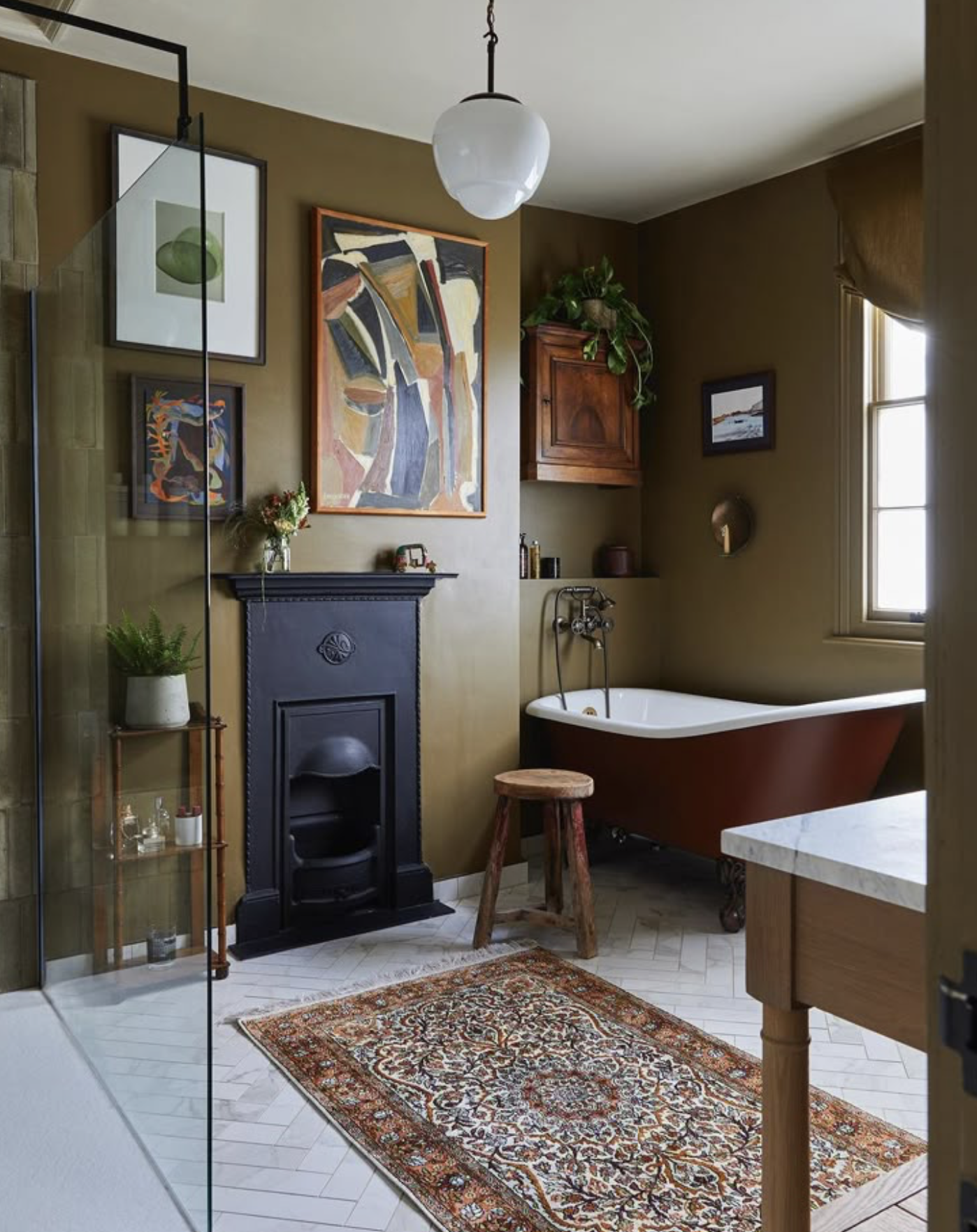
London bathroom designed by Emilie Fournet.
Salvia by Paint & Paper Library
I painted my own front door this aqua green. A sea green, it’s a versatile shade that can be used in multiple areas of the home.
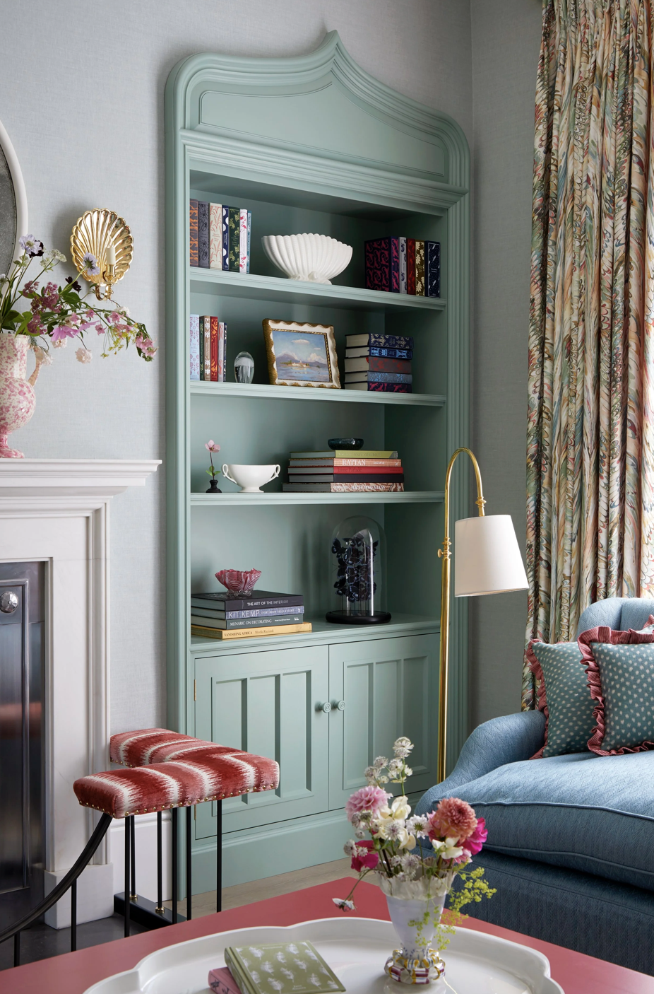
Salvia used on the cabinetry in this living room designed by Katharine Paravicini. Image credit belongs to Katharine Paravicini.
Garden by Little Greene
OK - spoiler alert - I have ended up painting the inside of my garden outbuilding in Garden by Little Greene and I LOVE IT! Come back soon to see all the reveal photos. This is a really fresh green, a ‘green green’ with no particular undertones of the usual blue/grey/yellow. It’s a brilliant colour to use on a front door, on kitchen cabinets, or on the walls of an entire room if you like brighter colours in your home.
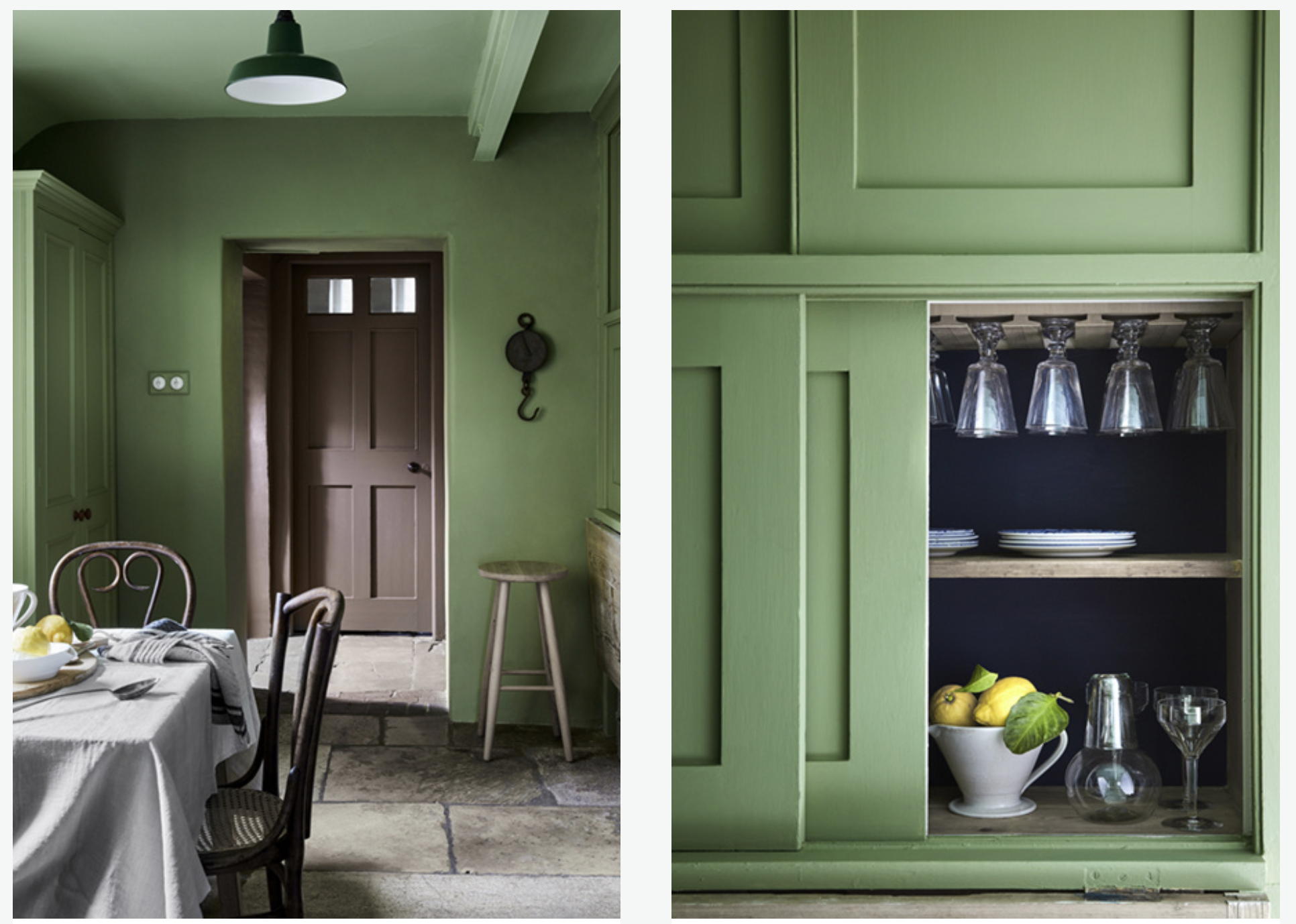
Image credit: Little Greene
Sprig V by Paint & Paper Library
This is such a subtle, muted green. I’ve used this in my own living room and it’s a great green if you don’t want a green that’s ‘in your face’ or too sage or olive green in colour. A very 'easy to live with’ shade.
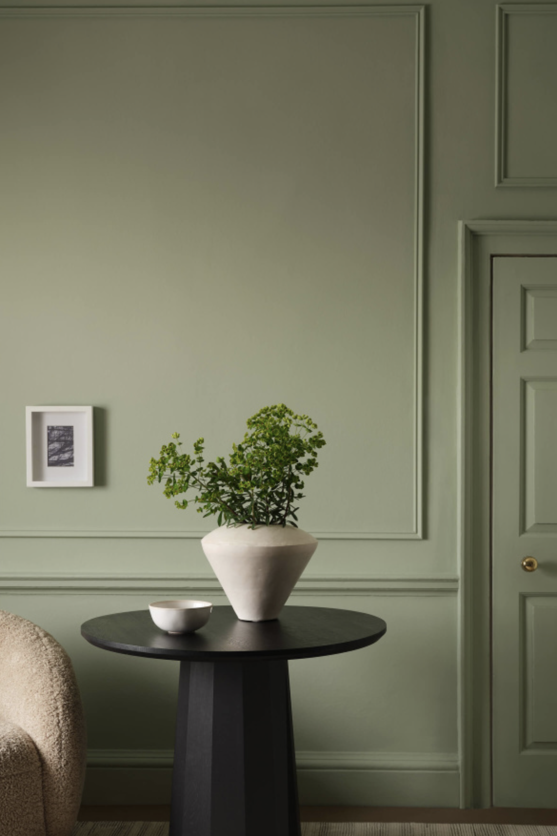
Image credit: Paint & Paper Library.
Beata Heuman x Myands Damp Leaf
Part of the colourful designers The Dependables paint rage in collaboration with London-based paint brand Mylands, Damp Leaf is a deep forest green with a tiny touch a blue that works well on accent furniture.

Image credit: Mylands x Beata Heuman.

Before and after of my garden outbuilding makeover!