Home Decor Paint Colour Trends For 2021

Credit: Little Greene
Taken down the December decorations and fancy a home refresh? Sick of staring at the same walls for the past nine months during lockdown? I’ve said it a million times before, but the biggest impact that you can make in a room at the lowest price is to paint it a different colour. Set aside two days (do one coat one day, the second coat the next) and for the price of a decent roller and a tin of emulsion, you’ll get a whole new look. With that in mind, I went to some of the UK’s leading paint brands and asked their colour experts what shades will be popular this year. The unanimous feedback was that the pandemic will dictate the colours we gravitate towards in 2021, resulting in three key paint colour trends: green & natural, warm neutrals and colour confidence.


Bedroom painted in Grassy by Earthborn Paints, part of their Earth collection of colours - a palette of 5 harmonious shades inspired by the natural world. £24 for 2.5L of Claypaint.
With shops, bars, gyms and restaurants closed, many of us have discovered or rekindled a joy of nature as we’ve headed out for long walks, or for a run, as part of our allocated allowance for exercise during lockdown. Shades of green and natural, earthy tones are revitalising and reassuring, so many of us will bring these colours indoors in 2021. According to Judy Smith, Crown Paints Colour Consultant, “the outdoors has been an escape, somewhere to go to recharge our batteries or even just take a break from everything. We now want to channel that feeling in our home too, with warm, cosy shades inspired by the natural world.”
Emerald Green is a new shade in Crown’s durable kitchen range this year. £20.50 for 2.5L, Crown Paints.

Ruth Mottershead, Creative Director at Little Greene highlights that the new shade of 'Book Room Green' works beautifully in combination with 'Sage Green' (both from the new Stone collection in partnership with the National Trust) to create a design scheme that’s both pleasing to the eye and soothing for the soul. Book Room Green 322. Sage Green 80. Green Stone - Pale 268. All Little Greene.
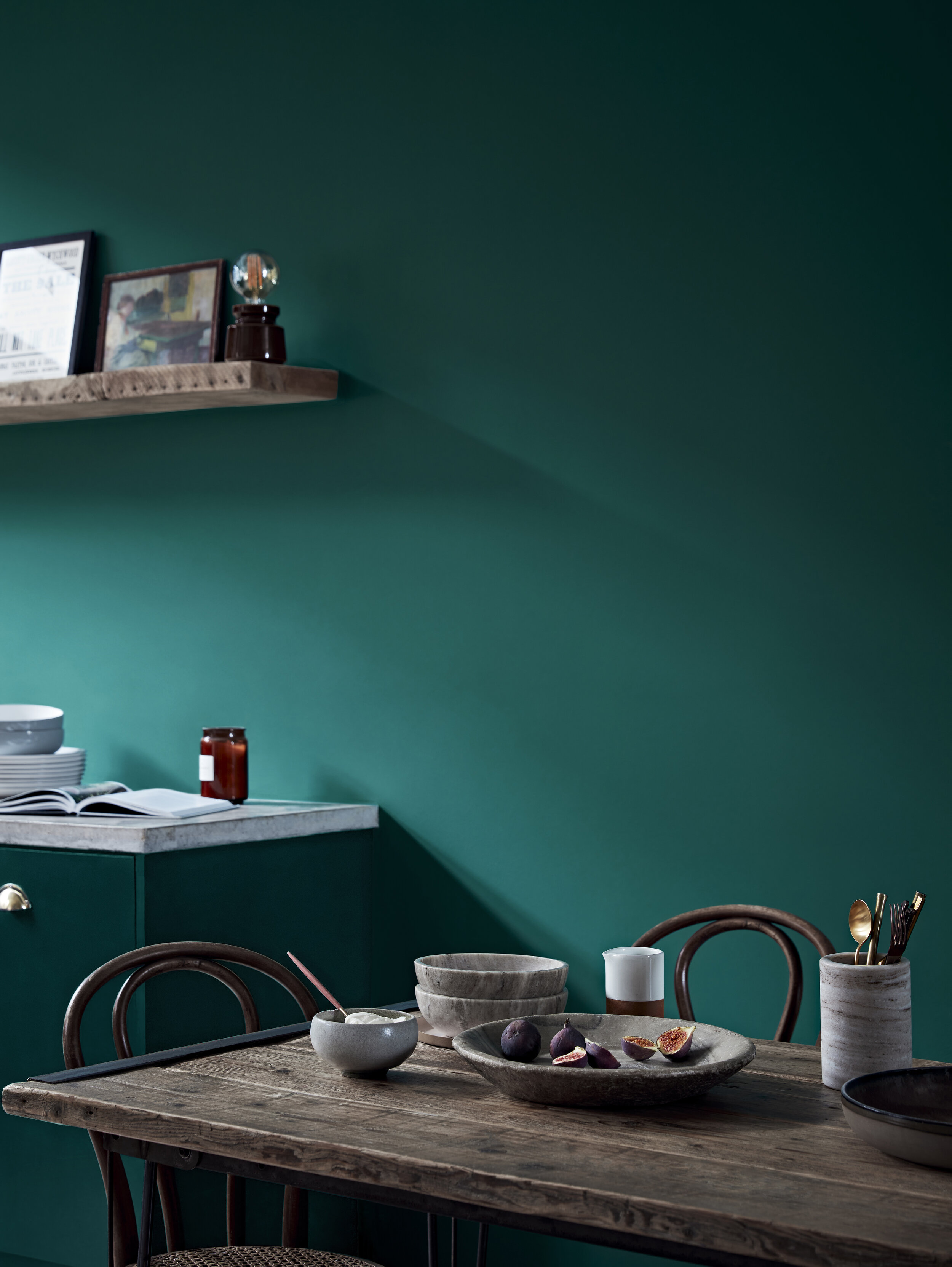
Ruth Mottershead, Creative Director at Little Greene, agrees. “With us all spending an increased amount of time at home, the yearning to bring nature indoors is certainly playing out in colour choices and green is the true colour of nature, one that we feel comfortable within the home,” she says. “It is a shade that we associate with the tranquillity of the outdoors.“

Slaked Lime 105. Light Bronze Green 123. Nether Red 315. Elysian Ground 320. Book Room Green 322. All Little Greene from the new Stone collection.
So, is there a particular shade of green that surpasses others and what room suits the colour best? The advice is that any green is good - from punchy emerald greens to more sage and olive tones. There are no rules with green, so just embrace the shade you are naturally drawn to. Try ‘Fleurie’ by Craig & Rose for a bolder hue, while Crown’s ‘Botanical’ colour stories from their ELLE Decoration by Crown range have a multitude of green tones to choose from, ranging from cool to warm.

Satin Lining and Go Green, both ELLE Decoration x Crown Flat Matt Emulsion, from £35 for 2.5L, Crown Paints.

‘Fleurie’ by Craig & Rose. Also check out their latest green shade, ‘Ottilie’.

This stunning green will be released at the end of the month by Zoffany as part of their brand new ‘True Matt’ collection. This highly durable paint range contains 156 richly pigmented colours with a sheen that is typically less than 3%.
In regards to location, Farrow & Ball’s Colour Curator, Joa Studholme, would advise the hallway. “All greens reinforce our connection to nature and create the perfect welcoming start to the journey through your home,” Joa says. “This makes greens a particularly popular choice for use in hallways, where they cause the rooms off it to feel bigger and lighter.”

Green Smoke by Farrow & Ball. £49.50 for 2.5L of Estate Emulsion.

As well as the use of green, Craig & Rose expect people to experiment with surface texture and interesting details that imitate nature. Achieve this look with their Pink Wash Chalk Clay.


Ferdinand 313, Castell Pink 314, Nether Red 315 and Arras 316. All Little Greene from the new Stone collection.
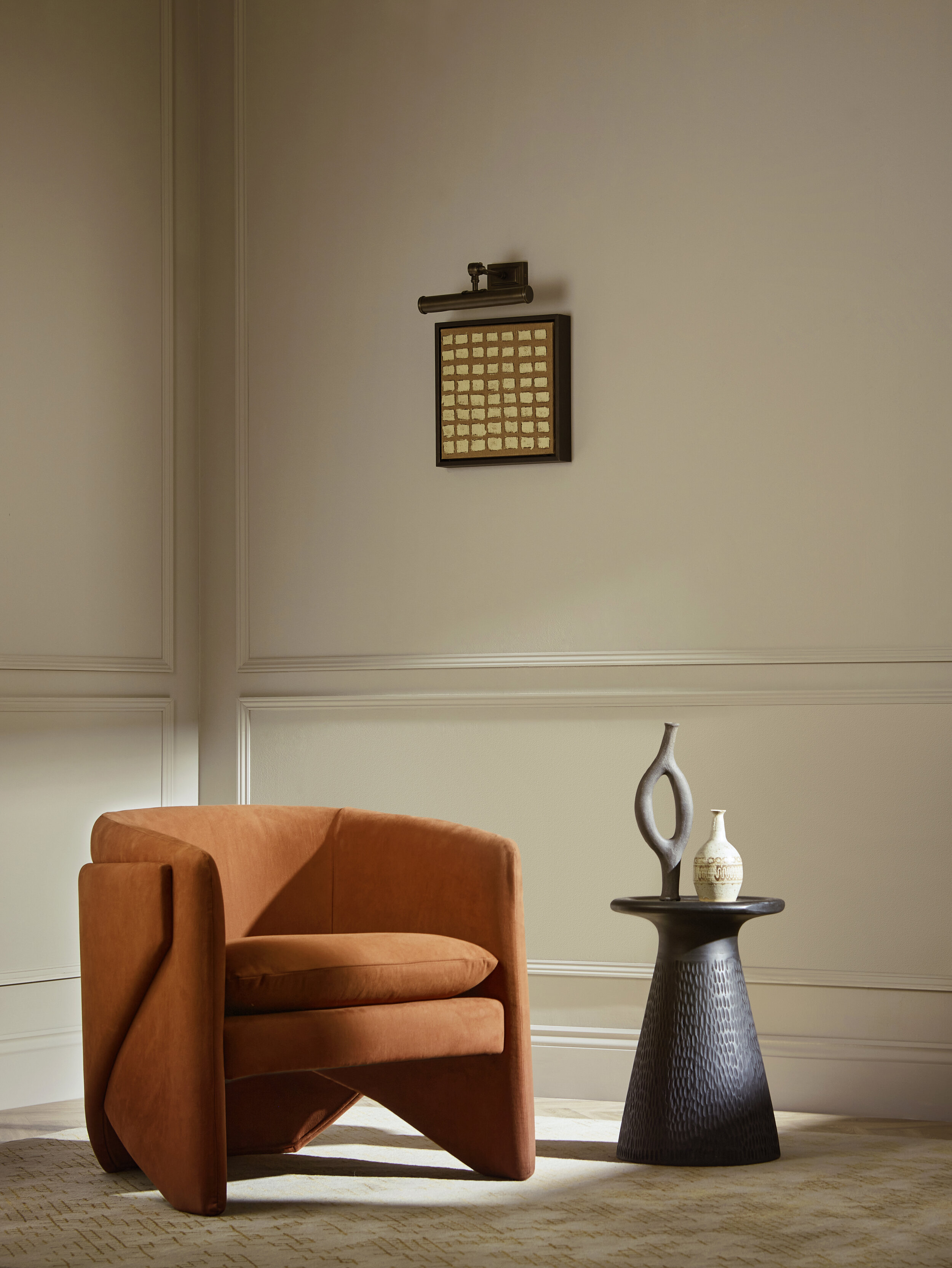
Contemporary, warm neutrals have been fashionable in interiors before the pandemic reared its ugly head, but they are here to stay due to their cocooning effect that turn our homes into our refuge: a place where we feel safe and warm. Warm neutrals also retain their popularity due to their versatility and ability to work so well when other colours are placed in front of them (a neon table or a white bouclé sofa both pair well with warm neutrals.) “Warmer neutrals will be very visible as we move through the year,” says Rebecca Craig, Lead Designer at Sanderson. “They offer more depth but still work perfectly with an accent colour.”
Zoffany ‘True Matt’ collection, out next month. Warmer neutrals work better in flat, matt finishes as opposed to glossy ones.
At the end of this month, Little Greene launches their Stone collection - a new palette of natural colours offering warmth, tranquillity, timelessness and harmony. ‘Stone’ includes a number of warm neutrals such as ‘Portland Stone’ and ‘Travertine’. “I see the creation of cocooning, intimate and relaxing spaces being the focus in 2021,” says Ruth, Creative Director. “There is a shift away from the cooler greys that have been so popular previously and warm neutrals will become the go-to colours, as they are perfect for creating restful interiors that bring a sense of comfort and cosiness to the home.”

Baluster 321. Portland Stone - Pale 155, both from the new Stone collection being released by Little Greene on the 25th January 2021.

Stock 37. Travertine 319, both from the new Stone collection by Little Greene.
Inspired by the earth, Crocky Road by Earthborn is a cool beige shade that’s a natural choice for living rooms and works as a brilliant backdrop for more vivid tones. Crocky Road & Milk Jug, both by Earthborn Paints.

The brown-based neutral of Brave Ground, Dulux’s Colour Of The Year for 2021. According to Marianne Shillingford, Creative Director at Dulux UK, “The colours on our walls are the backdrop to how we live our life. For many of us, lockdown has served to emphasise how important our home environment has become, it has been the place where we work, learn, relax. It can lift us up, nurture us, comfort us.” Other colours in this image include Paper Chain, Pressed Putty and Cacao Nibs (all Dulux).

‘Up Up Away’, a new shade for Earthborn Paints, is cool, calm and collected. It’s a relaxed off-white shade that’s at home in all spaces.


Crown SS21 Foresight Mid - Light Breeze, ELLE Decoration by Crown Flat Matt Emulsion and Mustard Jar Matt Emulsion, Crown Paints.
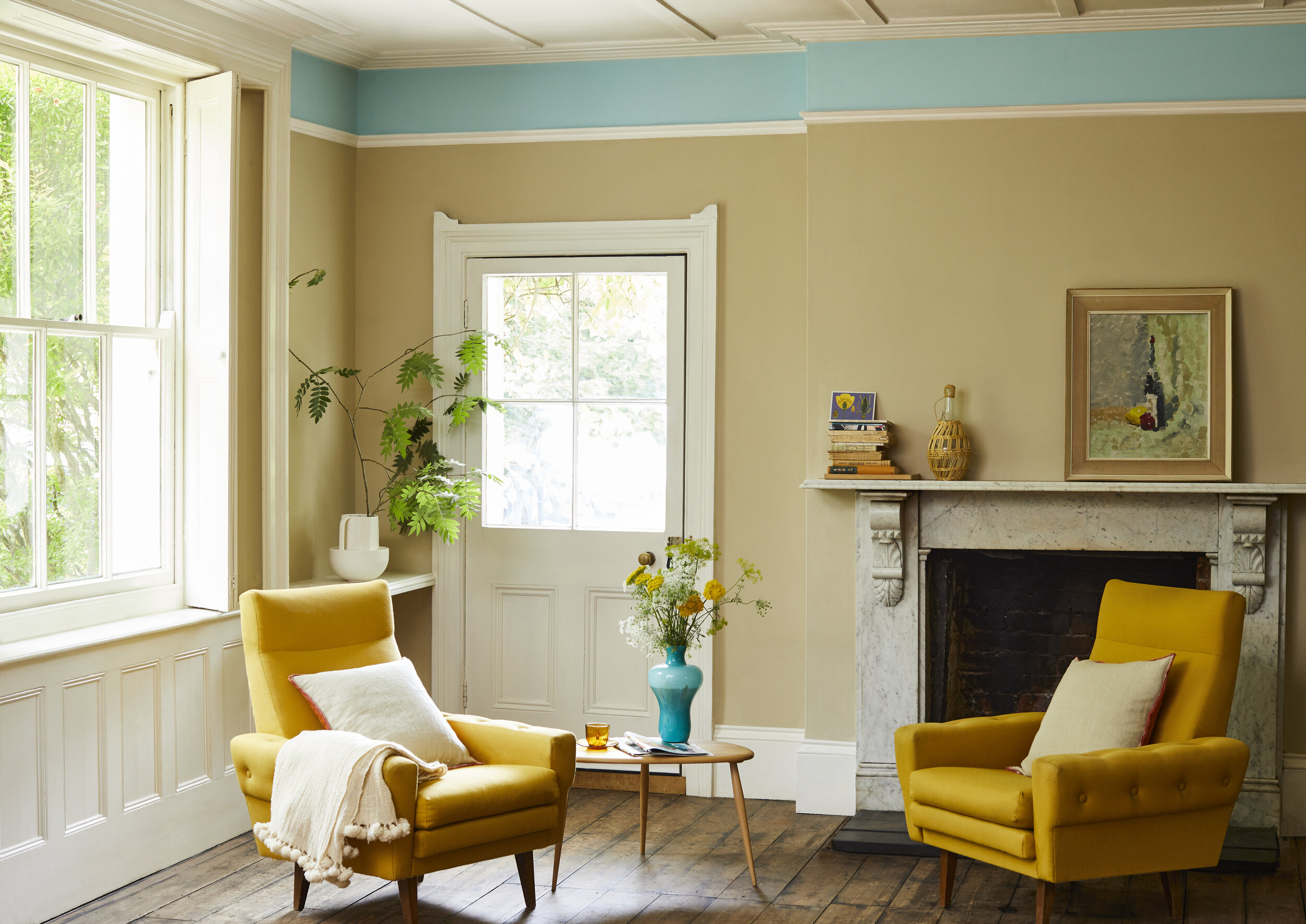
Bright, vibrant colours are good for the soul and can make us feel joyous and optimistic. Therefore, it is no wonder that the experts predict we will be using stronger colours in our homes like never before. According to Earthborn Paints, brighter colours “will bring the joy we are all missing and craving.”

Crown SS21 Foresight Main - Open Water ELLE Decoration by Crown Flat Matt Emulsion, Midnight Navy Feature Wall, Botanical Extract Matt Emulsion, Crown Paints.
Using bold tones often takes confidence, but as we all live a lot more in the ‘here and now’ and appreciate the moment, people will get braver with colour. There will also be a more individualistic approach to decorating with brighter shades and people will get more creative. ”In 2021, we will be seeing a lot more bright colours as a reflection of a more positive and optimistic mindset following the events of the last few months,” says Judy Smith, Colour Consultant at Crown. “This trend will showcase a grown-up way of using primary tones - bright red, blue and yellow look wonderful used in a graphic way with black and white.”

“As we move through the early part of this year, we hope that people will begin to feel inspired again about the prospect of inviting friends and family back into their homes once more but this time we all have a much more personal connection to 'home' and therefore a more individual approach to how we decorate. An era of being inspired by your own unique style and personality is something that we are very excited about at Craig & Rose” Pictured: Etruscan Red and Chatelaine by Craig & Rose.
It is a trend prediction that is echoed by Craig & Rose, who believes that “people will begin to realise their hopeful and optimistic aspirations for the year ahead by introducing more colour into their homes. As we've seen with the recent trend for graphic blocks and wall murals, colour is no longer confined to just the walls nor indeed defined by strict palettes. We expect to see more confident colour combinations and creative use of paint too!”

Nelly Hall, Brand Director at M&L Paints, says “For those who are willing to go bold, or for anyone missing their summer holidays abroad, our bright yellow, Gladio, can bring some much-needed Mediterranean sunshine to your home. Pair with Saxe Blue for unparalleled beach vibes! PIctured: Gladio, Inky Blue, Saxe Blue, all M&L Paints.
Out of the three primary colours, it is yellow that is expected to be the most popular choice. “We believe yellows will flourish this year,” says Rebecca at Sanderson. “They offer us optimism, hope and happiness. Pairing with blues and greys will really help to transition from winter into spring.” Nelly Hall, Brand Director at M&L Paints feels the same way, believing that people will be drawn to pairings of bright yellow and blue to “bring some much-needed Mediterranean sunshine to the home.” For sunny yellows try ‘Gladio’ by M&L Paints, or ‘Grandiflora’ or ‘Woodland Yellow’ by Sanderson.

Preference Red No.297 by Farrow & Ball is a sophisticated way to use a bold red in the home and feels warm when paired with wood.

Will you be painting your home in this stunning Zoffany shade? The colour is part of their new True Matt’ collection, out next month.
So, three colour trends, all in some way a result and reaction to the pandemic. What do you make of them? Will you be adding them into your home? What colours have you been gravitating towards since the pandemic began? Let me know in the comments box below!