Spotlight On: London-Based Artist Kate Burns
‘Primrose Hill’ by Kate Burns
As part of a new chapter for this blog in 2021, I’m going to regularly write up Spotlight On posts that showcase the work of amazing artists, designers or collections that I personally love. The first-ever post in this series is dedicated to the London-based artist Kate Burns, whose abstract paintings I discovered at the end of last year via Instagram. Kate’s grid post of her artwork ‘Toffee’ - a 60x60cm canvas full of soft caramel browns punctuated with dashes of light blue and pink - was a total scroll-stopper for me, and I instantly dived into her webshop to see more.

‘Toffee’ by Kate Burns. This was the first piece that I ever saw of Kate’s on Instagram. It completely drew me in with its colour palette and softness.
Kate uses warm and considered colour palettes, often ranging in shades of pink, orange, blue and taupe. It is the pairing of all these colours that I find so visually appealing: similar tones accompany each other in the background, while smaller, lighter bolts of colour are placed at the forefront, commanding attention. I literally could stare at one of her paintings for hours, taking in how she has assembled all the different hues.

‘Butterscotch’ by Kate Burns
“Colour is incredibly powerful and a leading element in my work,” Kate tells me when I probe her about the use of colour in her art over email. “I’m drawn to colour that evokes an emotion. Combinations that simply excite me. I further develop a palette through curiosity. For example, if I marry lime with aubergine how will that make me feel?... let’s see.”

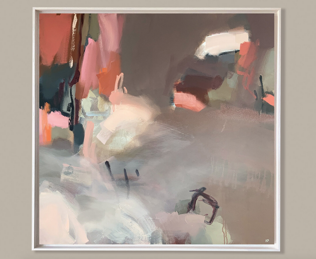
‘Unconditional’ by Kate Burns
With this deep passion for colour and an extraordinary talent in combining them together, I asked Kate what her starting point is when picking the first shade for a new painting: “Colour inspiration can strike anywhere, anytime and by anything. I don’t seek it out,“ she told me. “From a ladies bold hat and glove combo to the subtle tones in a crumbling brick wall, colour is all around us. That’s the beauty of it.”

Kate Burns with a selection of her paintings.

‘Patience’ by Kate Burns
After studying a Fine Art course at Central St Martins in 2016, Kate now works out of her North London studio. While the pandemic continues, Kate’s work can only be found online. Her next exhibition will be at the Silson Contemporary as part of the Winter / Spring show if it is able to open its doors before the end of May (it opens online on the 19th of February). In the meantime, Kate tells me that she will be working on commissions and trialling more colour combinations: ”Colour exploration is a large part of my work and, thankfully, the possibilities are endless.”

‘Meddling Fairies’ by Kate Burns
To keep up to date with Kate’s work click here to subscribe to her email list, or follow her on Instagram @kate_burns_london.