How To Choose The Right Paint Colour In Your Home, with Farrow & Ball Colour Consultant Joa Studholme

I think it is always the greatest DIY dilemma - what colour should we paint the room? I know myself I 'ummm' and 'ahhh' for weeks, buying tester pot after tester pot of virtually the same colour, until I am completely confused. Then, I often pick a colour completely different to what I had in mind originally, cross my fingers and hope for the best. If there is one thing that I do know about paint, it's that Farrow & Ball are the best in the business. I know so many people who have used this paint and then just can't ever conceive of using another paint brand again. That's why when Red Magazine invited me to their Smart Women week of workshops to hear Farrow & Ball's International Colour Consultant Joa Studholme talk about how to choose the right paint colour in your home, I jumped at the chance to lap up all of Joa's expert advice.

Red Magazine ran a series of talks and events with successful, smart women last week in London.
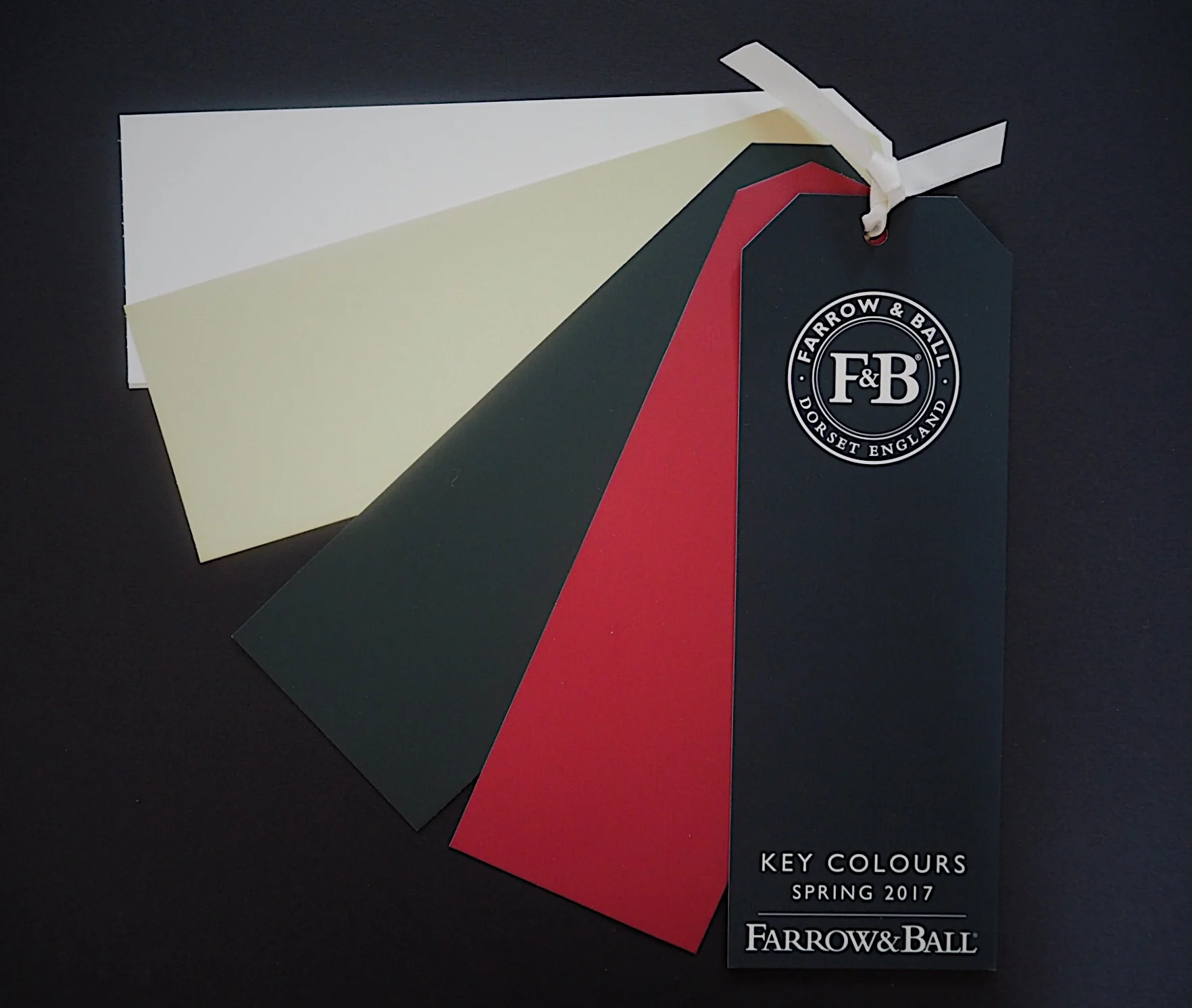
Joa has worked at Farrow & Ball for 21 years. She mixes, approves and names the Farrow & Ball paints ('Nancy's Blushes', a candly floss pink hue, was named after her daughters rosy cheeks). She revealed that there are 3 key things to think about when deciding on a paint colour in your home:
1. LIGHT
Think about the light that the room gets - is it very light? Does it get very little light? Is it bright morning light, or subtle evening light? Farrow & Ball paints are generally more expensive as they have less harmful chemicals and more pigmentation (which is why F&B paints are less shiny than other brands). It also means that their colours can look different in variations of light. Joa advised that you paint a few large pieces of card the same colour, then hang them in different parts of a room to see how the colour looks both in the day and the night.
Joa's top tips:
- If you have a porch, paint it all completely dark (even the ceiling). As soon as you step from the dark porch into your home, your home will seem much brighter and lighter - creating an immediate dramatic effect.
- Paint your hallway a dark colour - all the rooms off it will then feel immediately bright and airy.
- If your room is a dark room, don't try and paint it a light colour to brighten it up as it will not work. Instead, embrace the dark and paint it a dark hue, instantly making it cosy and inviting.

Joa Studholme with her book 'How To Decorate'.
2. ARCHITECTURE
Look at all the things you may have in the room: skirting, cornicing, dado rails, window frames - even the ceiling. Think of all these aspects when you decide on what colours to use in the room.
Joa's top tips:
- Move away from painting your skirting and dado rails in white, as this makes the room spin in white lines. Instead, try painting your woodwork a darker colour than the walls, rather than the other way round. By doing this, you'll create the effect of more light and space.
- If using a wallpaper, pick a colour within the paper and paint the skirting that colour rather than the standard white. F&B wallpapers are printed using their paint colours, so you will always be able to get an exact match.
- Use one colour throughout the whole room - paint the walls, window frames, ceiling, woodwork all in the same colour. This gives the room strength, has a calming effect and makes unsightly additions (like your basic style of radiator or build in cupboards) vanish.
- Paint over a dado rail rather than leaving the top half the same colour as the ceiling, otherwise your ceiling height will completely drop.
- Don't paint your ceiling white - paint it a colour sympathetic to the wall colour in the same colour group. This makes the wall colour 'bleed' into the ceiling instead of there being a harsh stop-line. Think of the ceiling as being your 5th wall. Farrow and Ball do a sympathetic white for all their emulsion colours.

3. STYLE
Don't follow the rules, choose colours that you feel comfortable with. You don't have to paint a Georgian house in heritage colours any more than you need to follow current colour trends.
Joa's top tips:
- If you are scared of colour, put it below eye-level so it does not feel that the dark colour in encroaching in on you. Paint your kitchen island a lot darker than the rest of the kitchen. Add tongue and groove panels on the lower half of the wall and paint them a darker colour than the top.
- Add wallpaper to a ceiling (rather than the walls) to mix it up.
- If you want to use pattern, start small. Paper an en-suite or guest room first to get used to it.
I found Joa's talk so inspiring. I had so many "oh yeah, I hadn't thought/realised that" moments! I'm definitely going to tackle my all white skirting in my house now, and i'll never think of my woodwork in the same way again.
I'd like to thank Red Magazine for inviting me to their Smart Women week, and making me think about using paint in my home in a much smarter way!