
Farrow & Ball's Key Colours For Spring 2017 & How I Would Use Them In My Home
I know this blog is meant to be about getting a contemporary look on a budget, and Farrow & Ball tend to be considered as 'posh paint' due to its price point, but I just cannot stress enough how much of a Farrow & Ball fan I am. To me, its often a false economy buying a cheaper paint brand. For application, colour depth and range, Farrow & Ball really cannot be beaten. If you are going to spend money in one area when decorating, spend it on the paint. It's the foundation of the room and what everything else will be based around.
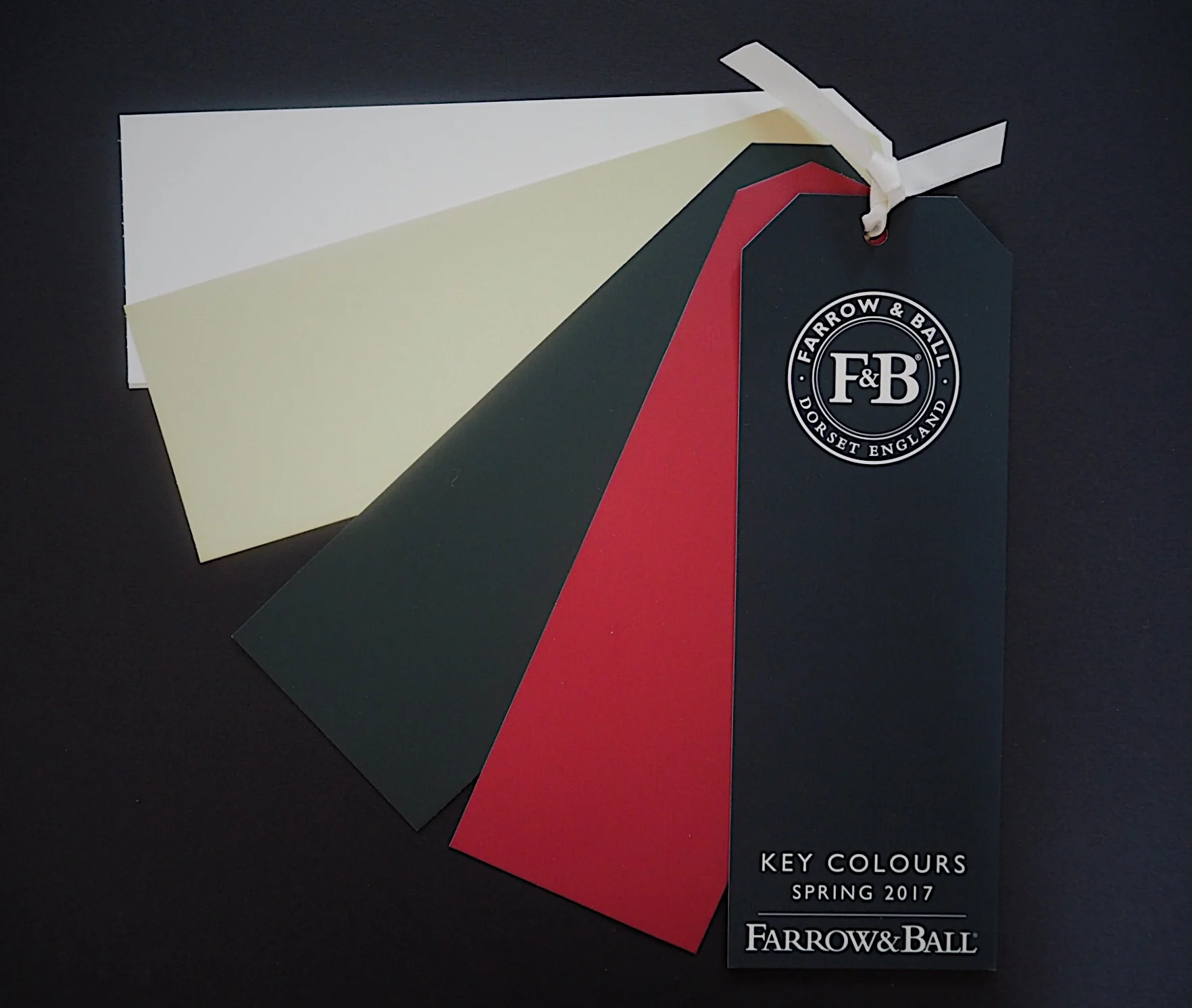
With my Farrow & Ball fan-dom you can imagine I was excited to see what the key colours for spring 2017 were going to be for F&B. This season F&B have picked four hues - two dramatic, intense colours alongside two neutral shades.
Studio Green (my fave of the four)

Image courtesty of Farrow & Ball
I think F&B have created the perfect press image for this colour. Look how the white and lime green of the flowers stand out against the dark green hue on the walls. It's also made to look distinctly modern being paired with the light wood, as well as framing the airy white room in the distance. This colour could look a bit old and stuffy (think home libraries and posh members clubs), but applied in a modern setting it's fresh, vivid and contemporary. It's going to the 'dark side' while being individual (F&B's 'Downpipe', although a classic, is just a bit too 'everywhere' on the net now). I would use this colour exactly like in this press image - combined with bright whites and light wood in larger, airy, high-functioning rooms like a bathroom or a kitchen as opposed to a bedroom or study.
Radicchio
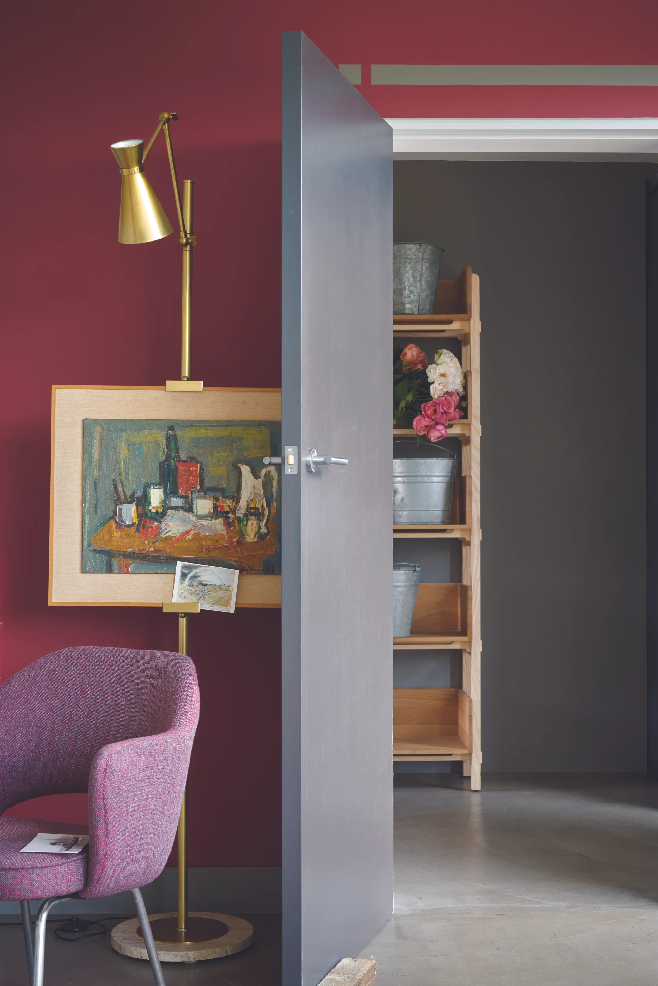
Image courtesy of Farrow & Ball
After the huge popularity of pink in interiors, F&B predict a natural progression to stronger reds. They also suggest that this colour should be used alongside harmonious greys. I agree that the move from pink to red may be a thing (in fact after seeing this picture I'm totally obsessing over combining pink furniture infont of red walls), but I'm not a fan of adding in the grey. I love the pink and the brass against Radicchio as per the press picture, but I personally would use clean whites rather than greys alongside it for doors and woodwork. Again, I would place modern furniture and accessories alongside the colour to make sure it's contemporary rather than seem an 'older', traditional colour. I'd use this colour in a living room alongside lots of lovely black and brass Tom Dixon Beat lighting.
Hay
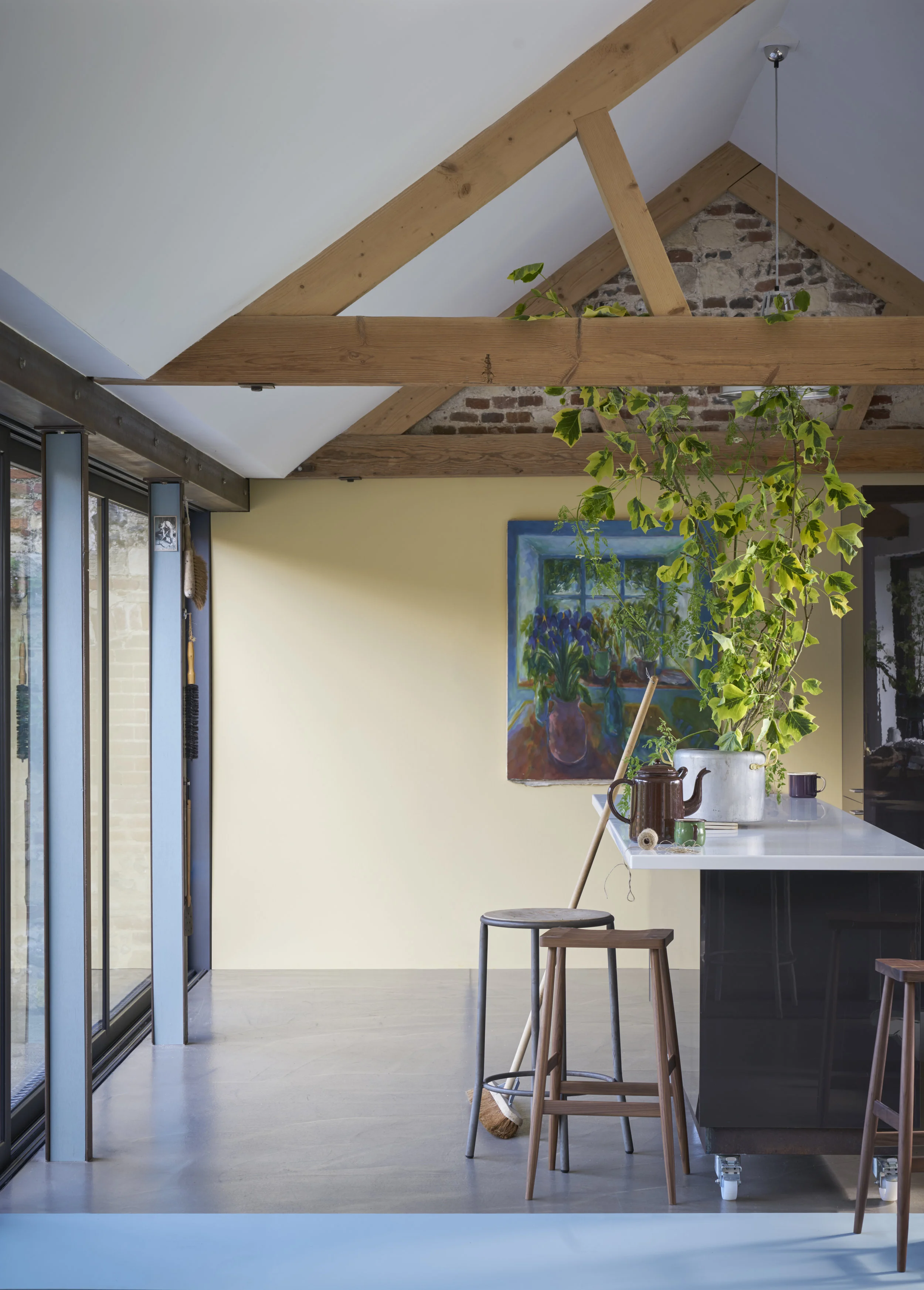
Image courtesy of Farrow & Ball
Eeek, a sort of magnolia? I struggle a bit with Hay, but combined here with Oval Room Blue it's a great way to give your home a warm feel without straying away from a neutral palette.
All White
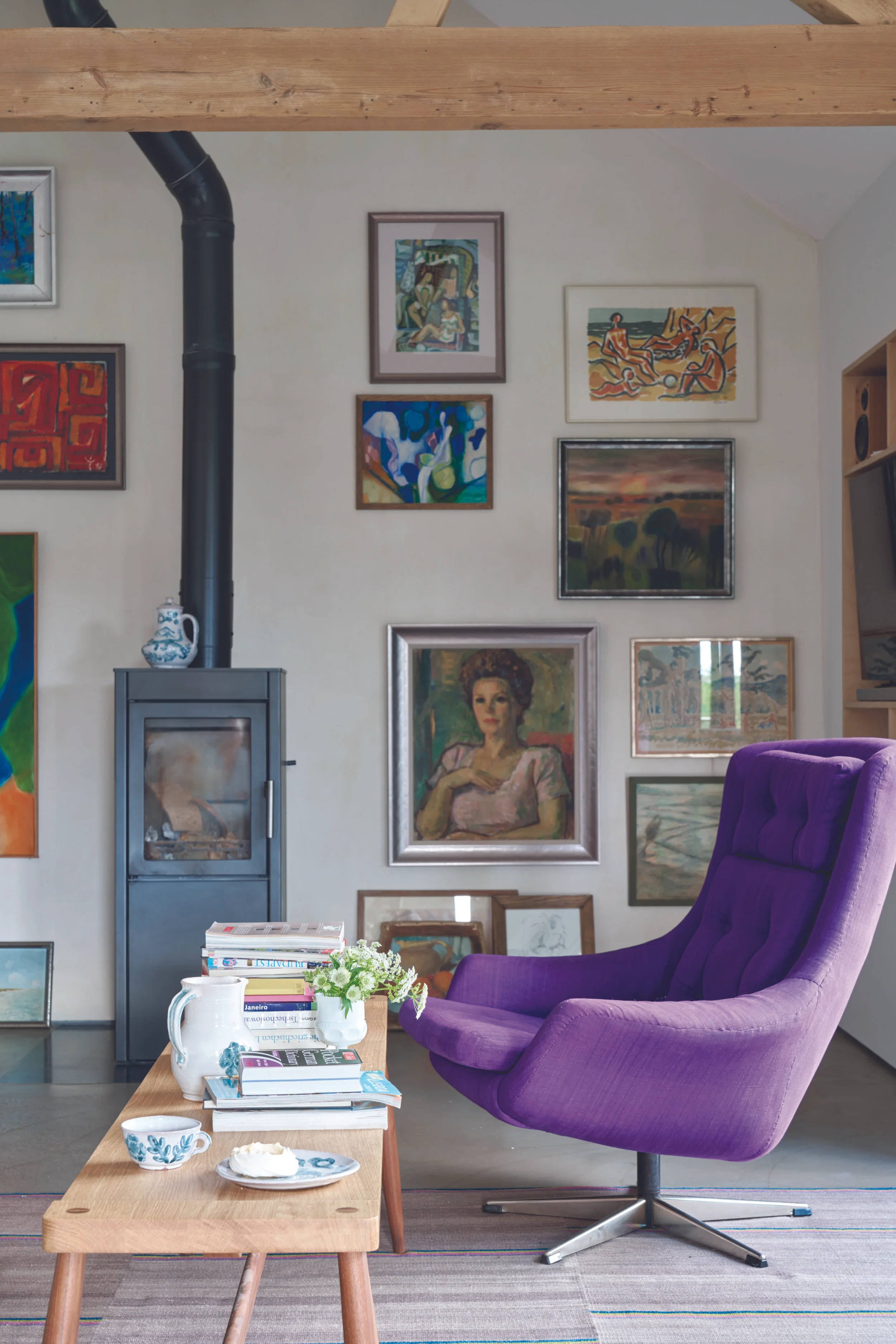
Image courtesy of Farrow & Ball
A classic. A beautiful, fresh white without it being blinding white. All white contains no pigment so is devoid of any colour. If you have a lot of 'stuff', All white provides a perfect backdrop. I'd use this colour in a small work room such as a sewing room or small home office, where lots of bits and bobs are stored on the walls.
What do you think of F&B chosen colours for spring 2017? Would you have chosen them from their wide colour palette? Do you think F&B should have stuck to colours traditionally associated with the season of spring? Or do you love these choices and want to re-fresh you home in time for spring in All White or Studio Green? Let me know in the comments section below.....


