Before & After: Decorating My Living Room Blue
I think that one of the major pro's of being an interiors blogger is the fact that you get invited to press shows to see next seasons furniture and home ware. Just spending my day in interiors shops is a fun day out for me, let alone being able to see and touch not-yet-on-sale furnishings! One of the big trends for SS17 that I took away from the end of last years press shows was the fact that blue would be big for 2017. Blue velvet sofas and chairs featured a lot. Large backdrops painted in lovely matt blues highlighted the new gold accessories for spring and summer.
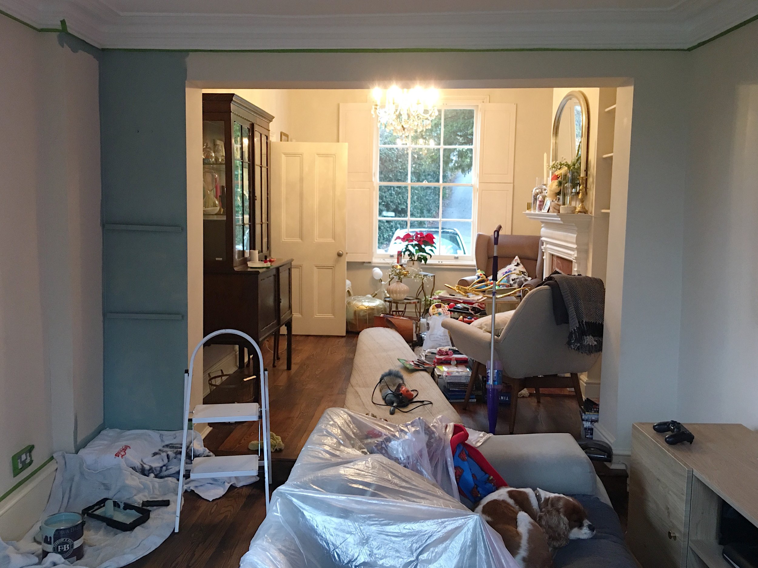
Loving the blue look at some of the press shows (plus a lot of blue decor inspiration from Instagram) made me decide that blue was definitely the colour I was going to paint my living room/TV snug area this year. This area of my home was still painted the cream colour the previous owners had decorated it in when we purchased the house two years ago. Even though I had some nice furnishings in the room, the room looked like this:

Before: The old rug from our previous house didn't complement the already boring wall colour.
The room needed a complete overhaul. Old furnishings from our previous house were doing nothing for any of the nice new pieces I was adding to the room. The room also had some amazing coving and pretty French doors out to the balcony that were just not being highlighted.
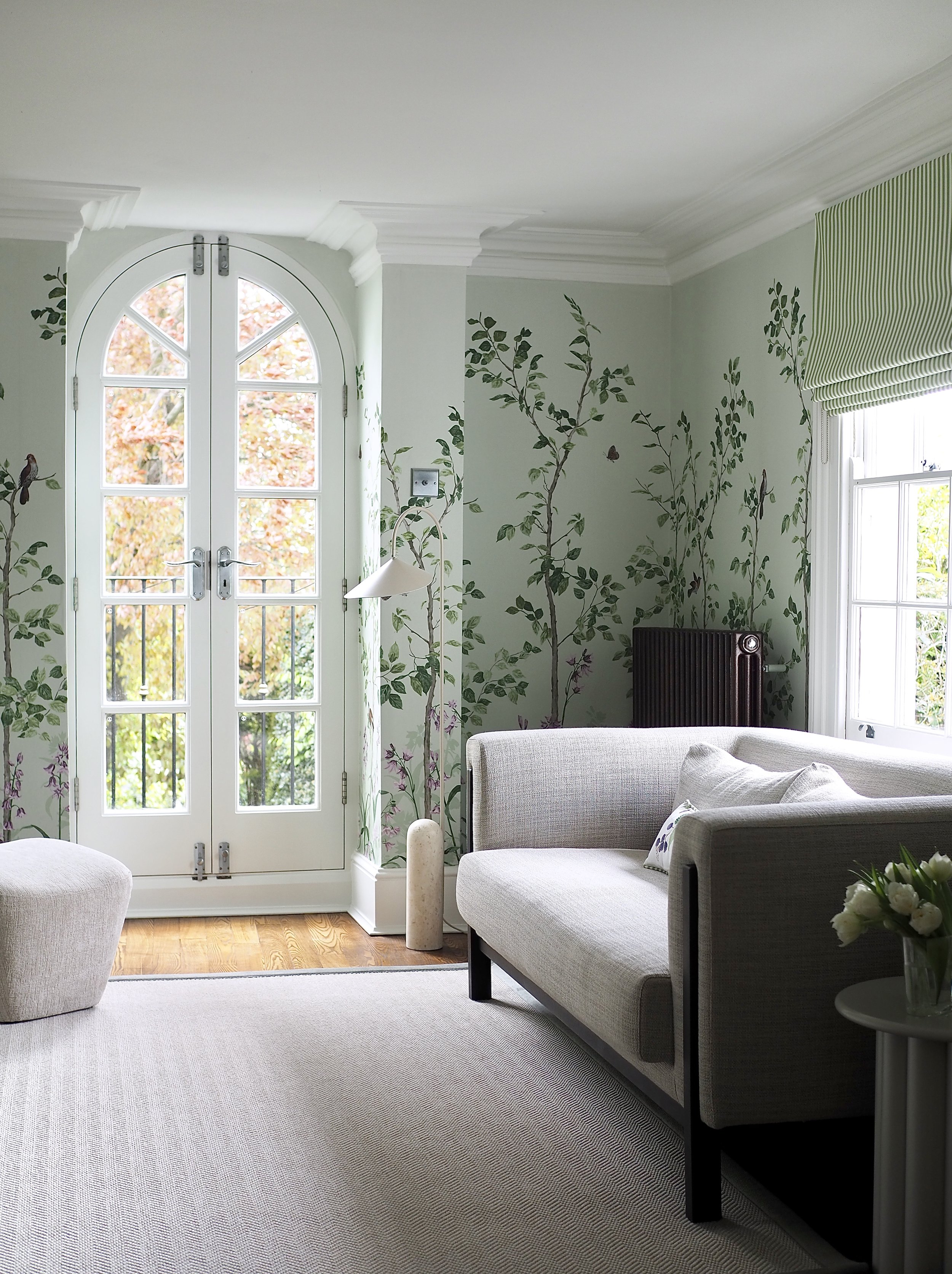
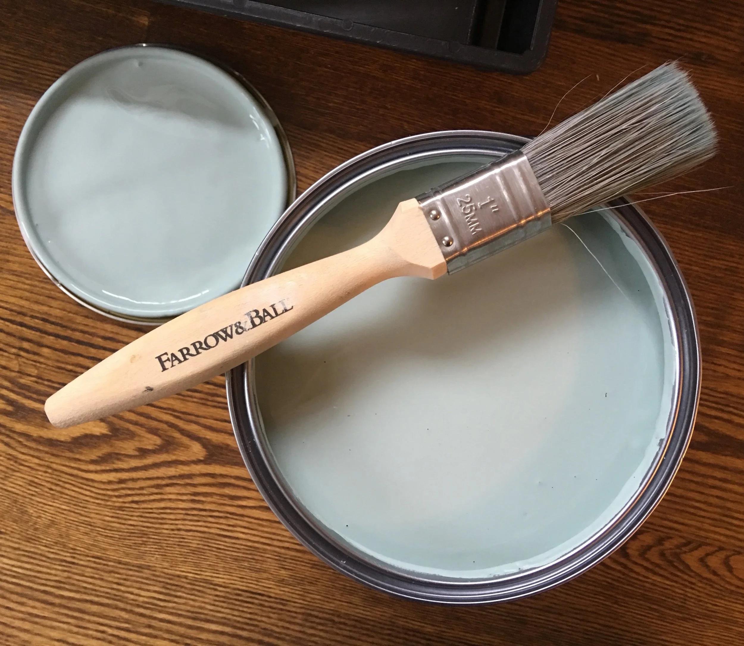
After trying out some blue tester paint pots, I decided that Dix Blue by Farrow & Ball was the colour I was going to paint the walls. To me, Farrow & Ball are still the best out there in terms paint application and finish.
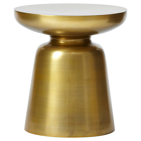
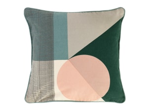
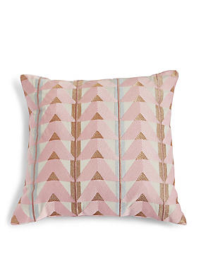
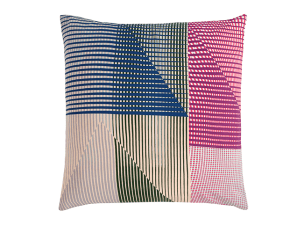
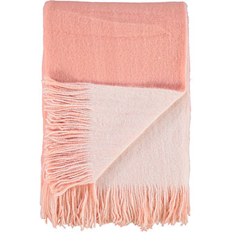
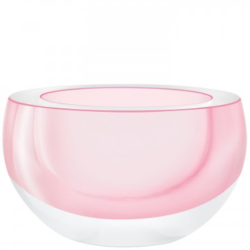
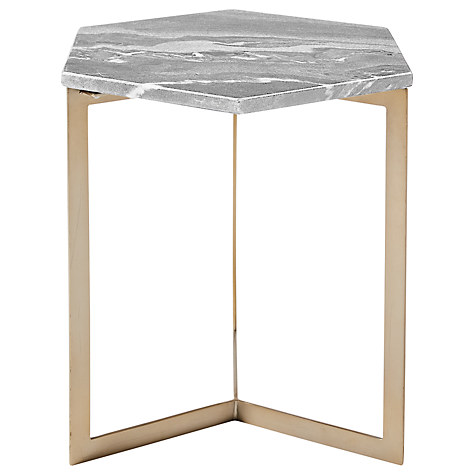
I then built the following mood board around the colour:

The Dix Blue walls would be complemented by blush pink soft furnishings, a colour I love and appeared to work so well with the blue on the mood board. I was also genuinely captivated by linen curtains from 3HLinen, which promise to be the perfect finishing touch for dressing up our windows.
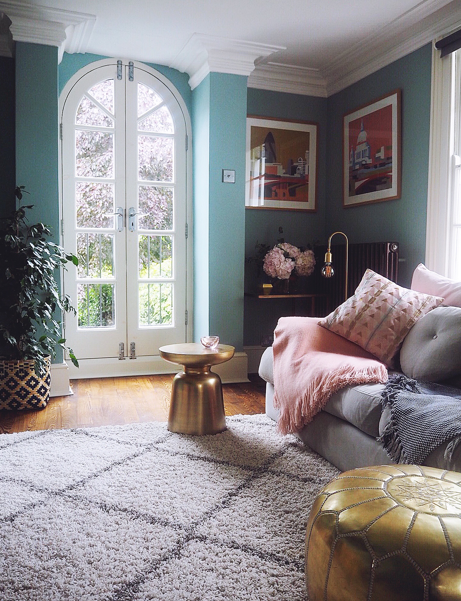
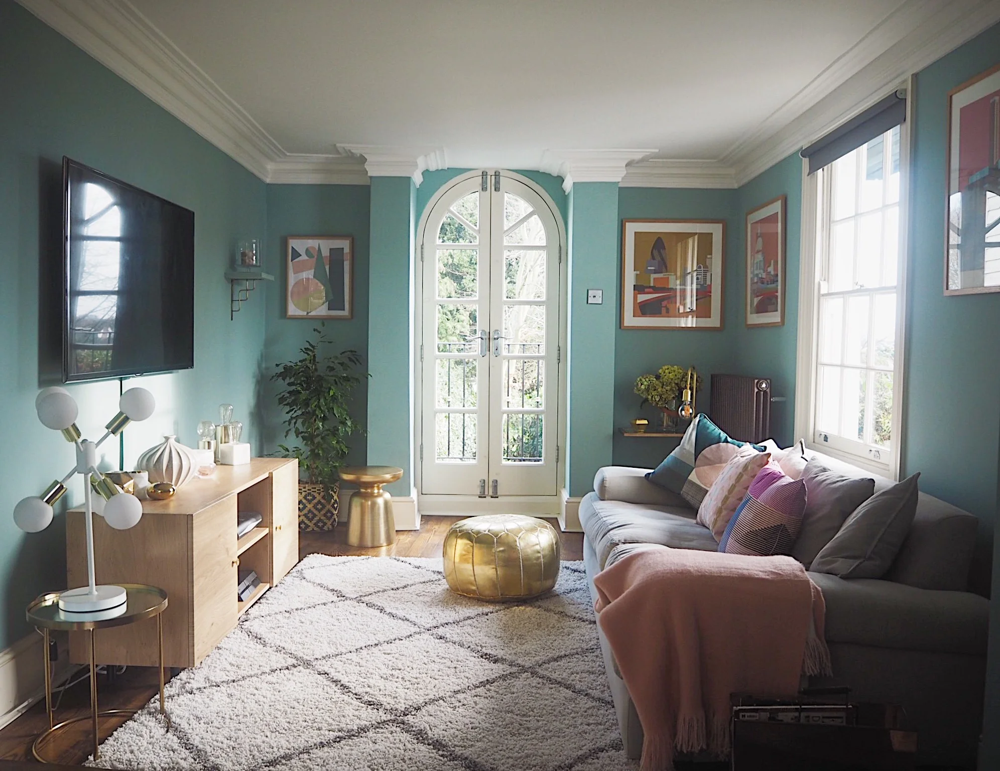
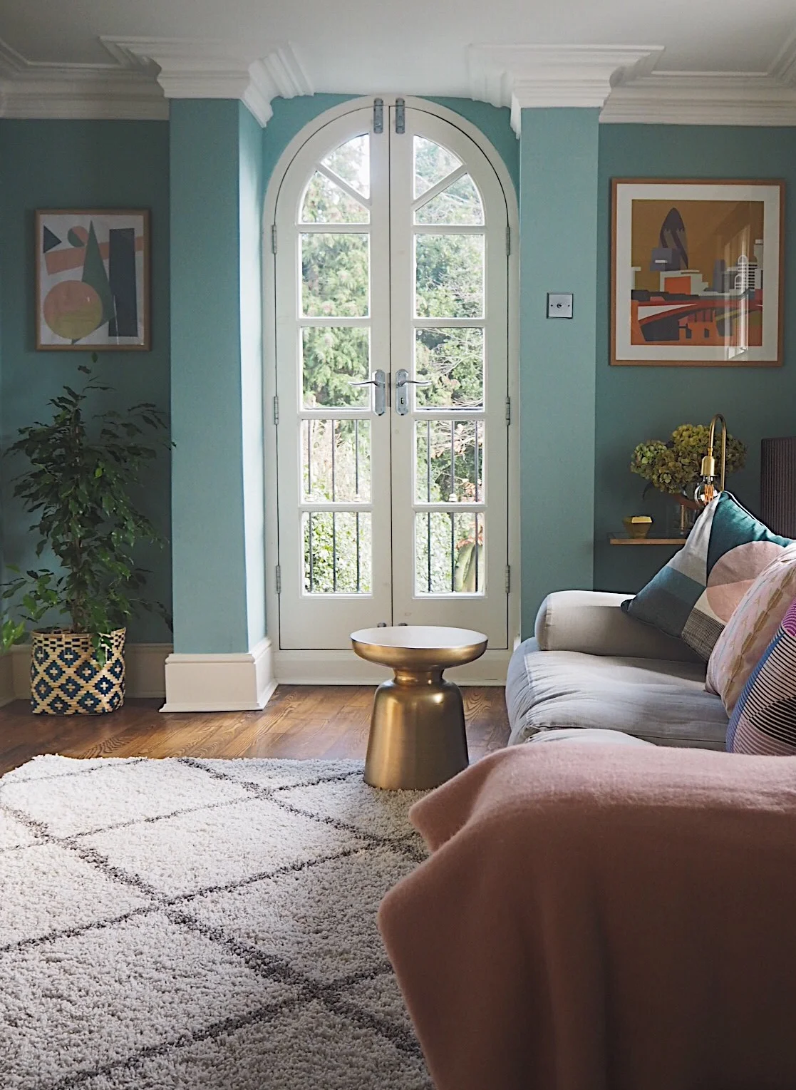
The finished room now looks like this!

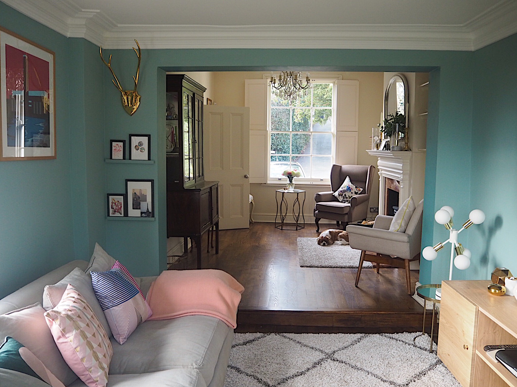
Spot the sleeping dog part 1.
I love the blue. Far from being cold it's really cosy and inviting in the room now. It also changes to a warmer, deeper colour in the evening which is perfect to snuggle down in.
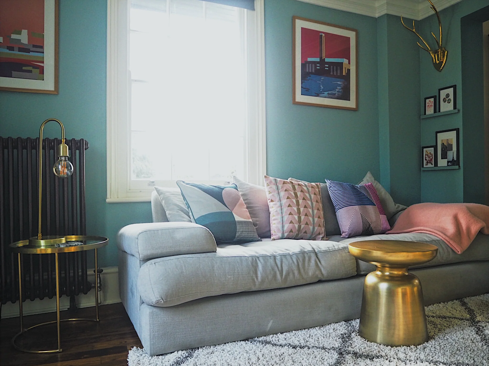
The colour also highlights my home accessories in the room. They are outlined and stand out with the blue backdrop, as opposed to just blending in with the previous cream colour.


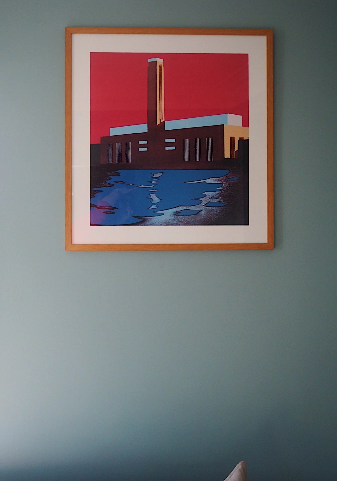
I'm glad that I chose pops of pink in the furnishings, as it works well with the blue without the scheme feeling really feminine. I'm so happy with the Made.com cushions - the fabric they are made out of is thick and durable (great with a dog and toddler chucking them about), and the pattern of the Axle cushion matches my DIY artwork for the room perfectly!
One thing that I did want to achieve with the room was to separate it from the other end. My living room is kind of divided, and I wanted the front part with the fire to be more of a 'reading' area, and the part I painted with the TV in to be more of a 'snug'. I was hoping by painting the TV area a different colour the rooms would appear two separate areas. The concern was that instead of working coherently, it would just look weird. Luckily, I think it does work. You can see in the photo below that the side being painted in Dix Blue instantly distances itself from the further part of the room and creates its own seperate area:
Spot the sleeping dog part 2?
One thing I changed from the original mood board was the choice of rug. I felt that the artwork, cushions and pink decorative items added enough to the room, and the rug should be more neutral. I chose this diamond pattern grey and ivory rug and I am so happy that I did. It has such a deep pile and feels so luxurious, everyone comments on it when they come in.

I'm in love with this room now! The colour palette feels fresh and ready for spring, while the architectural details of the room such as the doors and coving are made much more apparent.


* This post is in collaboration with Made.com. Please note that I was also kindly gifted a number of items in the room as well as the paint from Farrow & Ball. However, all opinions, choices and decorating decisions are my own - I'd never decorate my house with items that I think are lame, nor try and convince you otherwise!