My Dining Room Makeover With Sanderson Paint

Room reveal posts are my favourite type of blog posts. I always love reading the before & after posts of other interior bloggers, while simultaneously they are my favourite posts to feature on my own blog. I’ve not had a room makeover post on the blog since the summer, so I’m delighted today to reveal my dining room transformation with iconic paint, fabric and wallpaper brand Sanderson.
If you want to read more into why I wanted to revamp this room then click here. Otherwise, here is a snap of the room a few weeks ago:
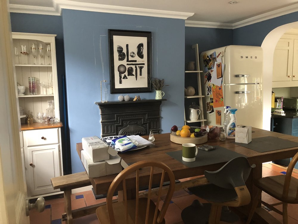
It literally had become the dumping round room - I didn’t like the room so I didn’t want to spend any time in it, so the room was ignored and hardly ever tidied up. I hadn’t planned to decorate it until next year, but after attending a stunning event at the Sanderson Hotel to celebrate the release of 50 new paint shades by the brand Sanderson, I got completely inspired by Sanderson’s wall of painted ceramics in all of their 154 available shades.

Photo credit: Sanderson / Style Library
While some might find that 154 shades may feel a bit overwhelming when it comes to choosing one colour, to me, who was the hunt for my ‘perfect shade of neutral’, I was literally a kid in a sweet shop. I am always drawn to strong colours, so choosing a neutral posed a bit of a challenge, but I knew what I was after - a white that is not a blinding white, warm but not ivory, slightly grey without being grey with a hint of pink. And yes, I am aware this makes me sound like a absolute paint diva, but I felt having more choice made me really see colour. I had 15 Sanderson sample pots (yes, 15, no sniggering please) and every shade was so different. They were all confident neutrals, but some had yellow undertones, some pink, some blue, some grey. This is always so important to think about when you choose a neutral paint colour: what colour is the base of the neutral shade made from? Would you prefer a traditional creamy ivory neutral or a darker shade with a hint of grey?

The three colours pictured below made my shortlist, even though they were not my final choice. The first, Chiswick White, is one of the new 50 colours that Sanderson have released this year. It’s a beautiful warm white without any yellowy undertone, making it feel contemporary and perfect if you are after a minimalist, Nordic white. The two shades to the right are Greige Light and Horizon Grey. Greige was exact to its name - a perfect grey-beige - but I felt it might not be light enough for my dark room. Horizon Grey was a slightly darker shaded white, but again I felt I needed a lighter tone.

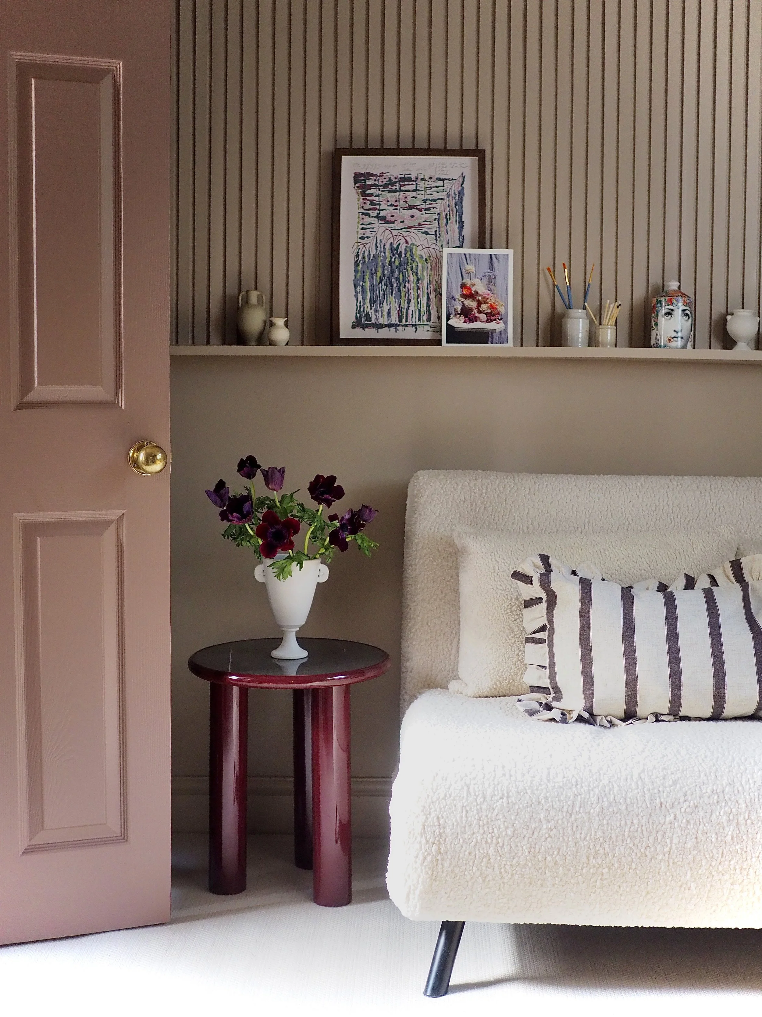
My choices in the end were Birch White Light on the walls and wood work and Snowy Owl (another new Sanderson shade) on the ceiling. Snowy Owl was the perfect ‘grown up white’ - it’s a clear white, but it is subtle and not blinding. Birch White Light I absolutely loved - in the light of day it is pure and clear, but as soon as it gets a bit darker or in artificial light it turns to greige. Snowy Owl and Birch White Light complemented each other perfectly, while being dissimilar enough to not blend in with one another.
I finished decorating the room at the weekend, so, without further hesitation here is the good bit - the ‘after’ photos:
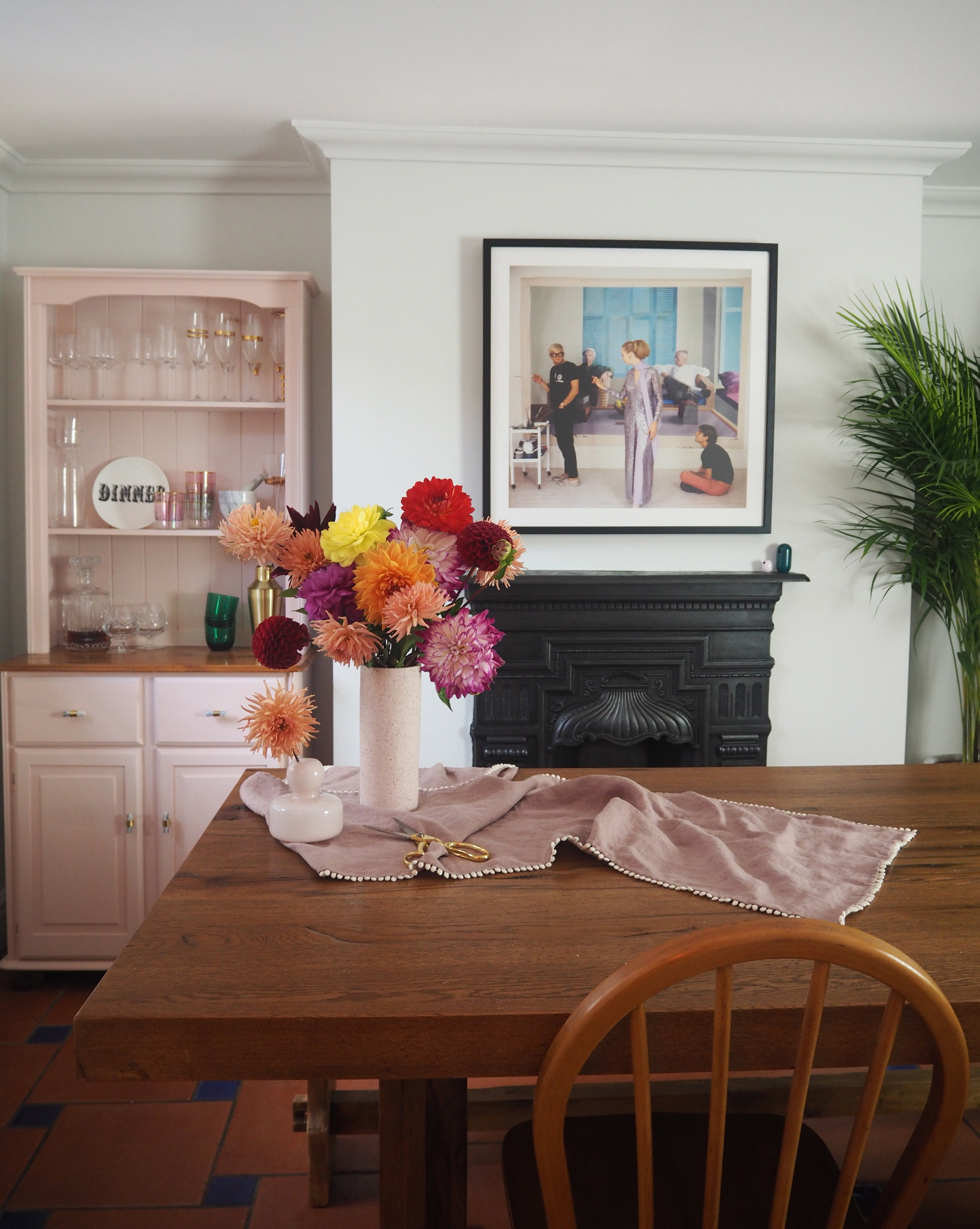


I love how Birch White Light is the perfect backdrop to pull out the understated purple and pinks of the artwork. It is so hard to tell from pictures, but in reality Birch White Light has pink and grey pigments but retains a sense a warmth - it really is a warm colour as opposed to cold.


I painted the skirting and coving in Birch White Light as well as the walls to elongate the space. The ceiling is really low in this room so by painting in the coving the room feels ‘taller’. Probably the biggest selling point for me is the fact that Sanderson’s Active Emulsion paint can also be used on woodwork, so there is no need to purchase a separate tin of eggshell. I used the Active Emulsion on the door and the window as well as the skirting. I’ve never known a paint brand to offer this before and it is fantastic as there can be so much extra expense / waste of you have to buy two separate paint finishes (especially if like me you are washing the whole space in the same colour.


I had never used Sanderson paint before but I am a total convert. I like a total matt finish and the Active Emulsion had no sheen at all. I also loved how thick the paint was - it resembled whipped double cream. Usually after painting a ceiling and walls with a roller I am covered in paint spots everywhere, but the thick, creamy nature of Sanderson paint meant that I was relatively unscathed from paint splashes.


So what do you think to my dining room makeover? I am delighted, the whole room feels completely new, but apart from new paint, a house plant and gorgeous new artwork from King & Mcgaw everything else remains the same - a total renovation on a budget!
To find out more about Sanderson paint and see their range of 154 colours, visit the Style Library website here.
*This post is a paid collaboration with Sanderson, however all thoughts and opinions are my own. Please note that I was also kindly gifted the artwork from King & McGaw and table linen from MagicLinen featured in this post.