How To Use Colourful Tiles In The Home

Sponsored Content: This blog post is a collaboration with Casalgrande Padana. As usual, all thoughts and opinions are my own.
Colourful tiles offer a wonderful opportunity to add personality into your home and create an individual and expressive design scheme. The depth and radiance of a majestic, colourful tile cannot be compared to other materials which do not have the ability to reflect light in the same way. Yet, the use of colourful tiles are often avoided due to a concern that they may look too ‘busy’ or ‘garish’. In fact, it is very easy to swerve anything lurid by following a few simple design rules when using colourful tiles in your home.
Today on the blog, I am going to escort you through five simple, successful ways to use colourful tiles in conjunction with the new Atelier collection from Casalgrande Padana: beautiful, porcelain stoneware tiles in eight distinctive colourways. Available in a soft, Nordic-style matt finish, Atelier is suitable for interior or exterior walls in both domestic and commercial spaces. The collection consists of large-format tiles (from 40x120 cm to 60x120 cm and from 120x120 cm to 120x278 cm) that are only 6.5 mm thick, allowing for easy wall-to-ceiling coverage without compromising on space. They can be laid with minimal grout lines and without having to be cut. The 30x30 mosaic tiles, with 5x5 and 5x15 cm pieces, complete the range.

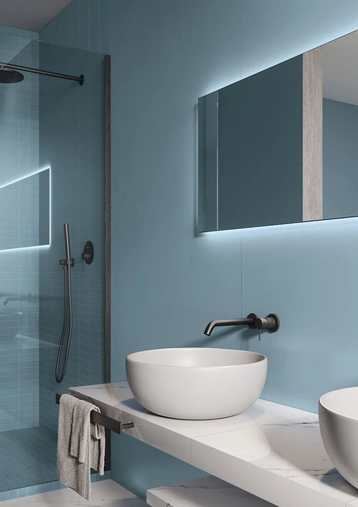
Blue and green tones that reflect nature are revitalising and reassuring, so choose tiles in hues that imitate the natural world and connect us to the tranquillity of the great outdoors. Avoid synthetic, vivid tones and lean towards soft, organic colours that are welcoming and refreshing. Deep, blue-based greens that emulate the bottom of the sea, along with muted blues that reflect the softness of the sky, are colours that surpass trends and provide a calming, soothing environment (especially in a bathroom where running water is incorporated).
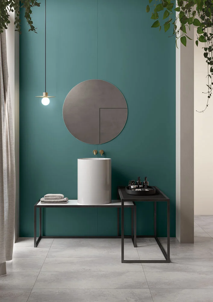
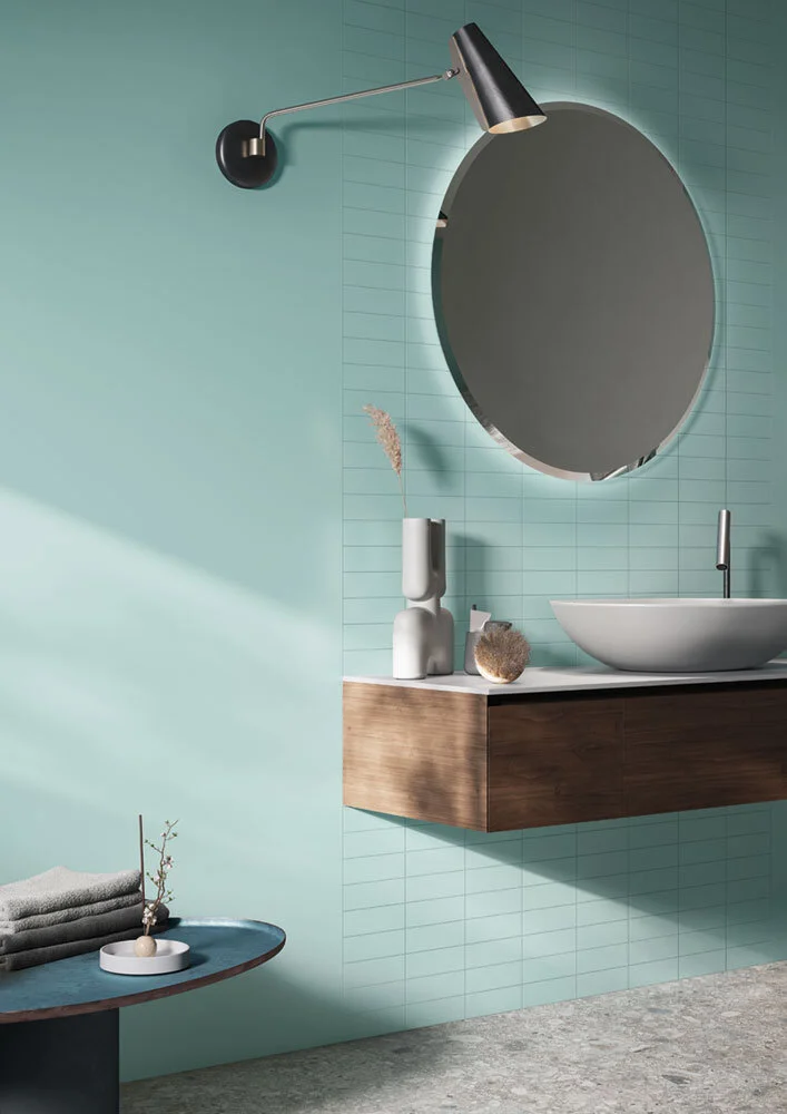
Atelier Indaco
The Atelier collection offers a wonderful array of natural green and blue tiles. The invigorating grey-based blue of Atelier Indaco pairs perfectly with natural stone accents; while the deep forest green of Atelier Ottanio creates a statement and works well when paired with Casalgrande Padana’s extensive wood-effect porcelain tile collections.
Green and blue are the perfect pairing if you want to use more than one colour in your design. Flooring: Marmosmart Fossena; Wall: Oltremare (back) and Fiordaliso (front)
If you are looking to use more than just one colour tile, then green and blue are a perfect colour pairing. As in nature, the tones complement and emphasize each other. Use the deep blue of Atelier Oltremare, alongside the green-based blue of Atelier Lavanda, to create a reviving and restoring design scheme.
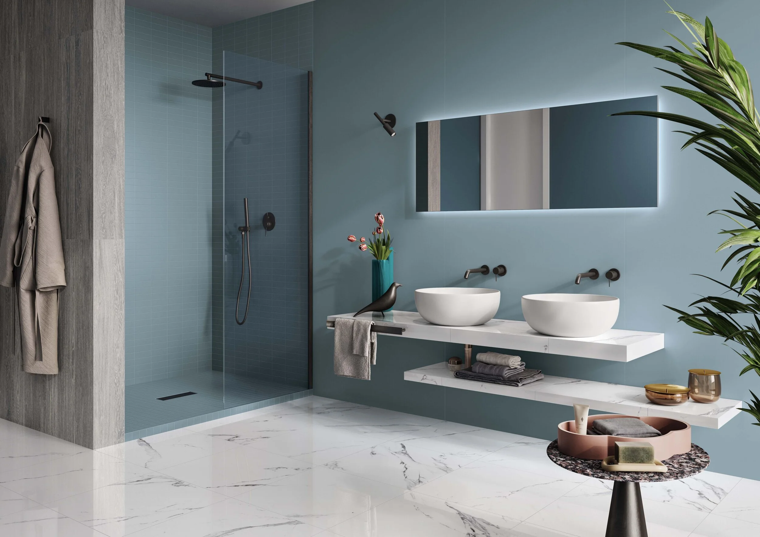
Flooring: Pietre di Sardegna Caprera; Wall: Atelier Ottanio (main) and Atelier Cristallo.
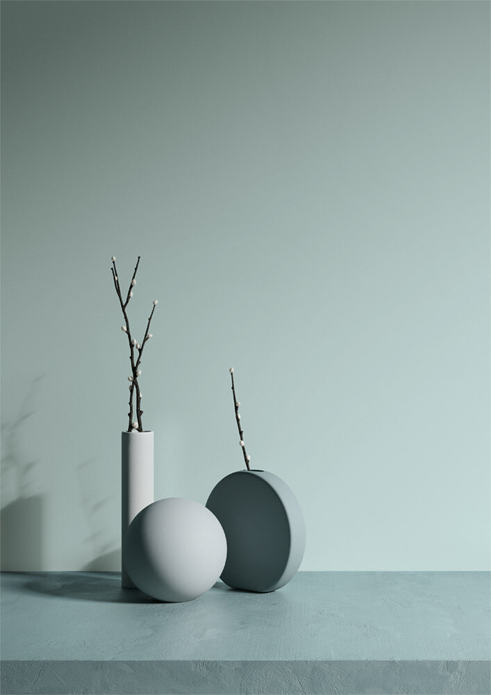
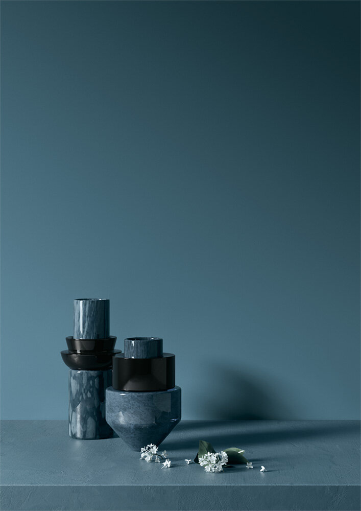
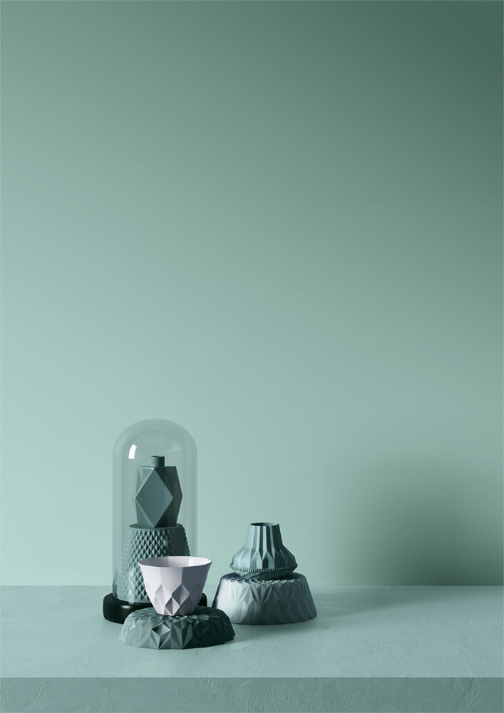
Image bottom right: Atelier Ottanio - Yermilov Vase Limited Edition CSL3 and Malevich Vase Limited Edition CSL2 Designer: Kateryna Sokolova Brand: NOOM

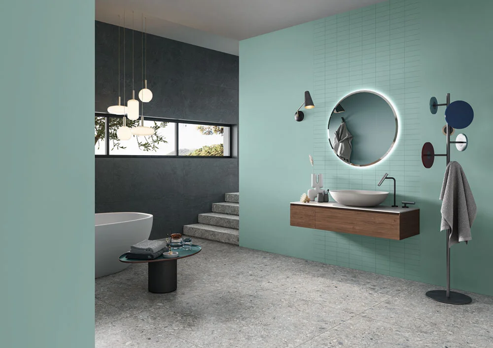
If you are concerned about colourful tiles feeling overpowering, juxtapose them alongside neutral tile shades. Brown-based warm neutral tones evoke calm, making them a great choice to balance out a more colourful design scheme. Use colourful tiles in accent areas of the room and then harmonise the rest of the space with lighter shades.

Juxtapose colour and pattern with neutral tiles and elements to create a harmonious scheme that doesn’t feel dominating. Flooring: Macro Moro; Wall: Atelier Brume (right) and Atelier Fiordaliso (behind mirror).
Contained within the eight colourways of the Atelier collection are Atelier Brume and Atelier Cristallo - light-toned, fawn and putty colours that work well as supporting hues for the more colourful options in the Atelier spectrum (as well as stand-alone colours in their own right). Atelier Cristallo perfectly enhances the earthy brown-based red of Atelier Rubino, while the natural clay-like tones of Atelier Brume provide a great backdrop for the richer shades of Atelier Oltremare and Atelier Ottanio.
When putting together a design scheme, take time to think about how to balance colour with neutral hues. In a bathroom, it is easily possible to carve out different areas of focus and function, divided by colour. For example, the more visually appealing, cornerstone area behind the mirror and sink can be made to draw the eye as soon as you walk into the space by using colourful tiles on the wall behind where these fixtures are situated. In contrast, areas of the room that should deflect attention (such as where the toilet will be hosted) can be made less prominent alongside neutrals.

Natural materials in the home are desirable as they create a rich and inviting look that is both grounding and calming. When combined with a deep and organic colour palette, a modern and cohesive look can be achieved.
The Scandi-style pastel tones of Atelier have been designed to wonderfully complement the other concrete-effect, wood-effect, marble-effect, metal-effect and stone-effect porcelain tile collections by Casalgrande Padana. The Atelier colour palette is enhanced and intensified when used in conjunction with textured and tactile surfaces that imitate natural stone, or the layered grain of wood and bark.

Natural wood tones and shades of green are pure combinations, as they are so intrinsically interlinked in the outside world. Merge the calming green shade of Atelier Lavanda with a wood-effect floor or feature wall. Or, bring wood in a bathroom via the fixtures and fittings, alongside any of the greens from the Atelier collection.
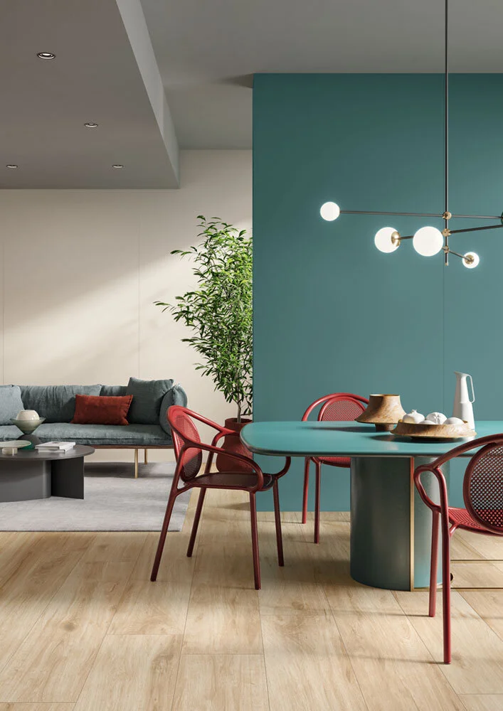
Pair a statement green with wood-effect floor tiles to create a look that feels naturally compatible. Flooring: Tavolato Grano; Wall: Atelier Ottanio (front) Atelier Cristallo (back).
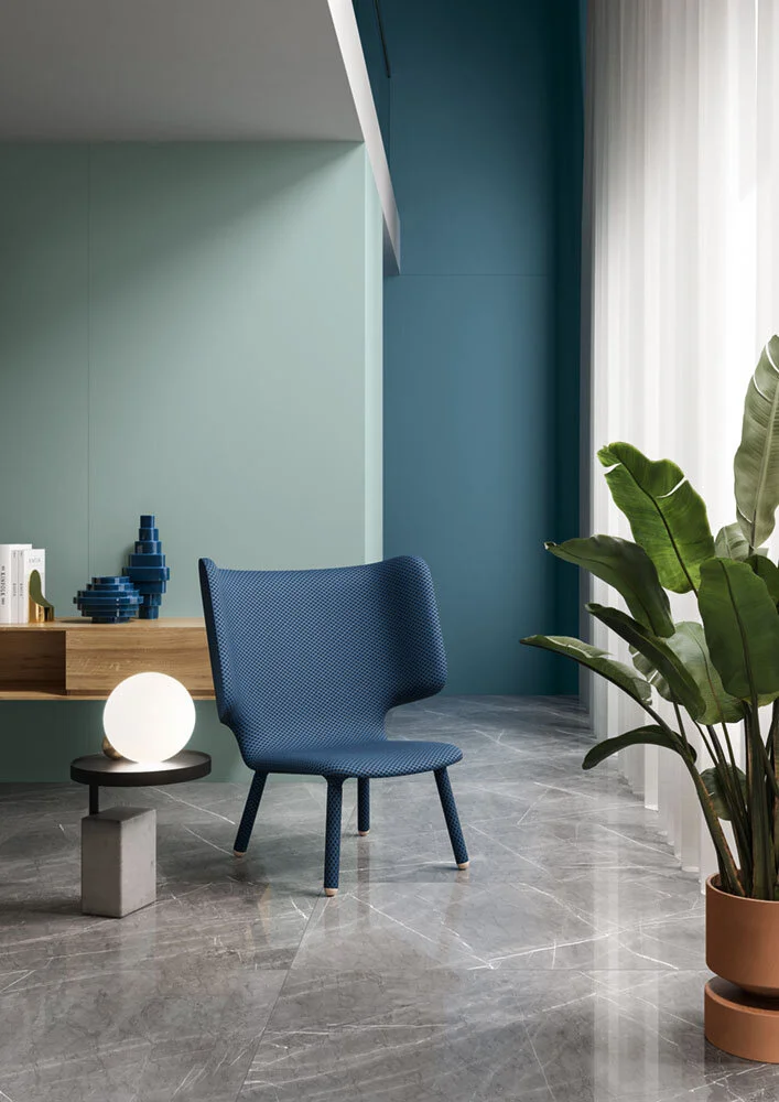
For a timeless and elegant look that will not date, pair any of the eight colours that make up the Atelier collection with Casalgrande Padana’s stone or marble-effect porcelain stoneware tiles. The natural tones and construct are versatile and multifaceted and create a harmonising design scheme when combined with Atelier.
Atelier Lavanda is balanced here with natural stone-effect floor tiles.
While wood and stone are effortlessly beautiful, the original material is hard to maintain in areas of high-traffic or moisture. With Casalgrande Padana’s porcelain stoneware, the look of the material is replicated with low levels of upkeep and maintenance.
Atelier Lavanda

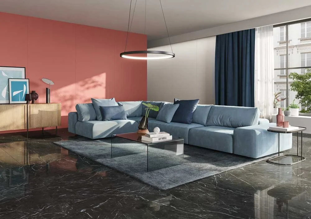
Creating a warm, welcoming and inviting space is one of the most important factors within interior design. Colour plays a significant role and using rich, pleasant hues on a far wall will not only create a comfortable space where you will enjoy spending time, but it will also add depth and give the illusion of a larger room for those with narrow, low or awkward proportions. When an accent wall is applied in an overly large space, it can add interest and detail and will balance out and centre a room that might be feeling a little lost.
This living space is given warmth and depth by having the far wall tiled in Atelier Rubino. Flooring: Marmoker Nero Creta; Wall: Atelier Rubino (left) & Atelier Brume (right).
To enhance the illusion of depth, place colourful, darker tiles on the hind wall and use lighter, contrasting neutrals in front of it. The lighter tones will feel more expansive and the darker, colourful tiles will create a contemporary impact.

The kitchen island pops against the earthy coral-red backdrop. Flooring: Terrazzo Black; Wall: Atelier Rubino; Island: Atelier Cristallo.

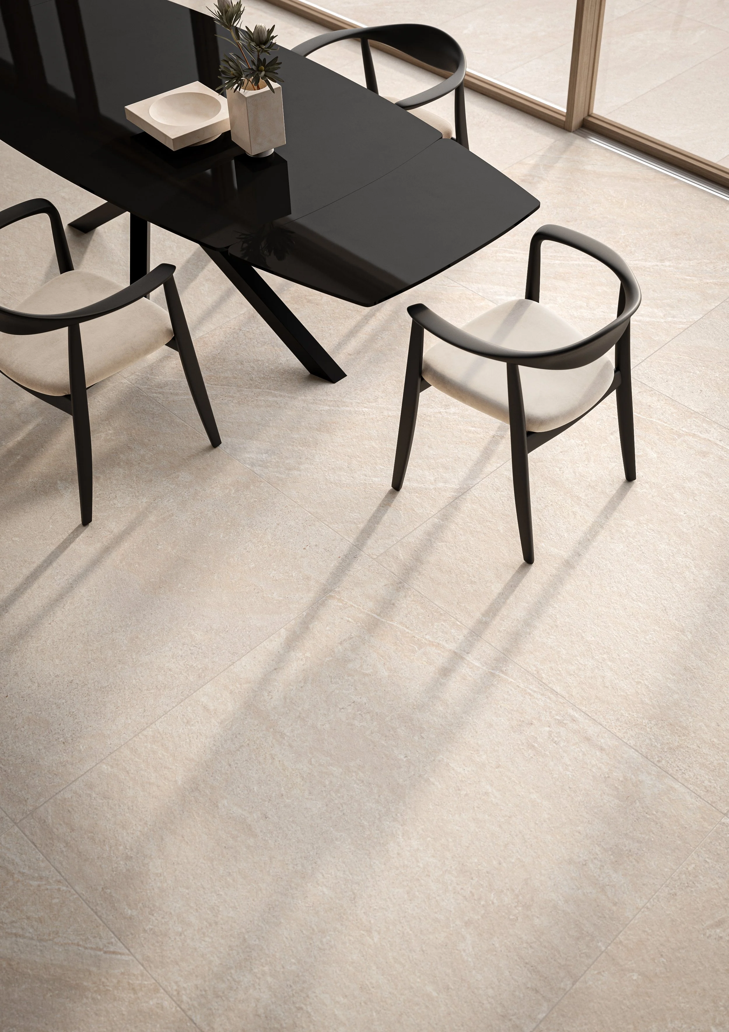
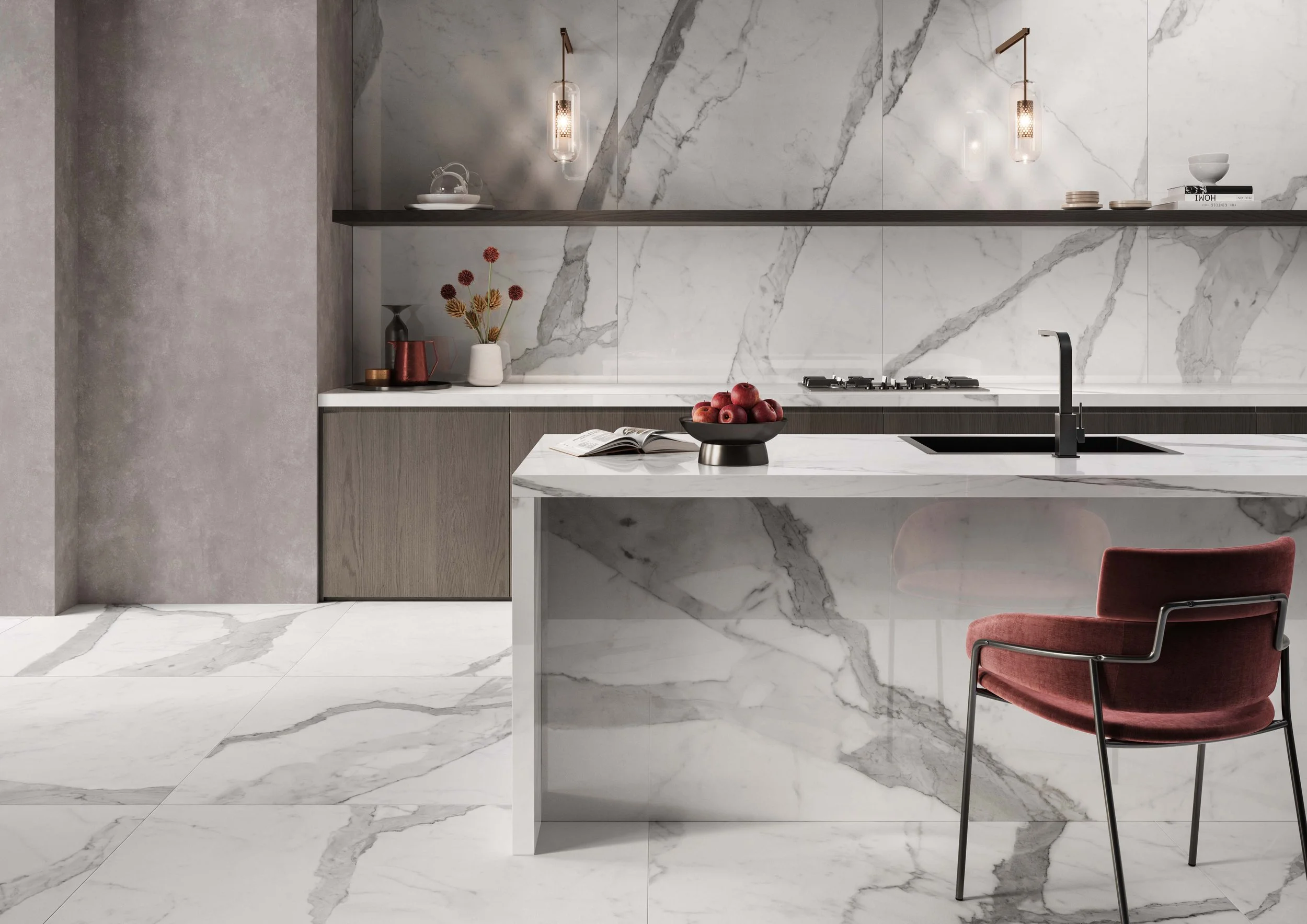
While the ceiling can often be considered the ‘5th wall’, it is the floor that should not be neglected. The floor provides the base upon which a whole design is built and by keeping a floor light, bright and airy, you have a lot more scope to add colour onto your walls. Choose a crisp white marble-effect tile (try Marmoker Statuario Grigio) or a light concrete-effect (such as Spazio Beige) to balance and harmonise the ornate colours of the Atelier collection wall coverings.
Flooring: Marmoker Statuario Grigio; Wall: Atelier Indaco; Enclosure: Newood Grey
For more information on the new Atelier collection from Casalgrande Padana, including a colour cart, sizing and retailers, please click here to be taken to their website. All imagery used in this article belongs to and is used with the kind permission of Casalgrande Padana.