Paint Colour Trends For 2020: The New Key Colours To Paint Your House In
As we move into the new season and 2019 starts coming to an end, new colours are released by the paint companies and there is a focus on certain shades which are likely to be popular in 2020. If you are a regular reader of this blog, you will know that I consistently bang on about the ‘power of paint’. Yet, with a tin of emulsion and a bit of determination, you can transform an entire room with paint in a couple of days (and all for less than fifty quid.) This is why I look forward to and really enjoy the announcement of certain pivotal hues and the release of new paint collections - it provides a whole new opportunity to give your house a new look, or think about what you want to achieve in your home. This could be creating a calming space, or making it feel more modern.
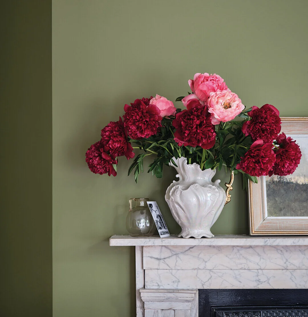
First of all, let’s start off with the Dulux Colour Of The Year that was announced last week. ‘Tranquil Dawn’, a grey-based, washed-green hue, was selected “by an expert panel of colour designers, trend forecasters, design specialists, architects and editors from around the world” and embodies “the nation’s mood on the approach of a new decade. It reflects a growing desire to understand what it is to be human at a time when advances in technology are making us feel increasingly disconnected from each other.”
Dulux’s Colour Of The Year, Tranquil Dawn. Image credits: Dulux.
So, what do we think? I believe green will be a massive colour in interiors next year as we all clamber for a shade that is connected to nature and makes us feel de-stressed and calm, but to be honest, I do not think this shade will take off. It’s all a bit too ‘apple-green’ for me and I prefer something much more punchy, like the other green colour being banded about as the next big thing: neo-mint. Neo-mint is definitely something I can get on board with. However, I appreciate that Tranquil Dawn is a lot more livable than neo-mint, and not everyone wants to paint their home in a trendy ice-cream colour. What I would suggest is to keep to a neutral background and add in a bit of neo-mint with painted furniture or soft furnishings to embrace it in your home, without it being overpowering. Great retro-tinged, mint paint hues include ‘Retro Jade’ by Designers Guild and ‘Green Verditer’ by Little Greene.
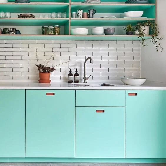
Pluck London do a great job of bringing neo-mint into the home in a way that really works.
If neo-mint is too out-there for you, and Tranquil Dawn is too wishy-washy, then the good news is that as of this week Farrow & Ball have added a whopping sixteen new colours to their paint chart as part of a collaboration with the Natural History Museum. The new colours have been inspired by shades found in a rare and archive book that the Natural History Museum holds, which depicts colours from the natural world. ‘Duck Green’, a match for the colour of a Mallards neck, is an intense jewel green which feels modern, yet retains that heritage look Farrow & Ball are famous for:

Farrow & Ball ‘Duck Green’. Image Credit: Farrow & Ball
‘Verdigris Green’ is the green based on the colour you would find on the tail of a small, long-tailed parrot. It’s a green that would appeal to those with vintage tastes and could be teamed well with vintage furniture or a bold, floral wallpaper.

Farrow & Ball ‘Verdigris Green’. Image Credit: Farrow & Ball
If green really isn’t your thing, then here are a selection of press images from Farrow & Ball of some of the other new shades being released as part of this new collaboration:

Broccoli Brown, Lake Red, Scotch Blue, Skimmed Milk White, Ash Grey, all Farrow & Ball. Image Credit: Farrow &Ball
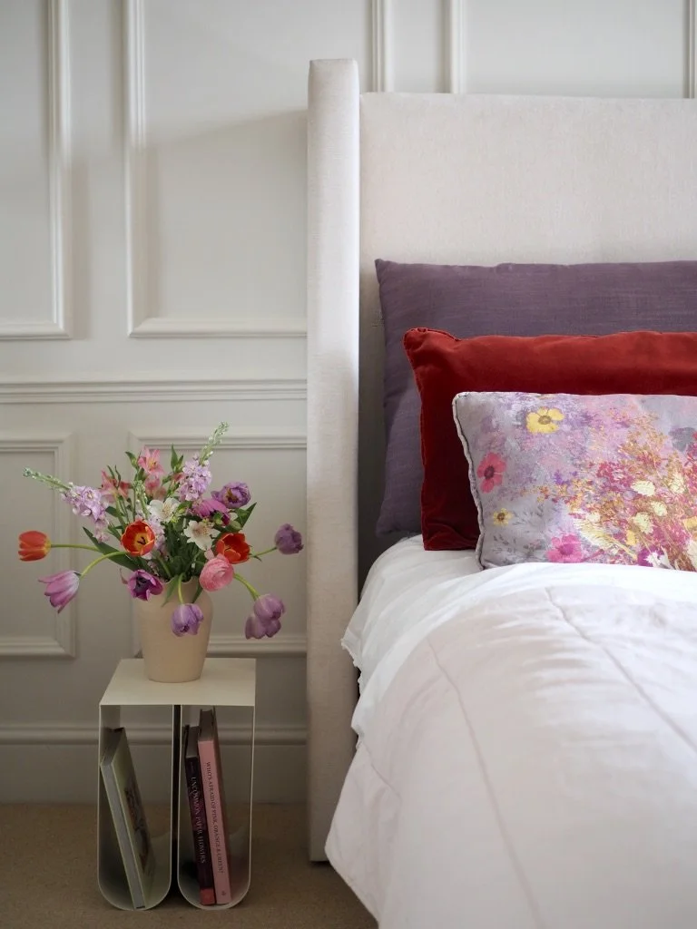
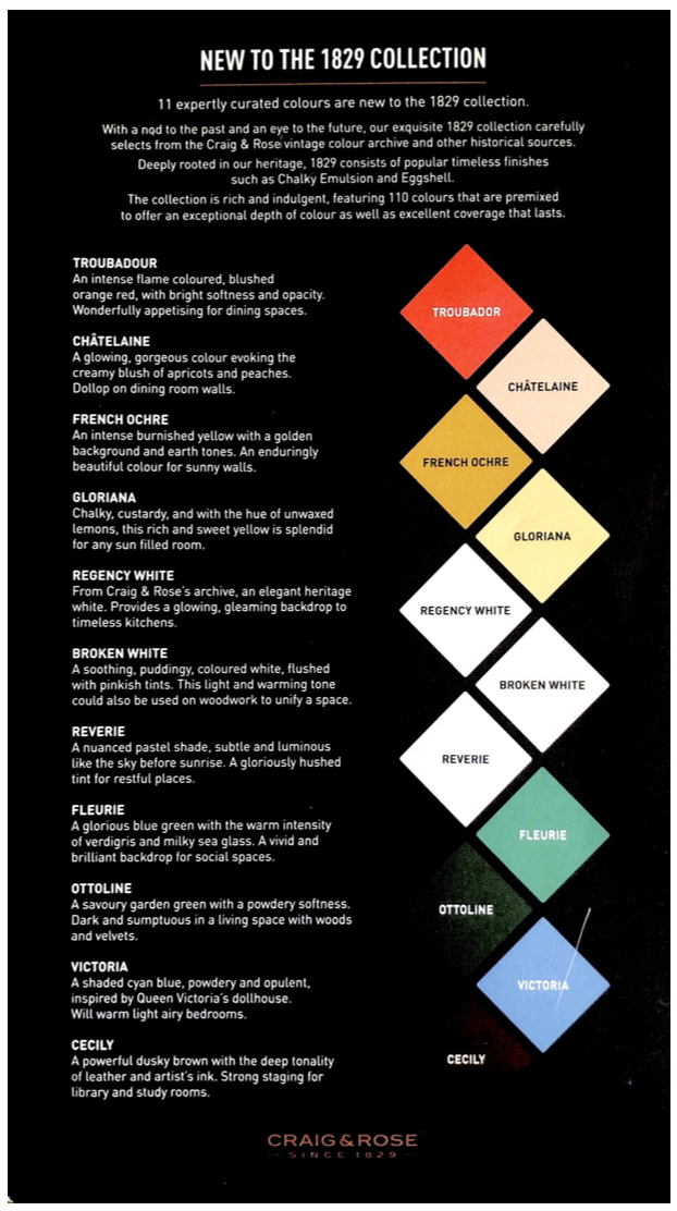
As well as green, expect a shift to more earthy, rusty reds and pops of burgundy, which actually work perfectly with pink. Pink isn’t going anywhere as a fashionable colour to decorate with, but subtle, peachy, light pinks will overtake the blush pink which has been so popular the past few years (especially on the inside or outside of front doors). Craig & Rose are releasing 11 new colours in the forthcoming weeks and I think new colour Chatelaine (snapped below at the Craig & Rose stand on my iPhone at London Design Fair) will be HUGE:
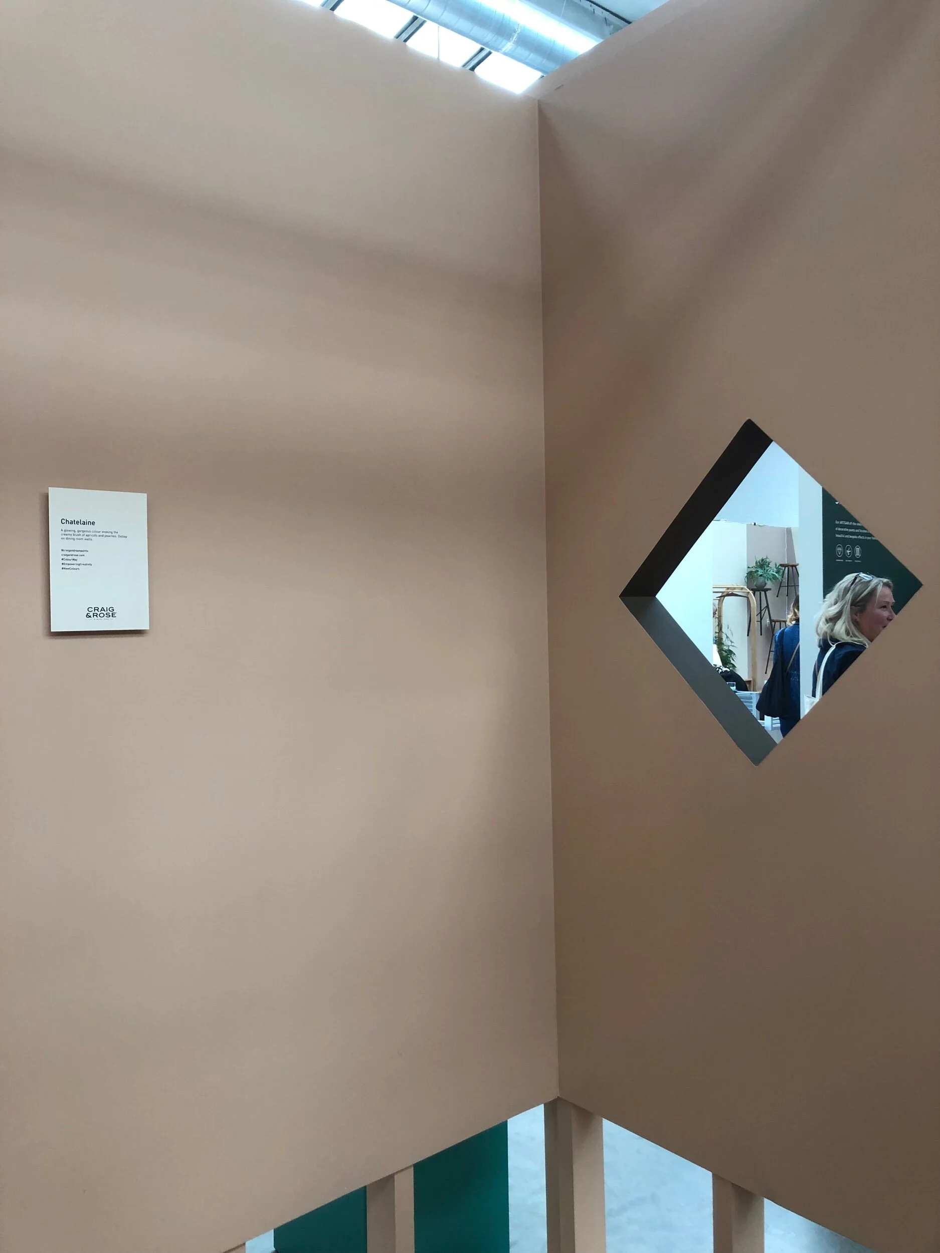
Here’s a scan of the leaflet for the new Craig & Rose colours and the top three: Troubador (slightly coral), Chatelaine (a soft pink with a brown undertone) and French Ochre (a slightly brown, earthy yellow) pair really well together.
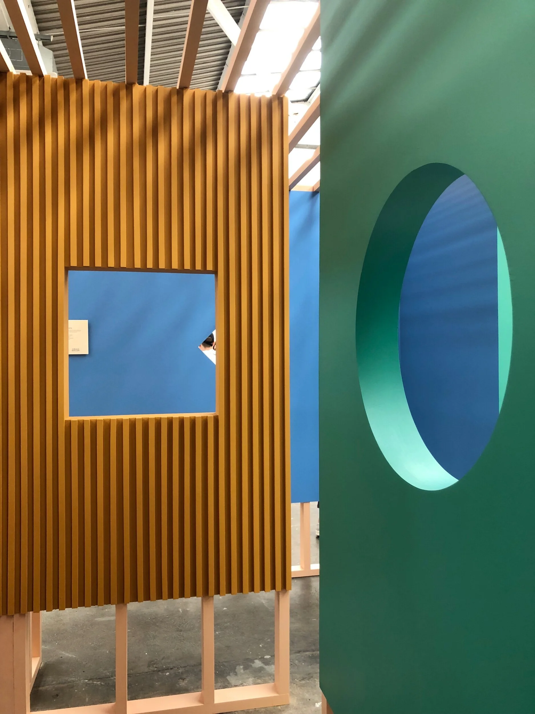
The Craig & Rose stand at the London Design Fair.
So, all this colour is great, but what if you aren’t a ‘colour' person? The good news for you is that monochrome is also going to be a trend. Paint & Paper Library have just issued “six nuanced pairs of black and white shades, tonally formulated to be used together in chic, subtly harmonious relationships.” They also have some gorgeous press imagery to support their claim, which you can see below:
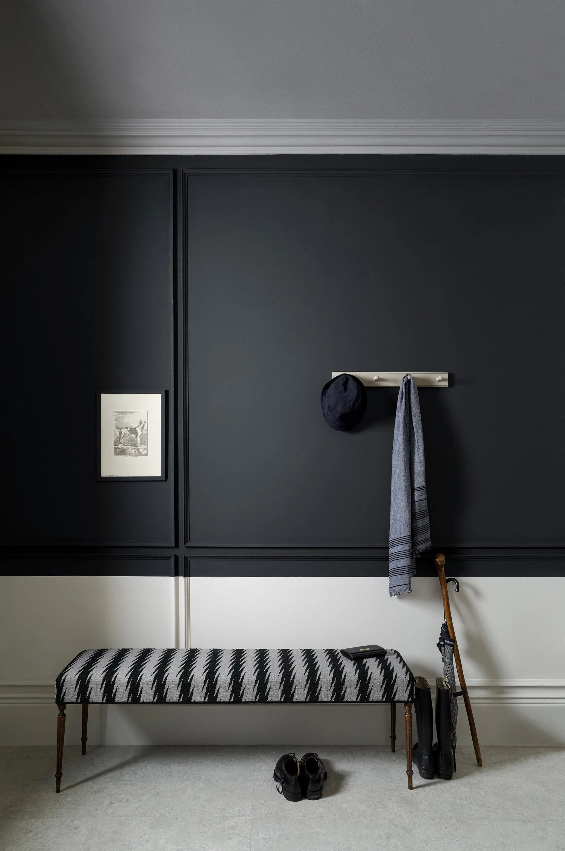
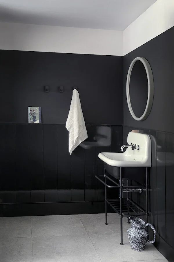
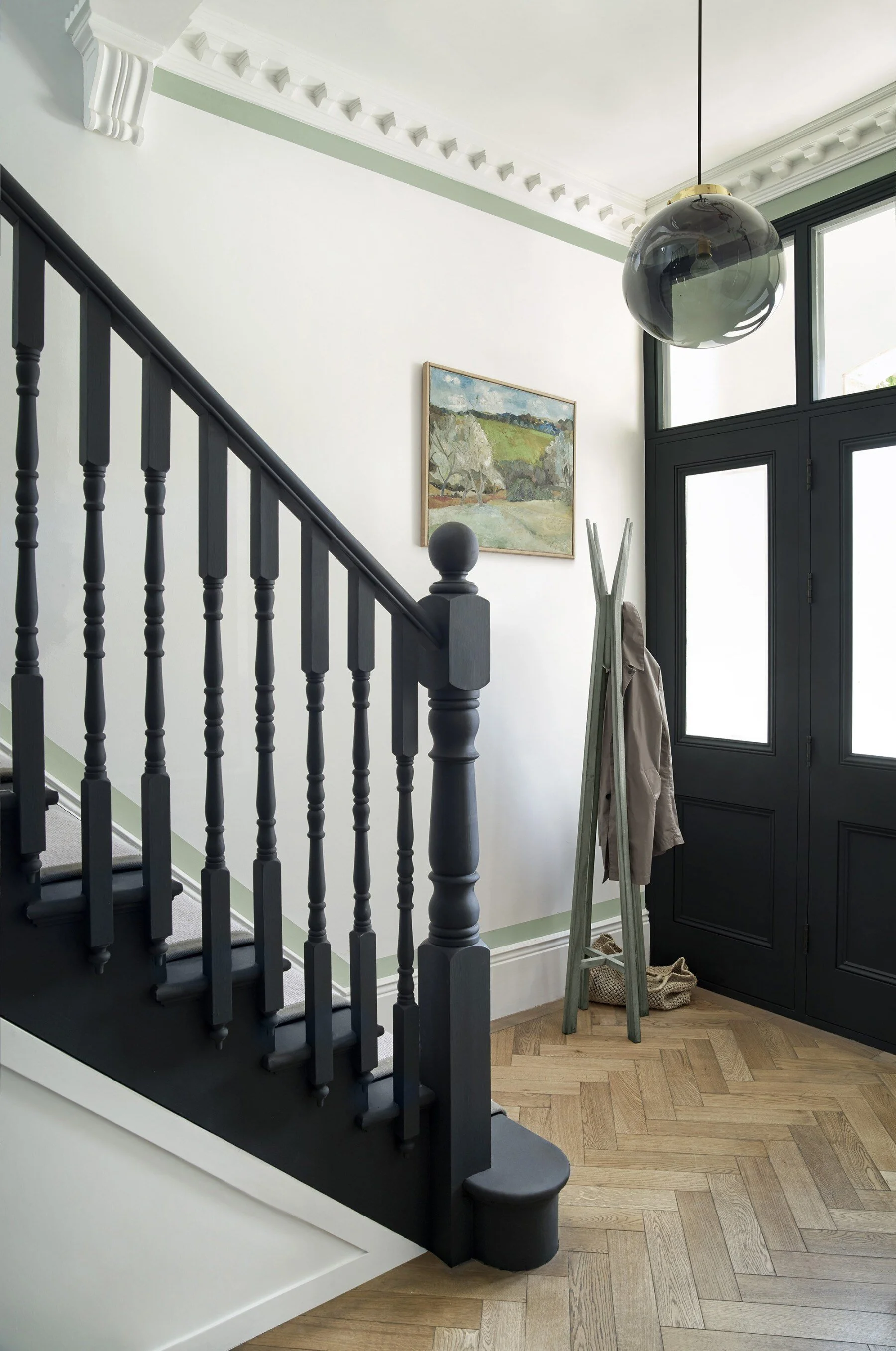
It is very popular to have a monochrome look in your hallway right now, as pictured above. Walls should be white but all the woodwork -including the stairs themselves - are painted black. It’s a modern spin for a traditional hallway that turns it into a contemporary and chic space, which also feels quite timeless. When it comes to monochrome, I am loving the move towards white walls and black ceilings, as seen here in the most recent project by Emilie Fournet Interiors:

What I absolutely adore about a black ceiling and white walls is that you can keep the room feeling light, but the room still has that super-dramatic, next-level impact.
So, what will it be for you in 2020? Going green? Sticking to pink? Or, experimenting with a black ceiling? I’d love to know, so please leave me a comment. It’s also not over yet, as Benjamin Moore (the paint brand of choice in the USA and now being stocked in the UK) releases their key colour on October 11th, so stay tuned…