Before & After: How I Designed The Shared Home Office

I'm so happy to be able to finally reveal to you the home office revamp that I have been working on since the start of the year! As I've mentioned in previous posts, me and my husband share this work space in our home and it just wasn't working for either of us. It was the only room in the house that remained decorated by the previous owners, and although the statement red chimney breast and biscuit coloured walls were inoffensive, they weren't exactly great either. Our artwork had been randomly hung all over the place just on the hooks left by the old owners; and with me and my husband working daily in this room, storage was a problem. As you can see in the pictures below, there was no-where to put anything and stuff had just started to build up until it was a TOTAL mess.
BEFORE:

Before: biscuit walls and beige curtains, art hung randomly, stuff EVERYWHERE!
Together with my husband we agreed on the below mood-board. The brief was a contemporary, masculine room which was also appealing to me. We already owned the walnut desk, plain rug and Ellie Vandoorne artwork (available from Rise Art - an ace online art marketplace selecting emerging and established artists), so we decided to choose colours that complemented these existing pieces.

The agreed final mood board for the room.
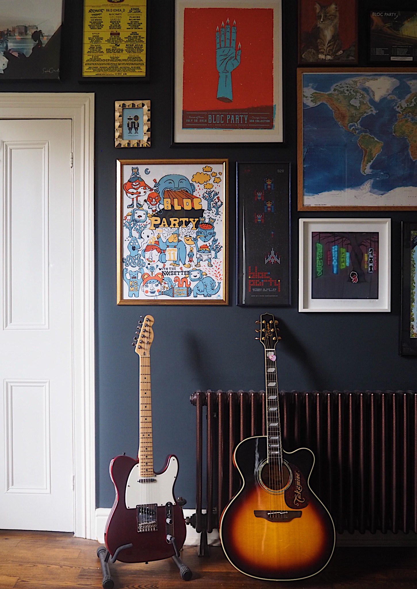
My husband really likes blue, so I decided to paint the chimney breast and the opposite wall in 'Railings' by Farrow & Ball. I'd been wanting to use darker colours in the home for a long time, so this was the perfect opportunity to use this dark navy blue hue. The colour on the chimney breast really made the Ellie Vandoorne artwork pop with its yellow background. While on the opposite wall, it was used as a background for a gallery wall to display all the artwork we wanted up in the room in a coherent manner (unlike how they were randomly hung before).
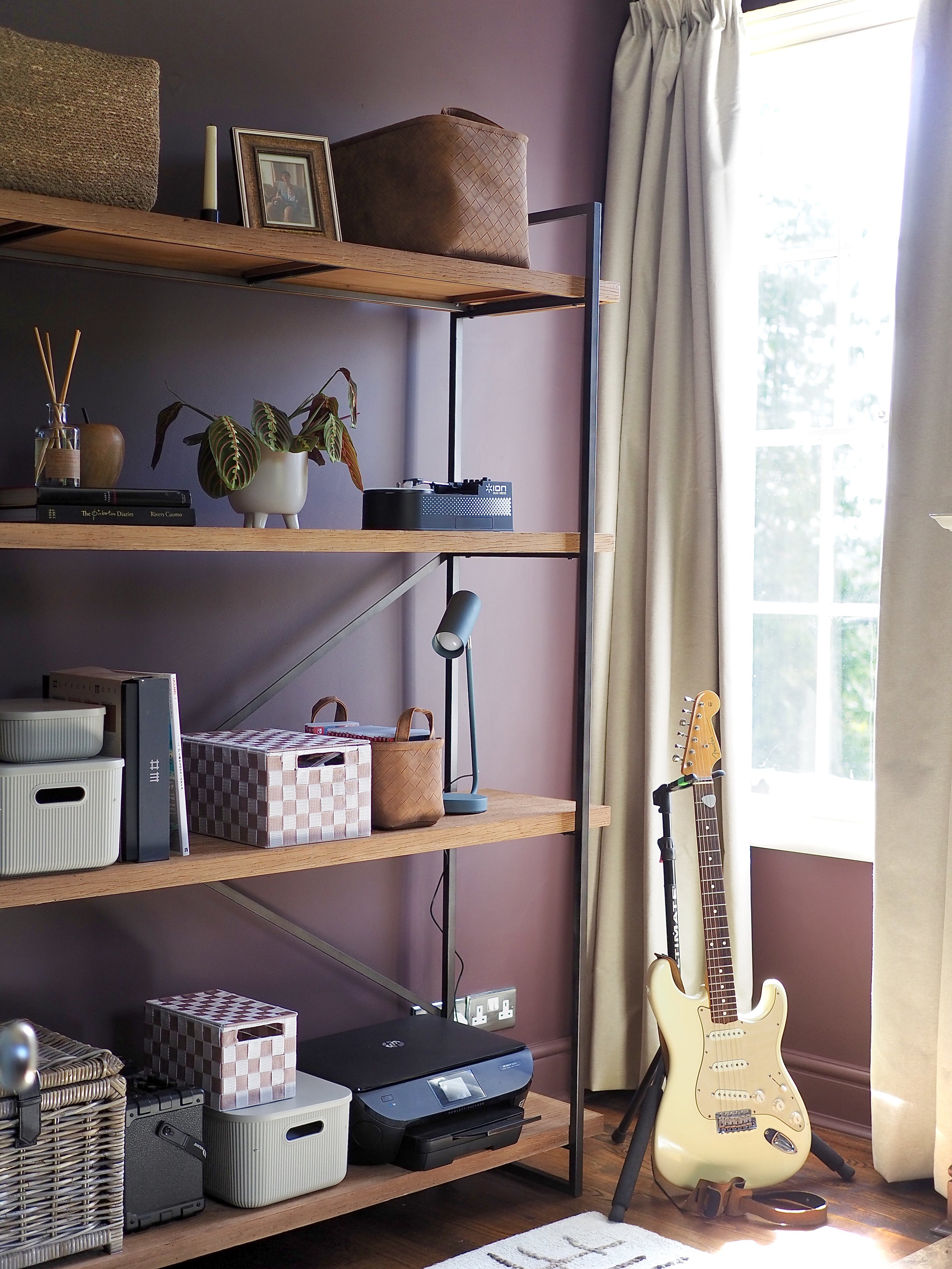
AFTER:

The colour on these walls is 'Railings' by Farrow & Ball. This is the Modular set with ash base from LSA International.
I did not want the room to be completely dark, preferring the chimney breast and gallery wall to be a 'feature', rather than blending in with all one colour. Instead, I painted the far end wall where the desk was placed in 'Clunch' by Farrow & Ball, which is a white that I prefer to others as in our house it always comes across more as a soft grey, rather than a yellow-white.

In the small space that existed on this end wall, I placed a really cheap shelf ladder that I also painted in Railings to blend in. On the shelves I put wire storage baskets for all my paint samples and documents to be tidily contained in one area! To DIY this gold mesh wire notice board click here.

These bowls with beech handles are part of the Disc Collection by LSA International.
In the shelving alcove I pasted in this Cole & Son Hicks Hexagon Wallpaper. This created an extra dimension in the room, as well as being a cheaper way to introduce designer wallpaper as this alcove used less than one roll. The black/gold/white colours of the paper tied in with the Railings, Clunch and gold notice board in the room.

With the left over Hicks Hexagon I covered old filing boxes and magazine holders that were going to be used in the room, to keep the room consistent.

Another budget DIY that I carried out to keep costs down was to dye the beige curtains with fabric dye. The existing curtains were in absolutely fine condition, they were just beige and didn't match the new decor. Ideally, I'd have opted for thick, opulent, dark velvet curtains, but I couldn't spend that sort of money when I had perfectly good quality lined curtains in the room. Instead, I brought some navy fabric dye from Hobbycraft and dyed the beige curtains dark blue. The curtains had a polyester stripe in the pattern which did not dye, but the cotton part and the lining dyed perfectly! I was really happy with the outcome.

This is the Axis Vase Trio with Ash Base by LSA International that I am using to store my multitude of gold paperclips!
To keep the room masculine, I used a lot of stationary containers by LSA International made of material such as glass, leather and wood. These LSA pieces not only look beautiful to be on display, but are totally practical! I found that by using 'display-worthy' storage on shelving units, you could fit a lot more in one place and it looked tidy and stylish, not chaotic and cramped!
Amazingly, me and my husband now have a work room which suits both our tastes! Craft items co-exist with music equipment, and thanks to choosing the right pieces it all works.
What do you think of our new he-she office? Leave your comments below!
* Huge thank you to Farrow & Ball, Cole & Son, LSA International, Rise Art and Sainsbury's who gifted items featured in this post. Please note that this post also contains some affiliate links, which basically means if you shop this look via this post I'll get a small commission.