Bedroom Design, Decor Ideas and Inspiration For A Master Bedroom Revamp
I’ve been working on a total overhaul of our master bedroom for a number of weeks now; today on the blog I thought I would share some of the decor inspiration which has led to the design of the new room scheme.
At the start of the year, I talked about how our bedroom desperately needed redecorating. We had also grown tired of the deep blue tones and jazzy wallpaper and craved something more calming and serene. Since then, I have been sourcing products and pinning a range of inspirational images which has culminated in the mood board for the new room below:

Shell Pot by Ferm Living via Nordic Nest / George Nelson Bubble Saucer pendant light via Heals / AYTM shell hooks via Amara / Milton bedside table lamp, Heals / Pleated vase by CB2 / Bedside table by Swoon Editions / Darcey bed in terracotta velvet, Heals / Bolster cushion by Poodle & Blonde / Serge Mouille replica wall light via Swivel UK

If you are looking to decorate a room in your own home, Pinterest is a great way to gain inspiration and start the design process. Create a number of boards for the room and divide them into categories such as lighting, furniture, wall colours and accessories. Every time you see an image that inspires you, pin it to the relevant board. After a while, take some time to peruse each board individually and you will probably find that you have pinned multiple images that feature the same colours or products as you are particularly drawn to them. This is a great way to work out your core interior style - interiors that are authentic to you and your personal taste. By taking the time to compile images of decor you really love, you shouldn’t tire of the design you create or get drawn into interior trends or fads that you may dislike after a short period of time.
THE WALLS
This image is taken from the Marks & Spencer Dining lookbook from 2016. Image credit: Marks & Spencer.
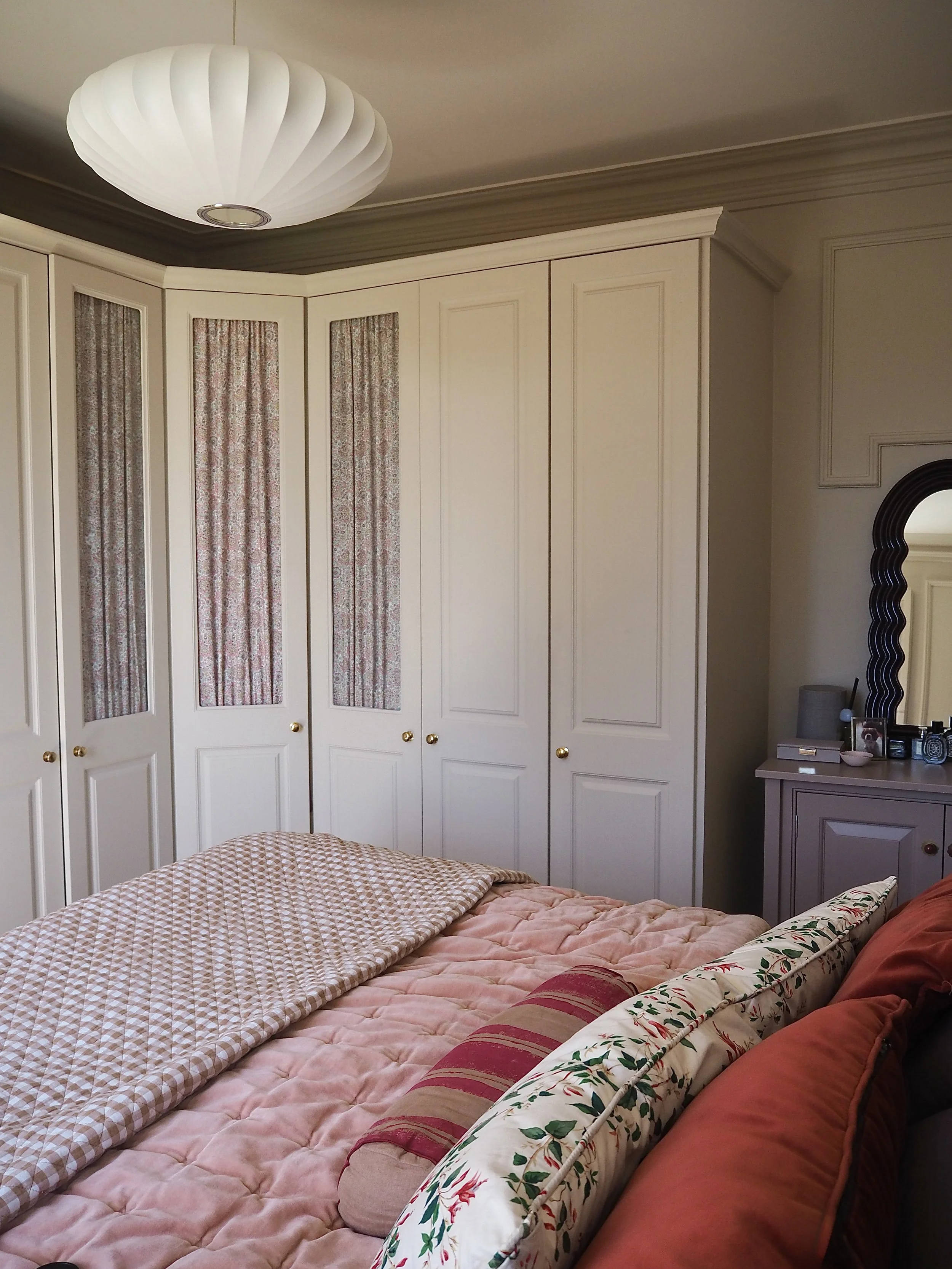
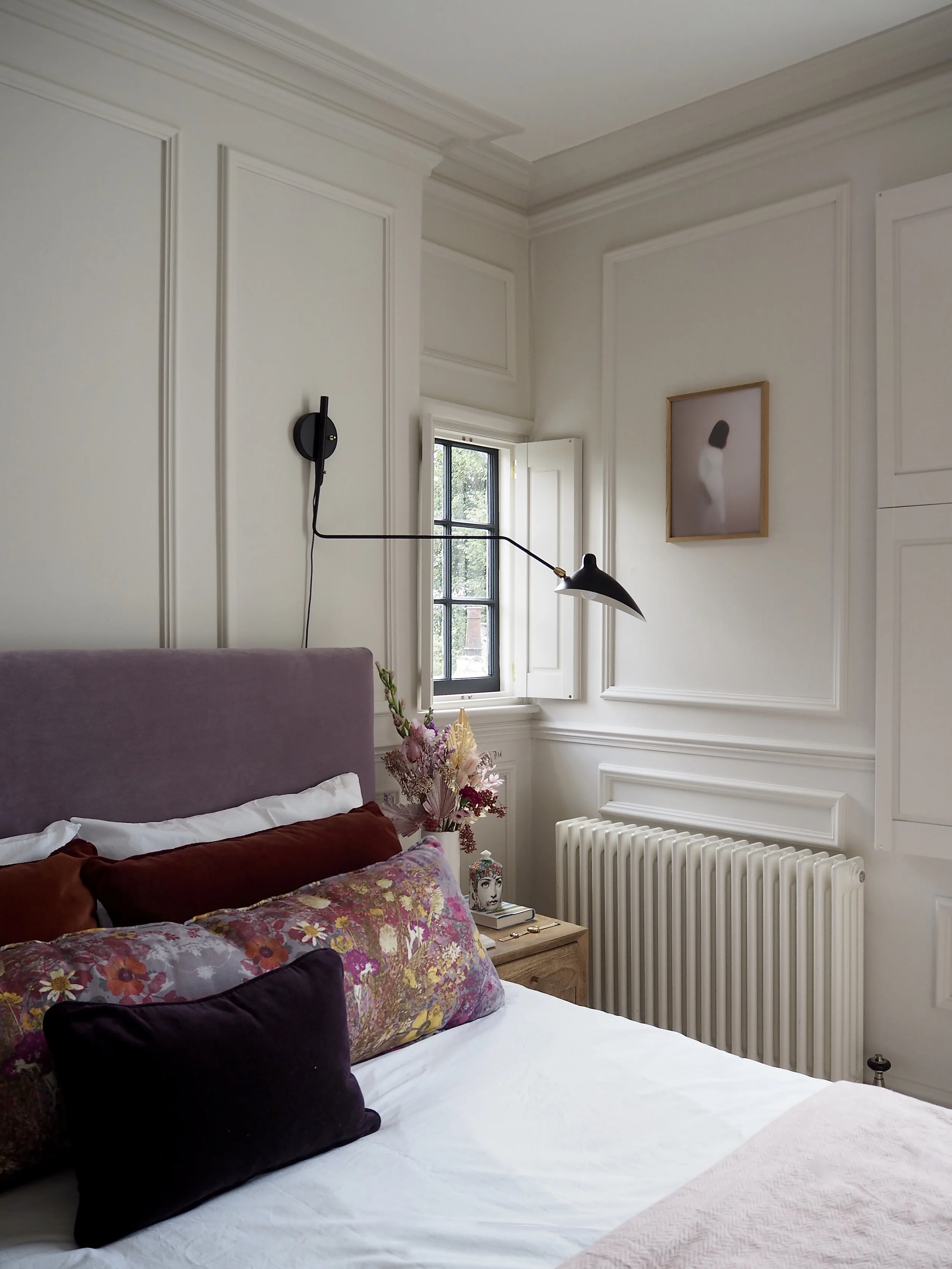
I knew that I wanted to have a light, bright and airy bedroom this time around. Our bedroom gets a lot of sun throughout the day and I thought the deep blue hues that once featured brought the light down rather than complement it. I did not want the walls to feel bare after stripping off the floral wallpaper and decided that I wanted to add in some chunky panelling to add visual interest (without relying on pattern). On Pinterest, I discovered the above image of multiple, separated panels and a central dado rail; using that as the blueprint for my own moulding:
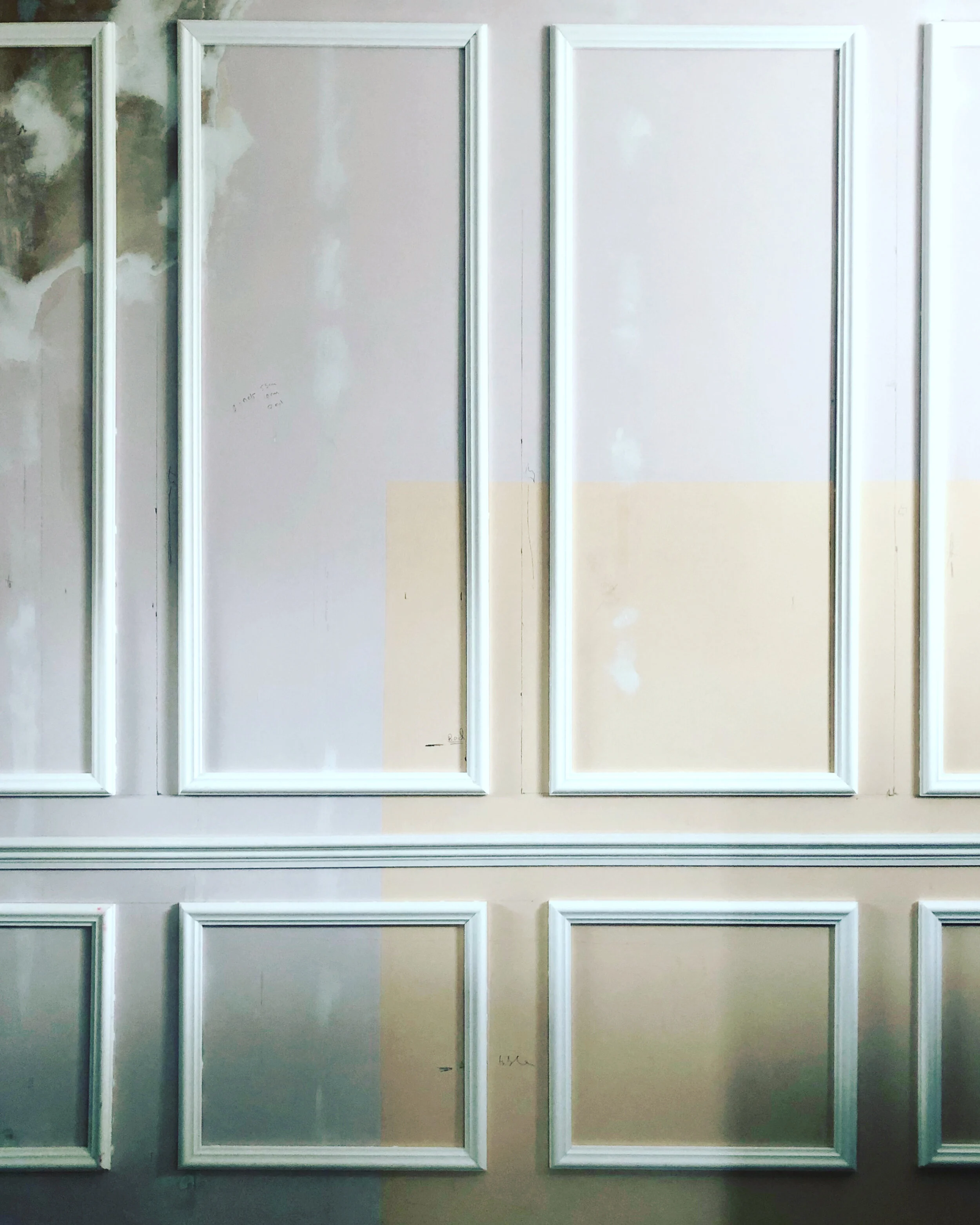
The DIY panelling that I have created in out master bedroom, inspired by the image I found on Pinterest.
The trend for ‘new neutrals’ - brown or pink-based whites with a warm tone to them - have been the base to many gorgeous Scandinavian design schemes of late. Pure, brilliant whites can feel too blinding in a bedroom, while whites with blue or green undertones can feel cold. A friend sent me this image below by the design company Gubi and I fell in love with the soft pinky-biscuit hue on the walls. I pinned this image to my Pinterest account and when I sample paint colours for the room, this will be the image that I keep referring to replicate the shade.
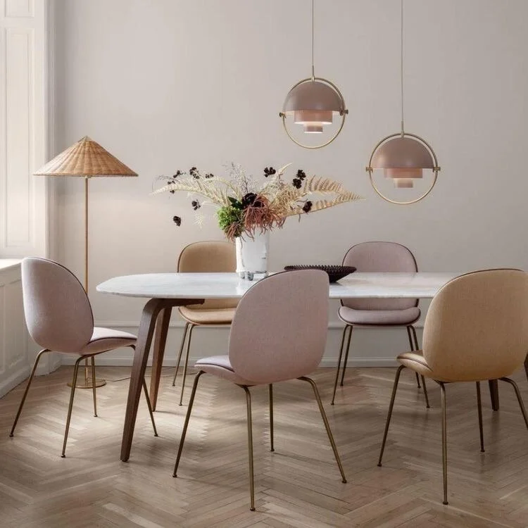
Image credit: Gubi
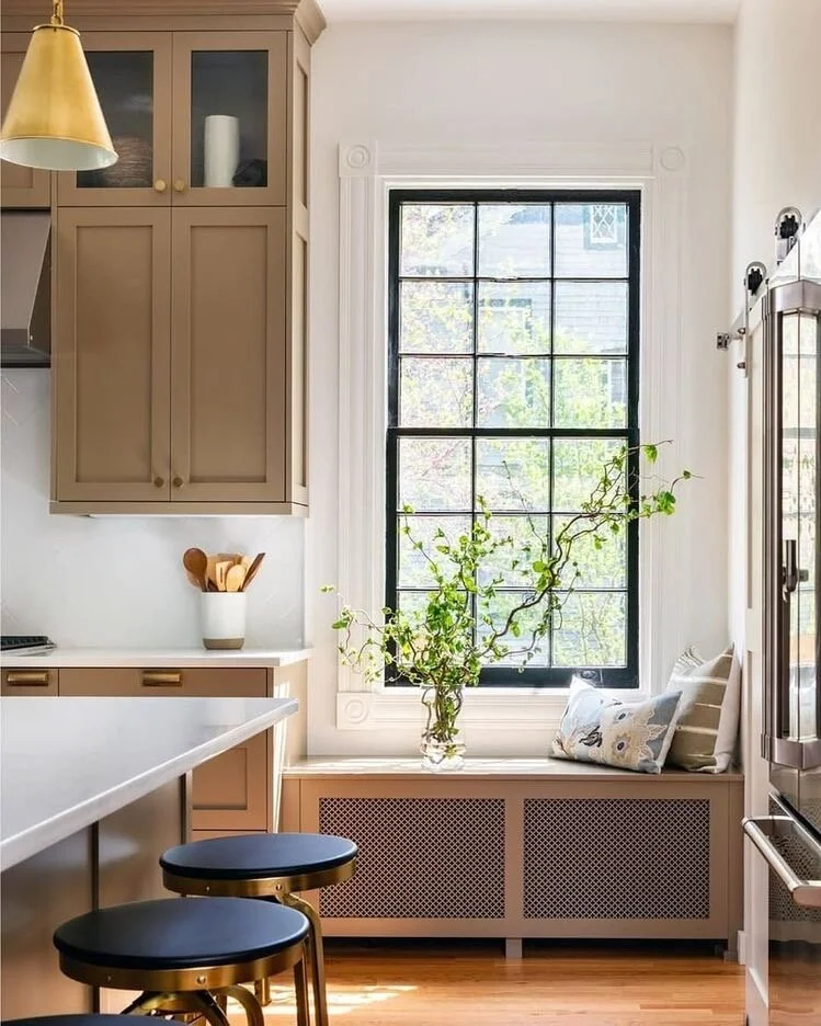
The Floors
Choosing the right flooring and rugs is key for a comfy bedroom vibe. Carpets with warm tones can match those 'new neutrals' on the walls. While too much white on the floor might feel overly bright, warmer biscuit shades or undertones of dusky pink complement neutral schemes without feeling overly stark. I stumbled upon some images online of bedrooms with cosy rugs and I’m thinking of getting custom size rugs for mine; they seem like the perfect way to add a touch of warmth and personal style to the room.
LIGHTING
Lighting plays a huge part in bedroom design as you have to consider the many different functionalities of each light within the space. If you get dressed or apply make-up in your bedroom (as well as use it as a calming space to read before you sleep) you’ll need a mix of bright task and atmospheric lighting within the room. I decided to add a reading light, a soft table lamp and a central pendant into the room to address all our needs and how we use the space.
When I referred to my ‘Lighting’ Pinterest folder, I could see that I had pinned images featuring Serge Mouille or Serge Mouille-inspired lighting multiple times. This lighting design appealed to me and I particularly liked it in the room below by designer Brady Tolbert. I decided to source a version of this lamp as a reading light and have chosen a complementary side table light from Heals to complement it.
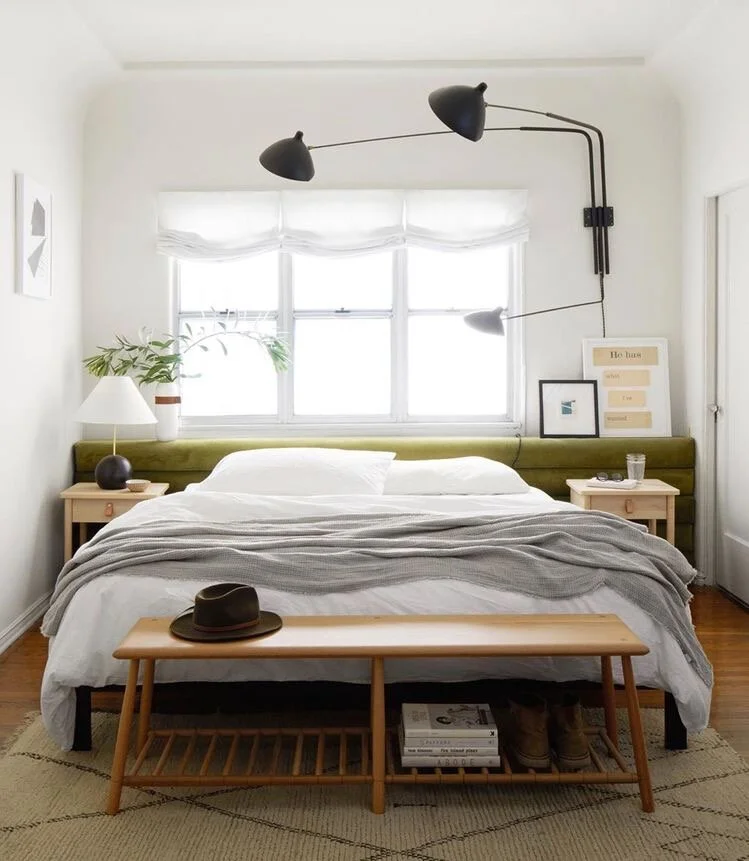
Image credit: Brady Tolbert
As the swinging Serge-Mouille light is quite the statement, I decided to step back from adding in a central bold chandelier or a big brass pendant. Instead, I love the interesting simplicity of the George Nelson saucer pendant (seen here below in one of my favourite homes on Instagram). Using the ‘send to’ function, I pinned this image from Instagram to my ‘Lighting’ Pinterest folder.
Imaged credit: Rikkes Room
THE WINDOWS
One thing that I did want to try out in the room and has been on my list to do in my home for a long time is paint my window frames black. This was a trend that I saw come out of the States back in early 2019 and I just think it looks so effective:
Photographed by @ansel_olson. Design by @iveydesigngroup.
I now have a whole folder on Pinterest dedicated to painted black windows. The windows in our bedroom are old wooden sash windows that are almost past their prime. I’m hoping that painting them black will hide a lot of the damage as well as make a style statement (hopefully, this will be a win-win situation)!
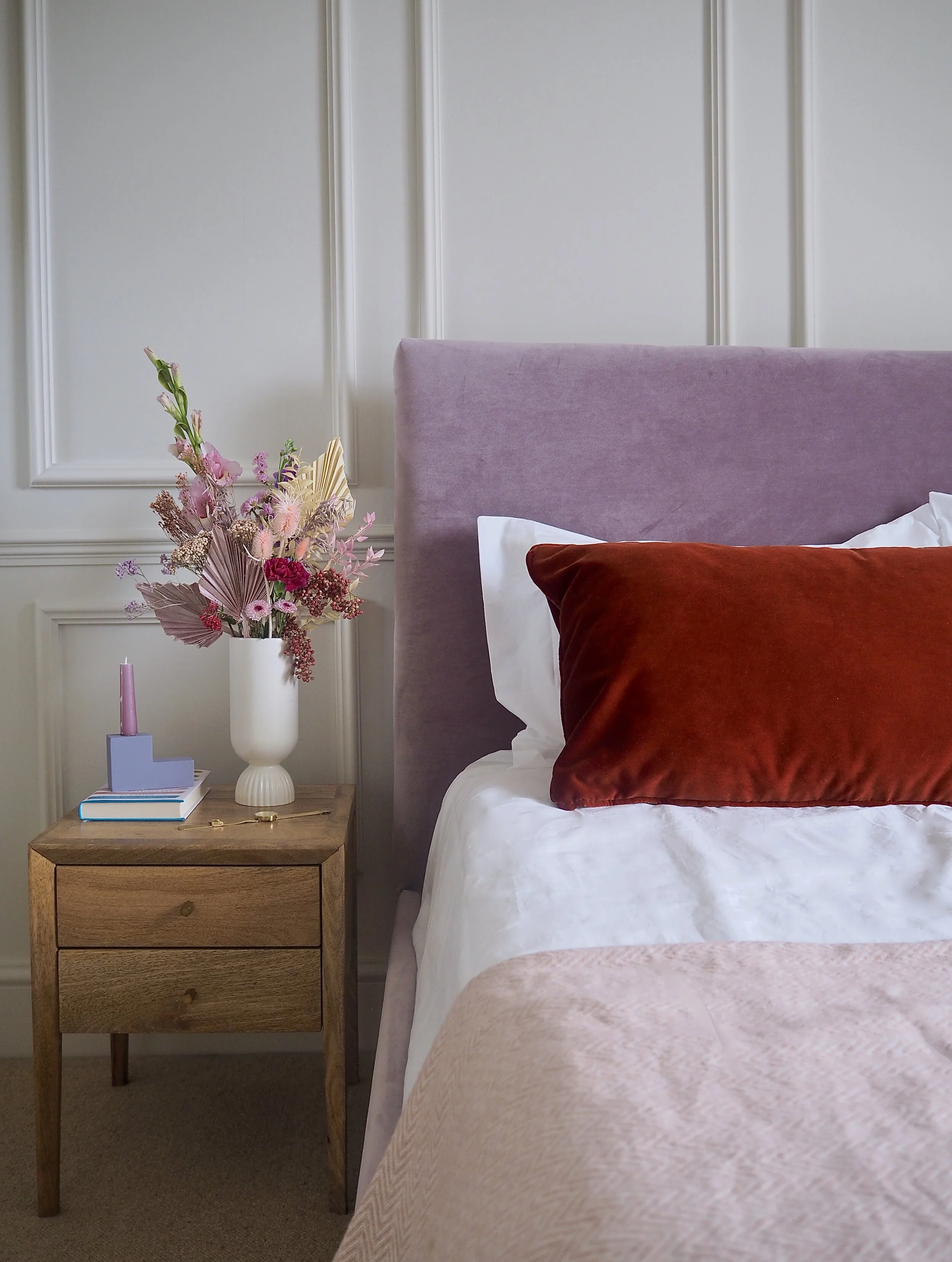
THE BED
While I wanted a neutral colour on the walls, I knew that I did not want a very minimalist monochrome bedroom scheme. At heart, I am a lover of colour, so for a room to be completely devoid of this would not speak to my core interior style. My Pinterest board has recently been full of rich, deep shades of burgundy, rusty reds and warm orange tones on statement pieces of furniture which have been key to deciding that the bed should be upholstered in luxurious velvet in one of these colourways.
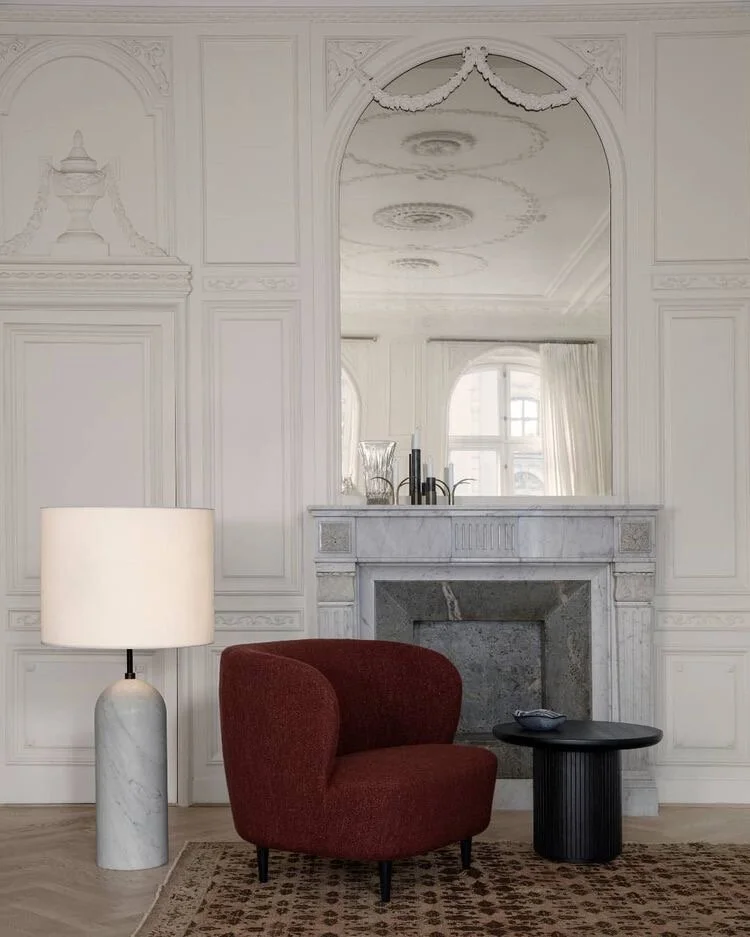
Image credit: Gubi
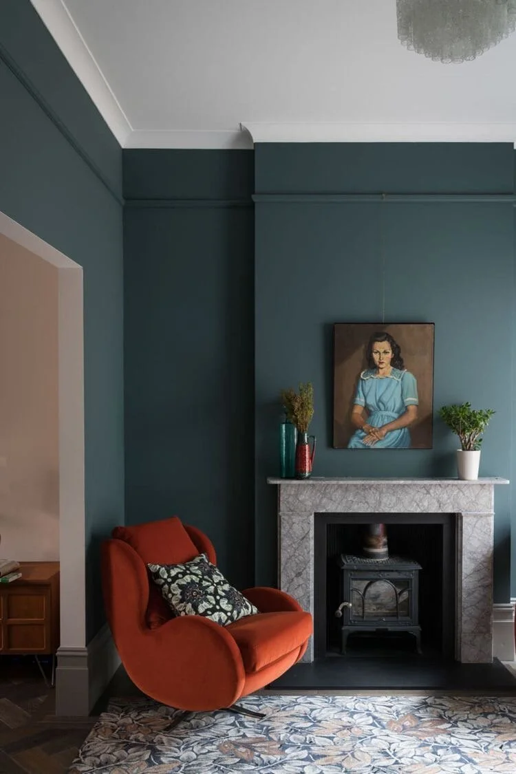
Image credit: Michelle Kelly Design Studio
Being so drawn to the dark red/orange colour palette, I actively searched out images of beds upholstered in these tones and found the image below taken in the London Hoxton Hotel by colour blogger extraordinaire Emma Jane Palin; it was love at first sight and gave me the confidence that a headboard in this shade was the right way to go!
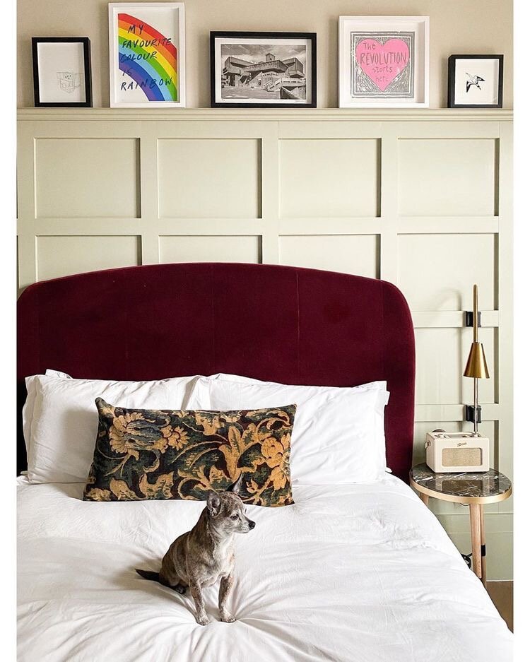
Image credit: Emma Jane Palin
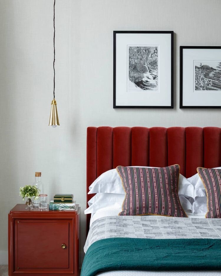
Image credit: Studio Ashby
I really do hope to share the room reveal with you soon. The old wallpaper has been stripped, the walls made good, the panelling is up and I’ve chosen a wall colour, but it may be some time before the UK opens up its factories and warehouses with the COVID-19 outbreak to deliver the fabric and lighting required to complete the scheme. In the meantime, I’d love you to follow along with my daily DIY progress of the room via my Instagram Stories.
Stay safe. x